Download a pdf of this Backgrounder
Related Content: Press releases for individual states, Washington Times Article
Table of Contents
Executive Summary
Using the latest Census Bureau data from 2010 and 2011, this paper provides a detailed picture of the more than 50 million immigrants (legal and illegal) and their U.S.-born children (under 18) in the United States by country of birth, state, and legal status. One of the most important findings is that immigration has dramatically increased the size of the nation’s low-income population; however, there is great variation among immigrants by sending country and region. Moreover, many immigrants make significant progress the longer they live in the country. But even with this progress, immigrants who have been in the United States for 20 years are much more likely to live in poverty, lack health insurance, and access the welfare system than are native-born Americans. The large share of immigrants arriving as adults with relatively little education partly explains this phenomenon.
Overall Numbers
- The number of immigrants (legal and illegal) in the country hit a new record of 40 million in 2010, a 28 percent increase over the total in 2000.
- Of top sending countries, the largest percentage increase in the last decade was for those from Honduras (85 percent), India (74 percent), Guatemala (73 percent), Peru (54 percent), El Salvador (49 percent), Ecuador (48 percent), and China (43 percent).
Labor Force
- In March of 2011, the share of working-age (18 to 65) immigrants holding a job was the same as natives — 68 percent. Immigrant men have higher rates of work than native-born men, while immigrant women have lower rates.
- While immigrants tend to be concentrated in certain jobs, natives comprise the majority of workers in virtually every occupational category. For example, natives comprise 52 percent of maids, 73 percent of janitors, 66 percent of construction laborers, and 65 percent of butchers and meat processors.
Poverty
- In 2010, 23 percent of immigrants and their U.S.-born children (under 18) lived in poverty, compared to 13.5 percent of natives and their children. Immigrants and their children accounted for one-fourth of all persons in poverty.
- The children of immigrants account for one-third of all children in poverty.
- Among the top sending countries, poverty is highest for immigrants and their young children from Mexico (35 percent), Honduras (34 percent), and Guatemala (31 percent); and lowest for those from Germany (7 percent), India (6 percent), and the Philippines (6 percent).
Welfare Use
- In 2010, 36 percent of immigrant-headed households used at least one major welfare program (primarily food assistance and Medicaid) compared to 23 percent of native households.
- Among the top sending countries, welfare use is highest for households headed by immigrants from Mexico (57 percent), Guatemala (55 percent), and the Dominican Republic (54 percent); and lowest for those from Canada (13 percent), Germany (10 percent), and the United Kingdom (6 percent).
Health Insurance Coverage
- In 2010, 29 percent of immigrants and their U.S.-born children (under 18) lacked health insurance, compared to 13.8 percent of natives and their children.
- New immigrants and their U.S.-born children account for two-thirds of the increase in the uninsured since 2000.
- Among the top sending countries, the highest rates of uninsurance are for those from Guatemala (46 percent), Honduras (44 percent), El Salvador (44 percent), and Mexico (41 percent); and lowest for those from Canada (9 percent), Japan (8 percent), and Germany (5 percent).
Public Schools
- There are 10.4 million students from immigrant households in public schools, accounting for one in five public school students. Of these students, 78 percent speak a language other than English at home.
- Overall, one in four public school students now speaks a language other than English at home.
Homeownership
- Of immigrant households, 53 percent are owner-occupied, compared to 68 percent of native households.
- Rates of home ownership are highest for immigrants from Italy (83 percent), Germany (75 percent), and the United Kingdom (73 percent); and lowest for those from Guatemala (30 percent), Honduras (28 percent), and the Dominican Republic (24 percent).
Housing Overcrowding
- In 2010, 13 percent of immigrant households were overcrowded, compared to 2 percent of native households.
- Immigrant households account for half of all overcrowded households.
Entrepreneurship
- Immigrants and natives have very similar rates of entrepreneurship — 11.7 percent of natives and 11.5 percent of immigrants are self-employed.
- Among the top sending countries, self-employment is highest for immigrants from Korea (26 percent), Canada (24 percent), and the United Kingdom (17 percent). It is lowest for those from Haiti (6 percent), Honduras (5 percent), and Jamaica (3 percent).
Educational Attainment
- Of adult immigrants (25 to 65), 28 percent have not completed high school, compared to 7 percent of natives.
- The share of immigrants (25 to 65) with at least a bachelor’s degree is somewhat lower than that of natives — 29 vs. 33 percent.
- The large share of immigrants with relatively little education is one of the primary reasons for their lower socioeconomic status, not their legal status or an unwillingness to work.
- At the same time immigration added significantly to the number of less-educated workers, the share of young, less-educated natives holding a job declined significantly. The decline began well before the current economic downturn.
Progress Over Time
- Many immigrants make significant progress the longer they live in the country. However, on average even immigrants who have lived in the United States for 20 years have not come close to closing the gap with natives.
- The poverty rate of adult immigrants who have lived in the United States for 20 years is 50 percent higher than that of adult natives.
- The share of adult immigrants who have lived in the United States for 20 years who lack health insurance is twice that of adult natives.
- The share of households headed by an immigrant who has lived in the United States for 20 years using one or more welfare programs is nearly twice that of native-headed households.
- The share of households headed by an immigrant who has lived in the United States for 20 years that are owner occupied is 22 percent lower than that of native households.
Legal Status
- We estimate that 28 percent of all immigrants are in the country illegally. Roughly half of Mexican and Central American and one-third of South American immigrants are here illegally.
Impact on Population Size and Age
- New immigration (legal and illegal) plus births to immigrants added 22.5 million residents to the country over the last decade, equal to 80 percent of total U.S. population growth.
- Recent immigration has had only a tiny impact on the nation’s age structure. If the nearly 14 million immigrants who arrived in 2000 or later are excluded, it raises the average age in the United States in 2010 from 37.4 years to 37.6 years — roughly two months.
State Data
- Among top immigrant-receiving states, poverty among immigrants and their children is highest in Arizona (37 percent), North Carolina (29 percent), and Minnesota (29 percent). It is lowest in Massachusetts (17 percent) Maryland (13 percent), and New Jersey (13 percent).
- Among top immigrant-receiving states, welfare use by immigrant households is highest in Minnesota (48 percent), New York (41 percent), and Texas (45 percent). It is lowest in Virginia (20 percent), Georgia (30 percent), and Nevada (25 percent).
- Among top immigrant-receiving states, home ownership for immigrant households is highest in Florida (61 percent), Illinois (61 percent), and Maryland (59 percent). It is lowest in California (48 percent), Massachusetts (47 percent), and Minnesota (46 percent).
- Among top immigrant-receiving states, the share of adult immigrants who have not completed high school is highest in Texas (46 percent), Colorado (41 percent), and North Carolina (36 percent). It is lowest in Virginia (15 percent), Massachusetts (15 percent), and Florida (16 percent).
Discussion
There are many reasons to examine the nation’s immigrant population. First, immigrants and their minor children now represent one-sixth of the U.S. population. Moreover, understanding how immigrants are doing is the best way to evaluate the effects of immigration policy. Absent a change in policy, between 12 and 15 million new immigrants (legal and illegal) will likely settle in the United States in the next decade. And perhaps 30 million new immigrants will arrive in the next 20 years. Immigration policy determines the number allowed in, the selection criteria used, and the level of resources devoted to controlling illegal immigration. The future, of course, is not set and when formulating immigration policy, it is critically important to know the impact of recent immigration.
It is difficult to understate the impact of immigration on the socio-demographics of the United States. New immigration plus births to immigrants added more than 22 million people to the U.S. population in the last decade, equal to 80 percent of total population growth. Immigrants and their young children (under 18) now account for more than one in five public school students, one-fourth of those in poverty, and nearly one-third of those without health insurance, creating very real challenges for the nation’s schools, health care systems, and physical infrastructure. The large share of immigrants who arrive as adults with relatively few years of schooling is the primary reason so many live in poverty, use welfare programs, or lack health insurance, not their legal status or an unwillingness to work.
Despite the fact that a large share of immigrants have few years of schooling, most immigrants do work. In fact, the share of immigrant men holding a job is higher than native-born men. Moreover, immigrants make significant progress the longer they reside in the United States. This is also true for the least educated. While many immigrants do very well in the United States, on average immigrants who have been in the country for 20 years lag well behind natives in most measure of economic well-being.
At the same time that immigration policy has significantly increased the number of less-educated immigrants, there has been a dramatic deterioration in the labor market position of less-educated natives. Comparing data from the beginning of this decade shows a huge decline in the share of young and less-educated natives holding a job — from two-thirds to just under half. The decline in work among the young and less-educated natives began well before the Great Recession. It is difficult to find any evidence of a shortage of less-educated workers in the United States. Some may argue that immigrants only do jobs that American do not want, but an analysis by occupations shows that the vast majority of workers in almost every job are U.S.-born.
A central question for immigration policy is: Should we continue to allow in so many people with little education — increasing potential job competition for the poorest American workers and the population in need of government assistance? The primary goal of this paper is to better inform that debate.
Data Source
The data for this paper come primarily from the public-use files of the 2010 American Community Survey (ACS) and the March 2011 Current Population Survey (CPS). In some cases, for state-specific information, we combine the March 2010 and 2011 CPS to get statistically robust results. In this report, the terms foreign-born and immigrant are used synonymously. Immigrants are persons living in the United States who were not American citizens at birth. This includes naturalized American citizens, legal permanent residents (green card holders), illegal immigrants, and people on long-term temporary visas such as foreign students or guest workers.
Introduction
There are many reasons to examine the nation’s immigrant population. First, the more than 50 million immigrants and their minor children now comprise one-sixth of U.S. residents, so how they are faring is vitally important to the United States. Moreover, understanding how immigrants are doing is the best way to evaluate the effects of immigration policy. Absent a change in policy, between 12 and 15 million new immigrants (legal and illegal) will likely settle in the United States in the next decade. And perhaps 30 million new immigrants will arrive in the next 20 years. Immigration policy determines the number allowed in, the selection criteria used, and the level of resources devoted to controlling illegal immigration. The future, of course, is not set and when deciding on what immigration policy should be, it is critically important to know what impact the immigration flow has had in recent decades.
There is no one answer to the question of whether the country has been well served by its immigration policy. To evaluate the effect of this immigration it is necessary to draw on the available data. This paper uses the latest Census Bureau data to provide readers with information so they can make sound judgments about the effects of immigration on American society and on what immigration policy should be in the future.
Although not explicitly acknowledged, the two most important ways of examining the immigration issue are what might be called the “immigrant-centric” approach and the “national” approach. They are not mutually exclusive, but they are distinct. The immigrant-centric approach focuses on how immigrants are faring, what is sometimes called “immigrant adaptation”. The key assumption underlying this perspective is not so much how immigrants are doing relative to natives, but rather how they are doing given their level of education, language skills, and other aspects of their human capital endowment. This approach also tends to emphasize the progress immigrants make over time on their own terms and the benefit of migration to the immigrants themselves. The immigrant-centric view is the way most, but not all, academic researchers approach the issue.
The other way of thinking about immigration can be called the national perspective, which is focused on the impact immigration has on American society. This approach emphasizes that immigration is supposed to benefit the existing population of American citizens; the benefit immigrants receive by coming here is less important. So, for example, if immigration adds significantly to the population living in poverty or using welfare programs, this is seen as a problem, even if immigrants are clearly better off in this country than they would have been back home and are no worse than natives with the same education. This approach is also focused on possible job competition between immigrants and natives and the effect immigration has on public coffers. In general, the national perspective is the way the American public thinks about the immigration issue.
When thinking about the information presented in this report, it is helpful to keep both perspectives in mind. There is no one best way to think about immigration. By approaching the issue from both points of view, the reader may arrive at a better understanding of the complex issues surrounding immigration.
Data Sources and Methods
Data Sources
The data for this paper come primarily from the 2010 American Community Survey (ACS) and the March 2011 Current Population Survey (CPS). In some cases, for state-specific information we combined the March 2010 and 2011 CPS to get a larger, more statistically robust sample. The ACS and CPS have become the two most important sources of data on the size, growth, and socio-economic characteristics of the nation’s immigrant population. In this report, the terms foreign-born and immigrant are used synonymously. Immigrants are persons living in the United States who were not American citizens at birth. This includes naturalized American citizens, legal permanent residents (green card holders), illegal aliens, and people on long-term temporary visas such as foreign students or guest workers who respond to the ACS or CPS.1 We also use the terms illegal alien and illegal immigrant interchangeably.
The 2010 ACS is of particular value because it the first ACS weighted to reflect the results of the 2010 decennial census. (The decennial census itself no longer includes any immigration-related questions.) The public-use sample of the 2010 ACS used in this study has roughly 3.1 million respondents, nearly 350,000 of whom are immigrants. It is by far the largest survey conducted by the U.S. Census Bureau. The ACS includes all persons in the United States, including those in institutions such as prisons and nursing homes. Because of its size and complete coverage we also use the ACS in this report to estimate the overall number of immigrants, their year of arrival, and other statistics at the national and state level. Because it includes questions on language and public school enrollment not found in the CPS, we use the ACS to examine these issues as well. While the ACS is an invaluable source of information on the foreign-born, however, it contains fewer questions than the CPS.
The March CPS, which is also called the Annual Social and Economic Supplement, includes an extra-large sample of minorities. While much smaller than the ACS, the March CPS still includes about 210,000 individuals, more than 26,000 of whom are foreign-born. Because the CPS contains more questions it allows for more detailed analysis in some areas than does the ACS. The CPS has been in operation much longer than the ACS and for many years it has been the primary source of data on the labor market characteristics, income, health insurance coverage, and welfare use of the American population. The CPS is also one of the only government surveys to include questions on the birthplace of each respondent’s parent, allowing for generational analysis of immigrants and their descendants.
Another advantage of the CPS, unlike the ACS, is that every household in the survey receives an interview (phone or in-person) from a Census Bureau employee. The survey questions are complex and having a live person ask the questions almost certainly improves data quality. In contrast, most respondents to the ACS mail in their questionnaire and never actually speak to a Census Bureau employee. Moreover, respondents remain in the CPS for several months at a time and this, too, means there is some relationship with the Bureau. Like the ACS, the CPS is weighted to reflect the actual composition of the total U.S. population. Unlike the ACS, the CPS does not include those in institutions and so does not cover the nation’s entire population. However, those in institutions are generally not part of the labor market nor are they typically included in statistics on health insurance coverage, poverty, income, and welfare use.
The ACS and CPS each have different strengths. By using both in this report we hope to provide a more complete picture of the nation’s foreign-born population. However, it must be remembered that some percentage of the foreign-born (especially illegal aliens) are missed by government surveys of this kind, thus the actual size of the population is somewhat larger than what is reported here. There is research indicating that some 5 percent of the immigrant population is missed by Census Bureau surveys.2
Historic Trends in Immigration
Immigration has clearly played an important role in American history. Figure 1 reports the number and percentage of immigrants living in the United States from 1900 to 2010. Figure 1 shows very significant growth in the foreign-born both in absolute numbers and as a share of the total population since 1970. The immigrant population in 2010 was double that of 1990, nearly triple that of 1980, and quadruple that of 1970, when it stood at 9.6 million. The increase in the size of the immigrant population has been so dramatic (20.2 million) in the last two decades that just this growth is double the size of the entire foreign-born population in 1970 or even 1900. The seemingly large growth of 1.5 million immigrants from 2009 to 2010 should be interpreted with caution because the 2010 data were weighted using the 2010 census.
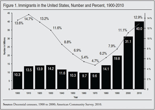
While the number of immigrants in the country is higher than at any time in American history, the immigrant share of the population (12.9 percent in 2010) was higher 90 years ago. In terms of the impact of immigrants on the United States, both the percentage of the population made up of immigrants and the number of immigrants are clearly important. The ability to assimilate and incorporate immigrants is partly dependent on the relative sizes of the native and immigrant populations. On the other hand, absolute numbers also clearly matter; a large number of immigrants can create the critical mass necessary to foster linguistic and cultural isolation regardless of their percentage of the overall population. Absent a change in policy, the number and immigrant share of the population will continue to increase for the foreseeable future.
Recent Trends in Immigration
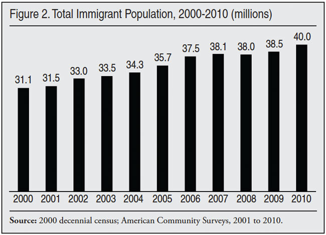
Figure 2 reports the size of the foreign-born population from 2000 to 2010 based on the ACS. The figure shows significant growth during the last decade. The figure for 2000 is from the decennial census because the ACS was not fully implemented in 2000. The ACS was not fully implemented until 2005 and did not include those in group quarters until 2006. Figure 2 shows a significant fall-off in the growth of the immigrant population from 2007 to 2009, with an increase of only 400,000 over that two-year period.
This slowing in growth likely reflects a reduction in the number of new immigrants (legal and illegal) settling in the country and an increase in out-migration. The deterioration in the U.S. economy coupled with stepped up enforcement efforts at the end of the Bush administration likely caused fewer immigrants to enter the country and more to leave. In a series of recent reports, the Center for Immigration Studies estimated immigration and emigration rates throughout the decade. In general, our prior research found good evidence that the level of new immigration fell at the end of the decade and that out-migration increased.3
Flow of New Immigrants
Another way to examine trends in immigration is to look at responses to the year-of-arrival question. In addition to asking respondents if they are immigrants, the ACS also asks them what year they came to the United States to live. Of the 40 million immigrants in the country in 2010, 13.9 million (±99,000) responded that they came to the United States in 2000 or later. This would translate into 1.3 to 1.4 million new arrivals annually during the last decade. Some prior research indicates that 5.2 percent of immigrants are missed in the ACS.4 So the actual level of new immigrants could be closer to 1.5 million a year during the decade just completed.
The 2000 census also included a year-of-arrival question and found that 13.2 million immigrants arrived during the preceding decade and were still in the county in 2000. The difference between the number of new arrivals in the 1990s and the decade just completed is statistically significant.5 This makes the last decade the highest in U.S. history. The 1990 Census showed 8.7 million new immigrants arrived from 1980 to 1990, much lower than the nearly 14 million who arrived in the 10 years prior to 2010. Based on the available evidence, no other decade comes close to the level of new immigration from 2000 to 2010.6
The finding that new immigration was higher in the 10 years prior to 2010 than in the 10 years prior to 2000 is important because the two decades were very different in terms of job growth. There were two significant recessions during the first decade of this century plus the 9/11 terrorist attacks. During the decade there was actually a net loss of about 400,000 jobs according to a Bureau of Labor Statistics (BLS) survey of businesses. In contrast, the BLS reported a net increase in jobs of about 22 million from 1990 to 2000.7
Figure 3 reports new arrivals based on the ACS from 2000 to 2010. (Each year the ACS provides complete data for the preceding calendar year, so, for example, figures for 2009 are from the 2010 ACS.) It also reports the unemployment rate for immigrants during the decade. The figure indicates that the number of new arrivals was higher in the first part of the decade than at the end of the decade. However, the growth in the foreign-born shown in Figure 2 indicates relatively high immigration from 2002 to 2005, which seems to contradict the finding in Figure 3. But there are breaks in the continuity of ACS data, so like the totals for the decade shown in Figure 2, the results in Figure 3 should be interpreted with caution. Nevertheless, even taking into account the discontinuity in the data, it is difficult to reconcile some of the results in Figures 2 and 3.8
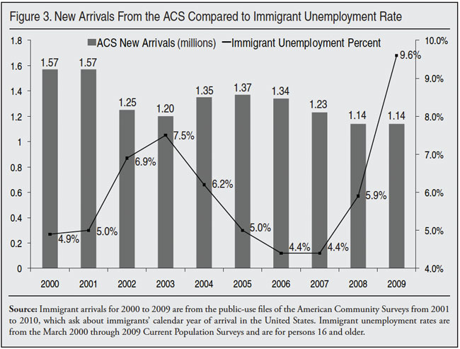
Moreover, Figure 3 by itself indicates that immigration remained very high throughout the decade, though the number of new arrivals was higher in 2000 and 2001 than later in the decade. This is a reminder that immigration is a complex process; not simply a function of labor-market conditions. Factors such as the desire to be with relatives or to enjoy political freedoms and lower levels of official corruption play a significant role in immigrants’ decisions to come to the United States. The generosity of America’s public benefits and the quality of public services can also make this country an attractive place to settle. These things do not change during a recession, even a steep one.
Deaths and Outmigration
By definition, no one born in the United States is foreign-born and so births cannot add to the immigrant population. Moreover, each year some immigrants die and others return home. There is some debate about the size of out-migration, but together deaths and return-migration equal 1 to 1.5 percent of the immigrant population annually, or 400,000 to 600,000 each year over the last decade. For the foreign-born population to grow, new immigration must exceed deaths and outmigration.
It is possible to estimate deaths and outmigration during the decade just completed based on the ACS data. Given the age, gender, race, and ethnic composition of the foreign-born population, the death rate over the last decade should be about seven per 1,000. (These figures include only individuals living in the United States and captured by the ACS, not any deaths that occur among illegal immigrants trying to cross the border.) This means that the number of deaths over the last decade varied from about 217,000 a year at the start of the decade to nearly 266,000 by the end of the decade, for a total of about 2.4 million deaths during this time period.
Assuming 2.423 million deaths during the decade among the foreign-born and 13.863 million new arrivals, and growth of 8.847 million, the implied level of emigration should be about 2.592 million during the decade. The equation looks as follows: outmigration = new arrivals – (growth + deaths). Filling in the numbers we get the following result: 2.592 million = 13.863 – (8.847 million + 2.423 million). This implies 2.592 million immigrants left the United States during the decade. Net immigration equals new immigration minus outmigration (13.863 – 2.592) or 11.271 million during the last decade.
Of course, it must be emphasized that this estimate is for the entire decade and outmigration may have varied significantly from year to year. Further, these estimates do not include the arrival and departure of individuals who came and went during the decade, such as a person who arrived in 2001 and left in 2008. There is also no adjustment for undercount in these numbers. So the estimate of slightly less than 2.6 million departures for the decade is a low-range estimate. Deaths, on the other hand, do not vary very much and should grow slowly but steadily as the size of the foreign-born population grows.
State Numbers
State Data
Table 1 shows the number of immigrants in each state for 2010. California, New York, Texas, Florida, New Jersey, Illinois, Massachusetts, Georgia, Virginia, Washington, Arizona, and Maryland have the largest immigrant populations. Each of these states had more than 800,000 foreign-born residents in 2010. California has the largest immigrant population, accounting for more than one-fourth of the national total. New York and Texas are next with about 10 percent of the nation’s immigrants. With 9 percent of the nation’s immigrants, Florida’s foreign-born population is similar in size. New Jersey and Illinois are next with 5 and 4 percent of the nation’s immigrants respectively. Table 1 shows that the immigrant population is concentrated in relatively few states. Six states account for 65 percent of the nation’s foreign-born population, but only 40 percent of the nation’s overall population.
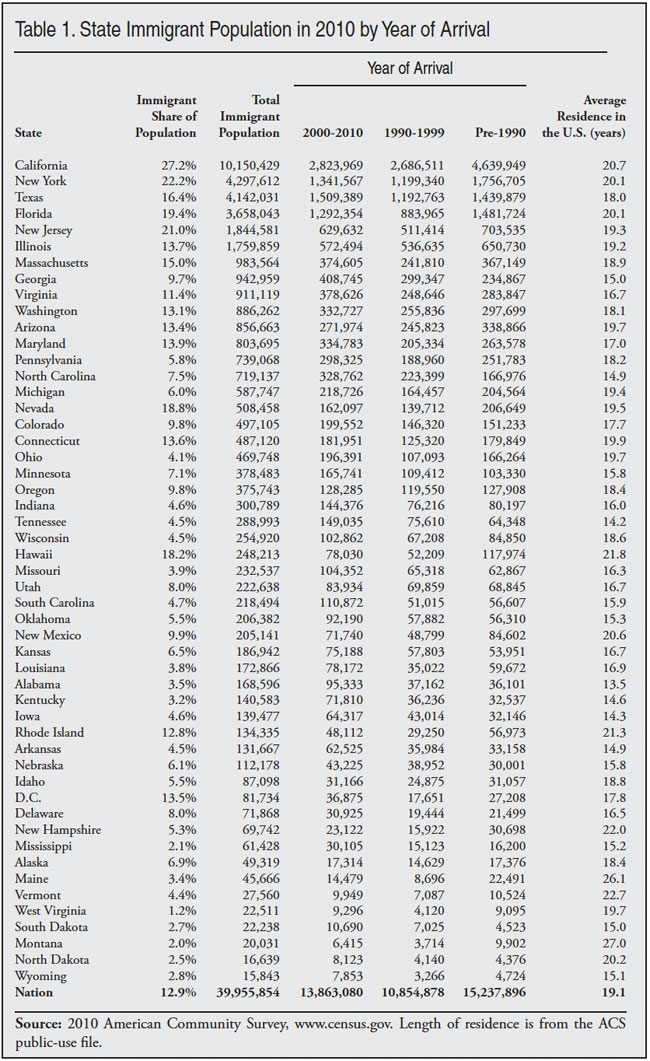
Table 1 also shows the year of arrival for the foreign-born population in each state. As already noted, in 2010 13.9 million had arrived in 2000 or later. This means that 26.1 million (65 percent) immigrants have lived in the United States for more than 10 years. The ACS also shows that, on average, immigrants have lived in the United States for slightly more than 19 years.9 Thus the immigrant population in the United States is comprised mostly of long-time residents. As will become clear in this report, immigrants have much higher rates of poverty, uninsurance, and welfare use and lower incomes and home ownership rates. However, the economic status of the immigrant population is not because they are mostly new arrivals.
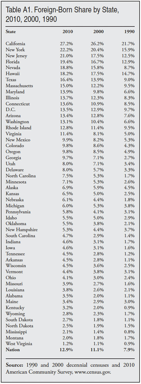
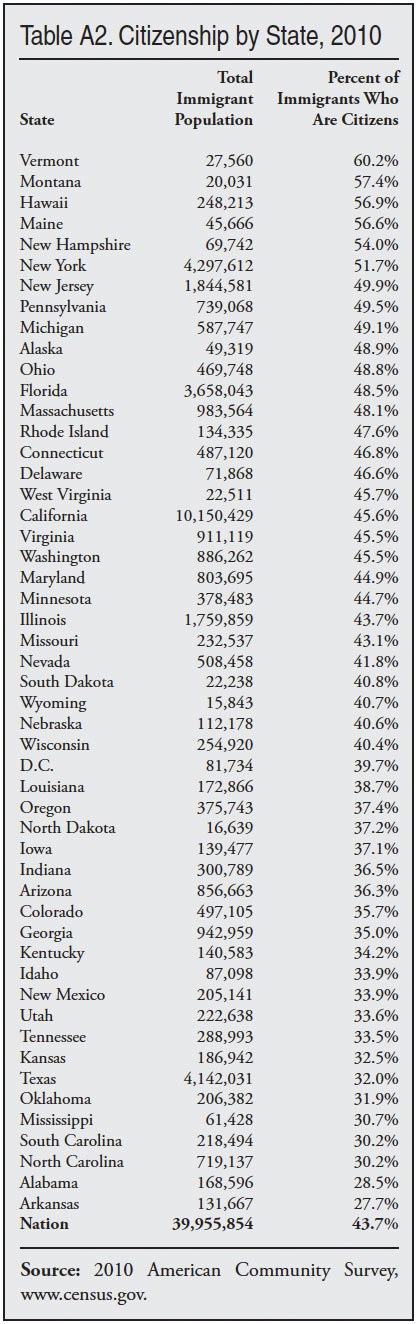
Many of the states with the largest immigrant populations are also those with the highest foreign-born shares. However, several smaller states, such as Hawaii and Nevada, rank high in terms of the percentage of their populations that are foreign-born, even though the overall number of immigrants is more modest relative to larger states. Table A1 in the appendix shows the share of each state’s populations comprised of immigrants in in 1990, 2000, and 2010. Table A2 shows citizenship rates by state.
Table 2 reports the size of state immigrant populations in 2010, 2000, and 1990. While the immigrant population remains concentrated, it has become less so over time. In 1990, California accounted for 33 percent of the foreign-born, but by 2000 it was 28 percent, and by 2010 it was 25 percent of the total. If we look at the top six states of immigrant settlement, they accounted for 73 percent of the total foreign-born in 1990, 68 percent in 2000, and 65 percent in 2010.
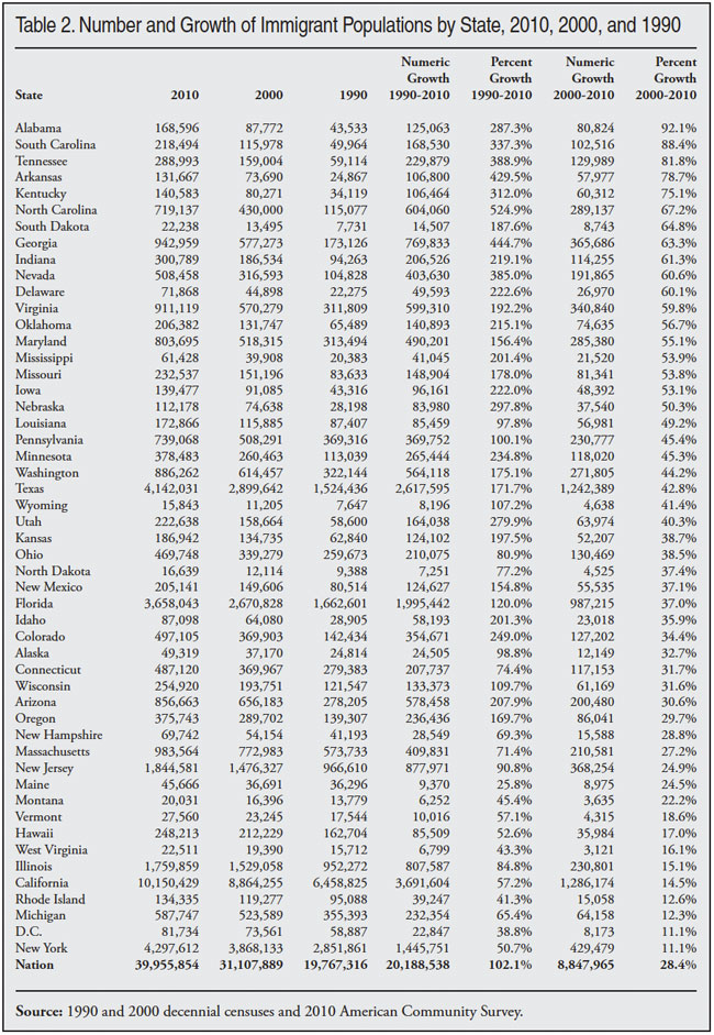
Table 2 also shows there were 13 states where the growth in the immigrant population was more than twice the national average of 28 percent over the last decade. These states were Alabama (92 percent), South Carolina (88 percent), Tennessee (82 percent), Arkansas (79 percent), Kentucky (75 percent), North Carolina (67 percent), South Dakota (65 percent), Georgia (63 percent), Indiana (61 percent), Nevada (61 percent), Delaware (60 percent), Virginia (60 percent), and Oklahoma (57 percent). It is worth noting that the growth rate in California, the state with the largest immigrant population growth, was only about half the national average over the last decade. Table 2 makes clear that the nation’s immigrant population has grown dramatically outside of traditional areas of immigrant settlement like the Golden State.
Immigrants by Country of Birth
Tables 3, 4, and 5 report immigrant figures by region and country of birth.10 Table 3 shows regions of the world by year of arrival.11 Mexico was by far the top sending country in the last decade, with more than four million immigrants from that country arriving between 2000 and 2010. Overall, 53 percent of immigrants came from Latin America (Mexico, Central America, South America, and the Caribbean). Table 4 reports the top immigrant-sending countries in 2010. In terms of sending the most immigrants, Mexico, India, China, the Philippines, El Salvador, and Guatemala sent the most during the decade. The former Soviet Union would also rank among the top sending countries as well if it were still intact.
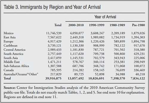
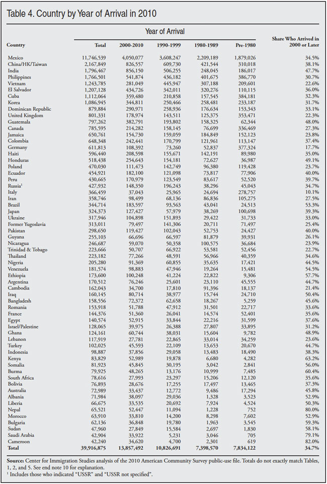
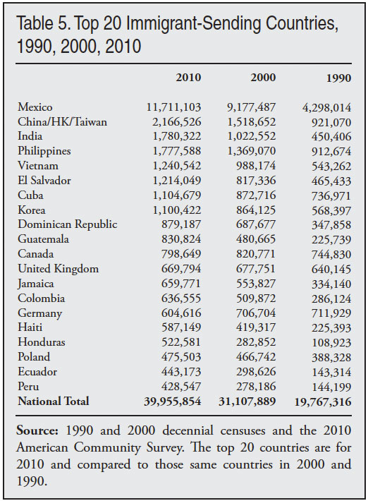
Table 4 also reports the share of immigrants from each country who arrived in the last decade. Thus the table reads as follows: 34.5 percent of Mexican immigrants in 2010 indicated in the survey that they arrived in 2000 or later. For immigrants from countries such as India, Guatemala, Honduras, and Brazil, roughly half arrived during the last decade. In contrast, for countries like Canada and Vietnam, few are recent arrivals. Table 5 shows the top sending countries in 2010 and those same countries in 2000 and 1990. Table 5 shows that among the top sending countries, those with the largest percentage increase in their immigrant populations in the United States from 2000 to 2010 were Honduras (85 percent), India (74 percent), Guatemala (73 percent), Peru (54 percent), El Salvador (49 percent), Ecuador (48 percent), and China (43 percent). This compares to an overall growth rate of 28 percent during the decade just completed.
Population Growth
The ACS and CPS can be used to provide insight into the impact of immigration on the size of the U.S. population. Table 6 reports six different methods using the 2010 ACS and CPS to estimate the effect of immigration on U.S. population growth since the last census. The first column in the table shows that between April 2000 (the control data for the Census) and July 2010 (the control data for the ACS) the U.S. population grew 27.9 million. The first three rows of Table 6 use the number of immigrants who arrived in the United States in the last decade to estimate the impact of immigration on U.S. population growth. As already indicated, in 2010 13.9 million immigrants indicated that they had entered the country in 2000 or later. Because those who arrived in the first three months of 2000 should already have been counted in the 2000 census we reduce this figure by 390,000, or three months worth of new immigration, to account for those who arrived in the first quarter of 2000.12 It is reasonable to view the 13.47 million immigrants who arrived over this time period as the basis for estimating immigration’s effect on population growth because this flow reflects current U.S. immigration policy — both legal immigration and the level of resources devoted to controlling illegal immigration.
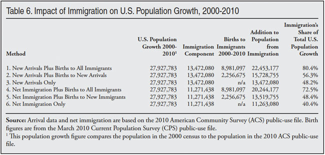
Of course, immigrants do not just add to the population by their presence in the United States. Based on the 2010 CPS, there were 8.98 million births to immigrants in the United States over the last decade.13 The first row of Table 6 adds the 13.47 million new arrivals to the 8.98 million births for a total of 22.45 million additions to the U.S. population from immigration. This equals 80.4 percent of U.S. population growth from April 2000 to July 2010. Not all births during the decade to immigrants were to those that arrived 2000 to 2010. Method 2 reports that, of the 8.98 million births during the decade, slightly less than 2.3 million were to immigrants who arrived during the decade. If we add this number to new arrivals we get 15.73 million additions to the U.S. population, or 56.3 percent of population growth. In Method 3 we just use new arrivals, which accounted for 48.2 percent of total population growth.
Methods 4 through 6 use net immigration to estimate the impact of immigration on population growth. As discussed in the section on deaths and outmigration, our rough estimate is that net immigration during the decade was 11.27 million. This is the difference in the number arriving and the number leaving. If we add net immigration to total immigrant births during the decade it equals 20.24 million or 72.5 percent of population growth, as shown in Method 4. Method 5 adds just births to new arrivals during the decade to net immigration for a total addition of 13.5 million, which equals 48.4 percent of population growth. Net immigration by itself equals 40.4 percent of population growth, as shown in Method 6.
It may be worth noting that growth in the immigrant population of roughly 8.8 million (see Figure 1) is not an accurate way of assessing the impact of immigration on population size because it includes deaths, which are not a function of immigration policy and are not connected with new arrivals.14 Table 6 makes clear that whether new immigration or net immigration is used to estimate the impact, immigration policy has very significant implications for U.S. population growth.
The same data used in Table 6 not only provide an estimate of immigration’s impact on population growth, they have other uses as well. If we wished to allow the current level of immigration, but still wished to stabilize the U.S. population by reducing native fertility, we can roughly estimate what it would take based on the table. In 2010 there were about 36.2 million children living in the country who were born to natives during the decade. As shown above, immigration added 22.5 million to the U.S. population. To offset these additions it would have required 22.5 million fewer births to natives, or roughly a 62 percent reduction in native fertility. Since the native-born population already has slightly below replacement-level fertility, to advocate a nearly two-thirds reduction in their fertility to accommodate immigration seems grossly impractical.
Selected Characteristics
Educational Attainment
Table 7 reports the education levels of immigrants and natives. The top of the table reports figures for all persons ages 25 to 65. Based on the 2011 CPS, about 28 percent of immigrants 25 to 65 have not completed high school, compared to about 7 percent of natives. This difference in the educational attainment of immigrants and natives has enormous implications for the social and economic integration of immigrants into American society. There is no single better predictor of economic success in modern America than one’s education level. As we will see, the fact that so many adult immigrants have little education means their income, poverty rates, welfare use, and other measures of economic attainment lag well behind natives.
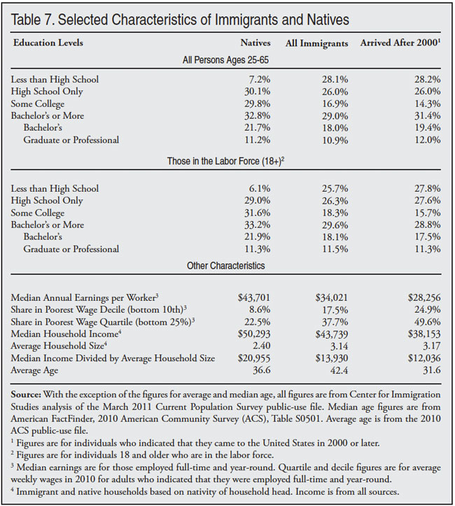
The table also shows that a slightly larger share of natives have a bachelor’s degree than immigrants, and the share with a post-graduate degree is almost identical for the two groups. Historically, immigrants enjoyed a significant advantage in terms of having at least a college education. In 1970, for example, 18 percent of immigrants had at least a college degree compared to 12 percent of natives.15 This advantage at the top end has now entirely disappeared.
The middle of the Table 7 reports the education only for adults in the labor force.16 The figures are not entirely the same because those who are in the labor force age 18 and older differ somewhat from the entire population ages 25 to 65 in their educational attainment. For example, the least educated natives in particular are much less likely to be working or looking for work. This means that they are less likely to be in the labor force. The right side of the table reports figures for those immigrants who arrived in 2000 or later.
Overall, 16 percent of those in the labor force are immigrants and this is somewhat higher than their 12.9 percent share of the total U.S. population because, in comparison to natives, a slightly higher percentage of immigrants are of working age. The large number of immigrants with low levels of education means that immigration policy has dramatically increased the supply of workers with less than a high school degree, while increasing other educational categories more moderately. This is important because it is an indication of which American workers face the most job competition from foreign workers.
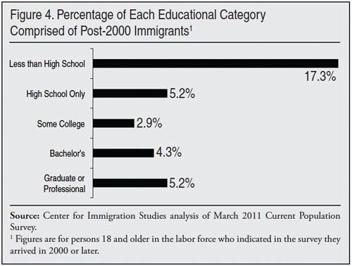
While immigrants comprise 16 percent of the total adult workforce, they comprise more than 44 percent of adults in the labor force who have not completed high school. Figure 4 shows how recently arrived immigrants have increased the supply of different types of workers. It reports the number of immigrants who arrived in 2000 or later divided by the total number of workers in each educational category (immigrant and native). Thus, the figure shows that post-2000 immigrants have increased the supply of high school drop-out workers by 17.3 percent, compared to 3 to 5 percent in other educational categories. This means that any effect immigration may have on the wages or job opportunities of natives will disproportionately affect the least educated native-born workers.
Income of Immigrants and Natives
In this paper we report figures for both earnings and income. Earnings are income from work, while income can be from any source such as working, investments, or rental property. Given the large proportion of immigrants with few years of schooling, it is not surprising that the income figures reported at the bottom of Table 7 show that, as a group, immigrants have lower median earnings than natives.17 (Earnings from the CPS are based on annual income from work in the calendar year prior to the survey.) The annual median earnings of immigrants who work full-time and year-round are only about 78 percent that of natives. And for the most recent immigrants, median earning are only 65 percent that of natives. Another way to think about immigrants and natives in the labor market is to examine the share of immigrants and natives who work for low wages. If we look at the 10 percent of full-time, year-round workers with the lowest weekly wages, we find that 17.5 percent of immigrants are in this bottom wage decile compared to 8.6 percent of natives. If we examine the weekly wages for the poorest fourth of the labor market, 37.7 percent of immigrants fall into the bottom quartile, compared to 22.5 percent of native-born full-time, year-round workers.
Household Income
Another way to think about the relative position of immigrants compared to natives is to look at household income. The bottom of Table 7 reports that the median household income of immigrant-headed households is $43,739, which is 87 percent that of the household income of natives — $50,293. (Income, unlike earnings or wages, is from all sources, not just income from working.) In addition to having lower incomes, immigrant households are 31 percent larger on average than native households — 3.14 persons versus 2.4 persons. As a result, the per capita household median income of immigrants is only 66 percent that of natives — $13,930 versus $20,955. This is important not only as a measure of their relative socio-economic standing, but also because it has fiscal implications. Lower household income means that, in general, immigrant households are likely to pay somewhat less in taxes than native households. This is especially true for progressive taxes, such as state and federal income taxes, which take into account income and the number of dependents. Larger household size also means that, in general, immigrant households will use somewhat more in services than native households. Since households are the primary basis on which taxes are assessed and public benefits are distributed in the United States, the lower income and larger size of immigrant households has implications for public coffers.
Age of Immigrants
The bottom of Table 7 shows that in 2010 the average age of an immigrant was 42.4 years compared to 36.6 years for the average native. The average overall age in the United States was 37.4. The fact that immigrants have a higher average age is a reminder that although immigrants may arrive relatively young, they age over time like everyone else. Partly for this reason, the belief that immigration will help fix the problem of an aging society is largely misplaced. Of course, those who argue that immigration will fundamentally change the age structure generally have in mind new arrivals. Table 7 shows that in 2010 the average age of immigrants who arrived in 2000 or later was somewhat younger than that of natives — 31.6 years compared to 36.6 years for natives. If we look at the most recent arrivals we also see they tend to be relatively young. In 2010 those immigrants who indicated they arrived in 2009 or the first half of 2010 had an average age of 29.8 years. This confirms the common belief that immigrants are younger than natives at arrival, but the difference with natives is modest. More important, the impact on the aging of our society is small.
We can estimate the overall impact on the age structure of American society by simply calculating the average age in the United States with and without recent immigrants. Again, the average age in the United States in 2010 for the entire population (immigrant and native) was 37.35 years. If all 13.9 million immigrants who arrived in 2000 or later are removed from the data, the average age in the United States would be 37.62 years. Thus, including post-2000 immigrants does lower the average age, but only by .27 years. Immigration over the last 10 years, which has been numerically the highest in American history, had a very modest impact on the average age in the United States.
If we remove from the 2010 ACS the 13.9 million newly arrived immigrants plus the more than two million children that these immigrants have given birth to in the United Sates in the last decade, the average age in the United States would be 37.87 years. So the full impact of recent immigration was to reduce the average age in the United States by about .52 years. Again, the impact is modest. Post-2000 immigration plus births to these new immigrants added 16 million new people to the U.S. population. But in a country of more than 300 million it is simply not enough to significantly lower the average age in the United States.
It could be argued that the benefit to the age structure might take more than just 10 years of high immigration. In a 2005 study, the Center for Immigration Studies examined the impact of immigration on the aging of American society as well as the Social Security system. Consistent with other research, we found that immigration has only a small impact on the problem of an aging society now and in the future. While immigrants do tend to arrive relatively young and have higher fertility rates than natives, immigrants age just like everyone else and the differences with natives are not large enough to fundamentally alter the nation’s age structure.18 A Census Bureau report in 2000 came to a similar conclusion. Among other things, that report looked at the impact of different levels of immigration over the next century, and concluded that immigration is a “highly inefficient” means for increasing the percentage of the population who are of working-age in the long-run.19
In a 2007 report the Center for Immigration Studies generated population projections and examined the impact of different levels of immigration on the size and aging of American society. We found that although the current level of immigration will add 105 million to the U.S. population by 2060, it has only a small impact on the share of the population that will be of working age.20 There is a clear consensus among demographers, the people who study human populations, that immigration has a positive, but small, impact on the aging of society. A simple analysis of the ACS data confirms this conclusion.
Labor Force and Occupations
Labor Force Attachment
Table 8 shows the share of immigrant and native-born men and women holding a job or in the labor force based on the March 2011 CPS. Those in the labor force have a job or are looking for a job.21 The top of the table reports figures for persons 18 to 65 and the lower portion of the table provides the same figures for those in the primary working years of 25 to 55 — when rates of employment tend to be the highest. The table shows that immigrants and natives (18 to 65) overall have virtually identical rates of employment and labor force participation. However, male immigrants have higher rates of employment and labor force participation than native-born men, while female immigrants have lower rates than their native-born counterparts.
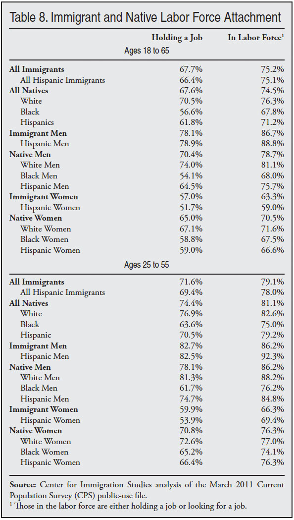
For those in the prime years of 25 to 55, Table 8 shows that the overall rate for natives of employment and labor force participation are somewhat higher than for immigrants. But male immigrants 25 to 55 are still more likely to have a job than are native-born men, while labor force participation is the same for both groups. In contrast, native-born women in the primary employment years are much more likely to work than foreign-born women. As will become clear in this report, immigrants’ income, health insurance coverage, home ownership, and other measure of socio-economic status lag well behind that of natives. But Table 8 shows that these problems are not caused by immigrants’ being unwilling to work. Immigrant men in particular have a strong attachment to the labor market.
Occupational Distribution
Table 9 shows the occupational concentration of immigrants and natives. The occupational categories are ranked based on immigrant share, which is shown in the first column. The numbers in the second and third columns show those employed and unemployed in each occupation. The table shows several important facts about U.S. immigration. First, there are millions of native-born Americans employed in occupations that have high concentrations of immigrants. While immigrants certainly are concentrated in particular occupations, it’s simply not correct to say that immigrants only do jobs natives don’t want. There are more than 20 million native-born Americans in the occupational categories of farming/fishing/forestry, building cleaning/maintenance, construction, production, and food service and preparation. More than four million of these natives are unemployed and they report one of these occupations as their last job. The second interesting finding in Table 9 is that in these top immigrant occupations unemployment for natives averaged almost 16 percent in 2010 compared to 9.5 percent nationally.
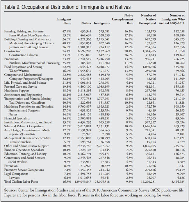
It is hard to argue that there are no Americans willing to work in these high-immigrant professions. Perhaps the native-born workers are not where employers want, or there is some other reason businesses find these unemployed natives unacceptable, but on its face Table 9 indicates that there is quite a lot of un-utilized labor of this kind in the United States.
It would be a mistake to think that every job taken by an immigrant is a job lost by a native. Many factors impact unemployment rates across occupations. But it would also be a mistake to assume that dramatically increasing the number of workers in these occupations as a result of immigration policy has no impact on the employment prospects of natives.
Poverty, Welfare, and the Uninsured
Poverty Among Immigrants and Natives
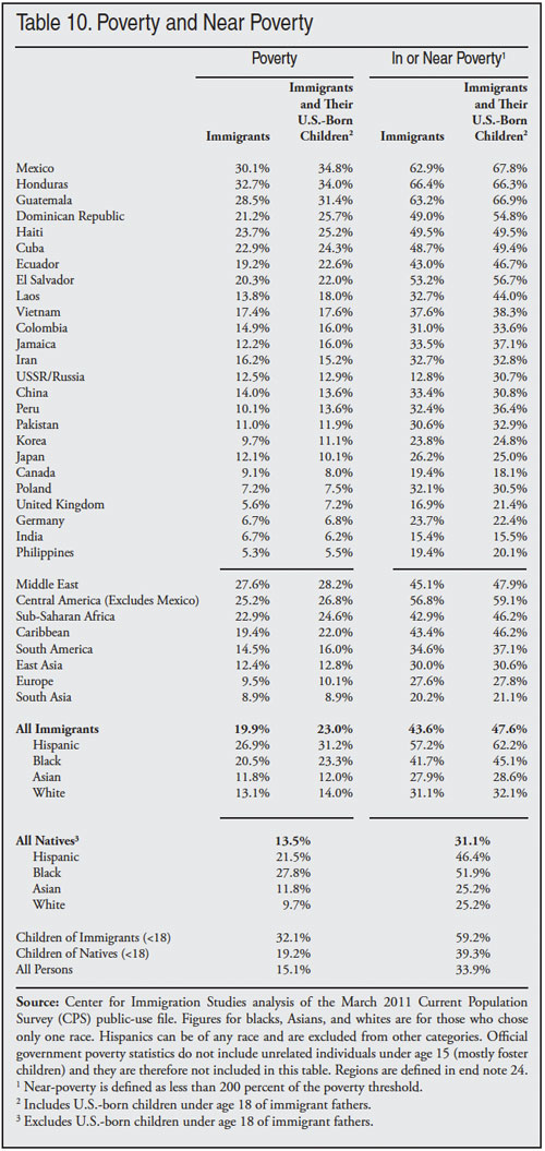
The first column in Table 10 reports the poverty rate for immigrants by country and the second column shows the figures when their U.S.-born children under age 18 are included.22 Based on the March 2011 CPS, 19.9 percent of immigrants compared to 13.5 percent of natives lived in poverty in 2010.23 (Poverty statistics from the CPS are based on annual income in the calendar year prior to the survey and reflect family size). The higher incidence of poverty among immigrants as a group has increased the overall size of the population living in poverty. In 2010, 16.5 percent of those in poverty in the country were immigrants.
In some reports the U.S.-born children of immigrants are counted with natives. But it makes more sense to include these children with their immigrant parents because the poverty rate of minor children reflects their parents’ income. Overall in the United States there are 54.1 million immigrants and U.S.-born children (under 18) with either an immigrant father or mother. In the analysis of poverty and insurance coverage in this report we focus on the 51.8 million immigrants and their children (under 18) with an immigrant father and mother or only an immigrant father. Those with only an immigrant mother and a native-born father are counted with natives. In this way, we avoid overstating the impact of immigration. If we added those with only an immigrant mother to the poverty totals, poverty associated with immigrants would increase slightly.
The second column in Table 10 includes the U.S-born children (under 18) of immigrant fathers. Table 10 shows that the poverty rate for immigrants and their U.S.-born children was 23 percent compared to 13.5 percent for natives and their young children. (The figures for natives exclude the U.S.-born minor children of immigrant fathers.)
The data by country and region indicate that there is an enormous variation in poverty rates among immigrants from different countries.24 For example, the 34.8 percent of Mexican immigrants and their U.S.-born children living in poverty is many times the rate associated with immigrants from countries such as India and the Philippines.
Of the 46.2 million people in the United States living in poverty in 2010 (based on 2011 data), 11.9 million, or 25.8 percent, are immigrants or the U.S.-born children (under 18) of immigrant fathers. Among persons under age 18 living in poverty, 31.1 percent are either immigrants or the young children of immigrant fathers. Immigration policy has significantly added to the population in poverty in the United States.
In or Near Poverty
In addition to poverty, Table 10 reports the percentage of immigrants and natives living in or near poverty, with near-poverty defined as income less than 200 percent of the poverty threshold. Examining those with incomes under 200 percent of poverty is an important measure of socio-economic status because those under this income generally do not pay federal or state income tax and typically qualify for a host of means-tested programs. As is the case with poverty, near poverty is much more common among immigrants than natives. Table 10 shows that 43.6 percent of immigrants, compared to 31.1 percent of natives, live in or near poverty. (Like the figures for poverty, the figures for natives exclude the U.S.-born minor children of immigrant fathers.) If the U.S.-born children of immigrants are included with their immigrant parents, the immigrant rate is 47.6 percent. Among the young children of immigrants (under 18), 59.2 percent live in or near poverty, in contrast to 39.3 percent of the children of natives. In total, 24.7 million immigrants and their young children live in or near poverty. As a share of all persons in or near poverty, immigrants and their young children account for 23.8 percent.
Without Health Insurance
Table 11 reports the percentage of immigrants and natives who were uninsured for all of 2010. (The CPS asks about health insurance in the calendar year prior to the survey.) The table shows that lack of health insurance is a significant problem for immigrants from many different countries and regions. Overall, 34.1 percent of the foreign-born lack health insurance compared to 13.8 percent of natives. (Like the figures for poverty, Table 11 excludes the U.S.-born minor children of immigrant fathers from the figures for natives.) Immigrants account for 26.1 percent of all uninsured persons in the United States, compared to their 12.5 percent of the total population in the 2011 CPS. (This is slightly less than the 12.9 percent shown in the 2010 ACS.) If the young (under 18) U.S.-born children of immigrant fathers are included with their parents, the share without health insurance is 28.5 percent. The share of children who are uninsured is lower than for their parents mainly because the U.S.-born children of immigrants are eligible for Medicaid, the health insurance program for the poor. Thus the inclusion of the U.S.-born children pulls down the rate of uninsurance for immigrants slightly. In total, there are 14.8 million uninsured immigrants and their young U.S.-born children in the country, accounting for 29.7 of all persons without health insurance. This is nearly double their share of the total population of 16.9 percent in the CPS.
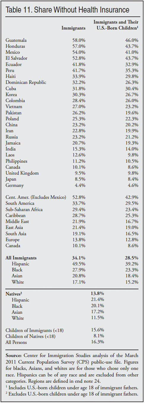
The low rate of insurance coverage associated with immigrants is partly due to their much lower levels of education. Because of the limited value of their labor in an economy that increasingly demands educated workers, many immigrants hold jobs that do not offer health insurance and their low incomes make it very difficult for them to purchase insurance on their own. A larger uninsured population cannot help but strain the resources of those who provide services to the uninsured already here. Moreover, those with insurance have to pay higher premiums as health care providers pass along some of the costs of treating the uninsured to paying customers. Taxpayers are also affected as federal, state, and local governments struggle to provide care to the growing ranks of the uninsured. There can be no doubt that by dramatically increasing the size of the uninsured population our immigration policy has wide‑ranging effects on the nation’s entire health care system. If the Patient Protection and Affordable Care Act is found constitutional and is implemented, a very large share of those currently uninsured who will receive coverage either through subsidies or Medicaid will be legal immigrants and their young children.
Do Uninsured Immigrants Cost Less?
One study found that, after controlling for such factors as education, age, and race, uninsured immigrants impose somewhat lower costs than uninsured natives. However, when the authors simply compared uninsured immigrants to uninsured natives the cost differences were not statistically significant. In other words, when using the actual traits that immigrants have, the costs that uninsured immigrants create were the same as those of uninsured natives.25 It seems likely that uninsured immigrants do cost less than uninsured natives because immigrants are more likely to be in younger age cohorts where use of health care is much less. Of course, even if the average uninsured immigrant costs less than the average uninsured native, the difference would have to be enormous to offset the fact that immigrants are 2.5 times more likely to be uninsured than native-born Americans.
Immigration and Growth in the Uninsured
To understand the impact of immigration, we can remove from the CPS those immigrants who lack health insurance by year of arrival. If we examine growth after 1999, new immigrants and their U.S.-born children added 6.59 million uninsured people to the U.S. population, accounting for 68.1 percent of the growth in the uninsured over the last decade.26 To a significant extent the growth in the uninsured in the United States has been driven by the nation’s immigration policies.
Uninsured or on Medicaid
The 2011 CPS shows that 21.7 percent of immigrants and their U.S.-born children under 18 are on Medicaid, compared to 14.7 percent of natives and their children.27 Thus, the large share of immigrants and their U.S.-born children who are uninsured is not necessarily due to their being unable to access Medicaid. Their use of Medicaid is actually higher than that of natives. It is true that, unlike natives, illegal immigrants cannot use the program unless they are pregnant and most new legal immigrants are barred as well. Despite these prohibitions, more immigrants and their children use Medicaid than natives and their children. It might be correct to say that part of the reason that uninsurance is so high among immigrants is that a significant share that need access to Medicaid cannot access that program.
Combining the uninsured and those on Medicaid together shows that 50.2 percent of immigrants and their young children (under 18) either have no insurance or have it provided to them through the Medicaid system, compared to 28.5 percent for natives and their children. Immigration clearly has enormous implications for the nation’s health care system.
Welfare Use
As the Census Bureau does in many of its publications, we report welfare use based on whether the household head is an immigrant or native.28 With regard to immigrant households, this means we are mainly reporting welfare use for immigrants and their U.S.-born children who live with them and comparing them to natives and their children. Table 12 shows the percentage of immigrant‑ and native‑headed households in which at least one member of the household uses one or more major welfare programs. The definition of programs is as follows: cash assistance: Temporary Assistance to Needy Families (TANF), state administered general assistance, and Supplemental Security Income (SSI), which is for low-income elderly and disabled persons; food assistance: Supplemental Nutrition Assistance Program (SNAP), informally known as food stamps, free and subsidized school lunch, and the Women, Infants, and Children nutrition program (WIC); housing assistance: subsidized and government-owned housing. The table also shows figures for Medicaid, the health insurance program for those with low incomes.
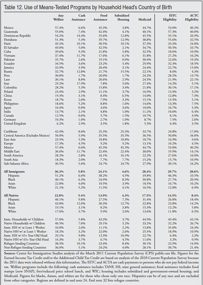
Table 12 indicates that, even after the 1996 welfare reforms, which curtailed eligibility for some immigrants, immigrant households’ use of the welfare system remains higher than that of natives for most programs. Use of cash tends to be quite similar for immigrant and native households. Thus if by “welfare” one only means cash assistance programs, then immigrant use is roughly the same as that of natives. Of course, there is the question of whether native use of welfare is the proper yardstick by which to measure immigrants. If immigration is supposed to be a benefit, our admission criteria should, with the exception of refugees, select only those immigrants who are self‑sufficient. Table 12 shows that welfare use, even of cash programs, is not at or near zero. It is also worth noting that the welfare use figures in Table 12 understate use of all of these programs, particularly cash assistance. The problem of under-reporting of welfare in the CPS is well known by the Census Bureau and has been studied for some time.29 The welfare figures are all based on self-reporting and many people who have used the program in the prior calendar year forget about it or do not report it when asked by the Census Bureau. However, it is not clear if this problem is more or less pronounced among immigrants.
Table 12 shows that use of food assistance is significantly higher for immigrant households than native households — 24.1 percent vs. 13.9 percent. The same is also true for Medicaid: 28.4 percent of immigrant households have one or more persons using the program compared to 17.5 percent of native households. In terms of costs to taxpayers, use of Medicaid by immigrants and their dependent children is the most problematic because that program costs more than the combined total for the other welfare programs listed.
As was the case with lower income and higher poverty rates, the higher welfare use rates by immigrant households are at least partly explained by the large proportion of immigrants with few years of schooling. Less educated people tend to have lower incomes. Therefore, it is not surprising that immigrant households’ use of the welfare system is significantly higher than that of natives for some types of programs.
While immigrants’ use of some welfare programs is higher than that of natives, Table 12 shows that most households, immigrant or native, do not use the welfare system. On the other hand, even though most households (foreign-born or native) in the country do not use the welfare programs, the programs listed in Table 12 cost the government well over $700 billion annually.
Use of EITC and ACTC. In addition to welfare programs, Table 12 reports the share of households in which at least one worker is eligible for the Earned Income Tax Credit (EITC) and the refundable portion of the Additional Child Tax Credit (ACTC).30 Based primarily on income and number of dependents, the Census Bureau calculates eligibility for these programs and includes this information in the public-use CPS file. Workers receiving the EITC pay no federal income tax and instead receive cash assistance from the government based on their earnings and family size. The ACTC works in the same fashion, except that to receive it one must have at least one dependent child. The IRS will process the EITC and ACTC automatically for persons who file a return and qualify. Even illegal aliens sometimes receive the EITC and ACTC. This is especially true of the ACTC because the IRS has determined that illegals are allowed to receive it, even if they do not have a valid Social Security number. To receive the EITC one must have a valid Social Security Number. With an annual cost of over $40 billion for the EITC and $35 billion for the ACTC, the two programs constitute the nation’s largest means‑tested cash programs to low-income workers.
Table 12 shows that 29.7 percent of immigrant-headed households have enough dependents and low enough income to qualify for the EITC and 20.6 percent have low enough incomes to receive the ACTC. This compares to 14.5 and 8.4 percent respectively for natives. As already stated, the figures for the EITC and ACTC probably overstate receipt of the programs for both immigrants and natives because they are imputed. This is in contrast to the welfare programs listed, which are based on self-reporting by survey respondents and therefore underreported.31
Given the low education level of so many immigrants it is not surprising that despite the large share who work, they still have incomes low enough to qualify for the EITC and ACTC. It is important to understand that the high rate of EITC and ACTC eligibility does not reflect a lack of work on the part of immigrants. In fact, one must work to be eligible for them. Nor does the relatively high use of welfare programs reflect a lack of work on the part of immigrants. In 2010, 84.2 percent of immigrant households had at least one worker, compared to 75.8 percent of native households. Work in no way precludes welfare use, particularly use of the non-cash programs. The high rate of welfare use should also not be seen as a moral failing on the part of immigrants. Like all advanced industrial democracies, the United States has a well-developed welfare state. This fact coupled with an immigration system that admits large numbers of immigrants with modest levels of education and tolerates large-scale illegal immigration is what explains the figures in Table 12.
Welfare Use by Country and Region
Table 12 shows that immigrants from some countries have lower welfare use rates than natives while those from other countries have much higher rates than natives. Mexican and Dominican households have welfare use rates that are much higher than natives — even higher than for refugee-sending countries like Russia and Cuba. In fact, if one excludes the primary refugee-sending countries, as shown in the bottom portion of Table 12, the share of immigrant households using a welfare program remains virtually unchanged at 36 percent.32 Refugees are simply not a large enough share of the foreign-born, nor are their rates high enough, to explain the level of welfare use by immigrant households. Or put a different way, the relatively large share of immigrant households using welfare is not caused by refugees.
Welfare for Households with Children
The bottom of Table 12 makes a number of different comparisons between immigrant and native households. Households with children have among the highest welfare use rates. The share of immigrant households with children using at least one major welfare program is high —57 percent. The share of native household with children using welfare is also very high. But the figures for immigrants mean that a very large share of immigrants come to America and have children, but are unable to support them. As a result, immigrant households with children make extensive use of food assistance and Medicaid. This raises the important question of whether it makes sense to allow the large-scale settlement of immigrants who are unable to support their own children.
Welfare Use Among Working Households
The bottom of Table 12 shows the share of households with at least one worker using welfare. The table shows that 33 percent of immigrant households with at least one working person still use the welfare system. This compares to 18.2 percent of native households with at least one worker. Most immigrant households have at least one person who worked in 2010. And as we have already seen, immigrant men in particular have high rates of work. But this in no way means they will not access the welfare system, particularly non-cash programs, because the system is designed to provide assistance to low-income workers with children and this describes a very large share of immigrant households.
Given their education levels and relatively large family size, many immigrant households work and use the welfare system. In fact, of immigrant households using the welfare system, 82.1 percent had at least one worker during the year. For native households, it was 66.2 percent. And, as already discussed, immigrant households in general are more likely to have at least one worker than native households. But immigrant households are still often dependent on the government to support their families, particularly in providing food assistance and medical care.
Self-Employment
Table 13 examines the self‑employment rates of immigrants and natives. The table shows that immigrants and natives exhibit remarkably similar levels of entrepreneurship. The table shows that about 11.5 percent of immigrants and 11.7 percent of natives are self‑employed. There is no meaningful difference between the two groups in self-employment. Turning to self‑employment income, we see that the average self‑employment income (revenue minus expenses) of immigrants is slightly higher than that of natives, though the average is quite low for both groups. The table also reports the share of entrepreneurs whose business has more than 10 employees. Self-employed natives are somewhat more likely to have larger businesses than self-employed immigrants. The share of natives who are self-employed part-time also is shown at the bottom of the table and differences are small.
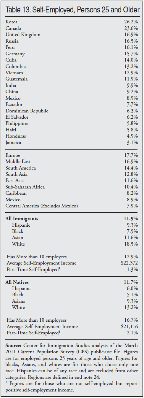
While immigrants overall are not more entrepreneurial than natives, immigrants from some countries and regions are, including Korea, Canada, the United Kingdom, and the Middle East. But overall entrepreneurship is neither a lacking nor a distinguishing characteristic of the nation’s immigrants, at least as measured by self employment. If one removed immigrants from the data, the overall rate of self‑employment in the United States would be about the same.
Households, Home Ownership, and Language
Household Income
Table 14 shows average and median household income. The average household income of native-headed households is about 7 percent higher than that of immigrant-headed households. The difference in median income is about 15 percent. The larger difference between median and mean is almost certainly due to income among immigrants being somewhat more skewed than native income, with a large share of immigrant households on the high and low income extremes. As discussed earlier in this report, there is a large difference with natives in per-capita household income whether it is calculated by dividing median or mean income by household size. Immigrant households are 30 percent larger than native households. Per-capita median household income for natives is $6,924 (50 percent) higher than per-capita median immigrant household income. Per-capita mean household income for natives is $7,951 (39 percent) higher than that of immigrants. Immigrant households do not differ that much from native households in income, but because they are much larger, their per-capita income is much lower.
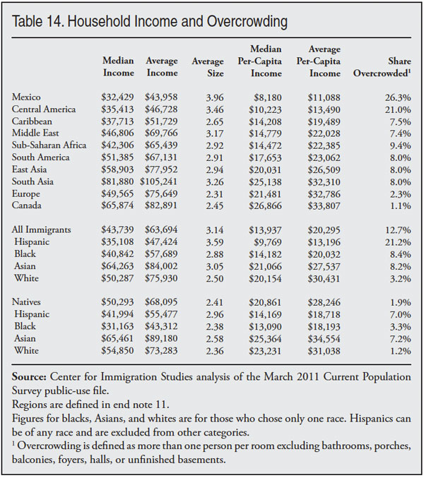
Table 14 also shows large differences in income for immigrants by country and sending region. Immigrants from Canada and South Asia have very high household incomes, while those from Mexico, Central America, Sub-Saharan Africa, and the Caribbean tend to have relatively low incomes. It is worth noting that while the average household income of some immigrant groups such as South Asians is much higher than that of natives, the per-capita household income is closer to that of natives because many of these immigrant groups have much larger households on average than natives.
Overcrowded Households
There are several possible measures of what constitutes an overcrowded household. The Department of Housing and Urban Development has compiled a detailed summary of the overcrowding literature and the various ways to measure it.33 Most researchers define a household as overcrowded when there is more than one person per room. The analysis that follows uses this standard definition of dividing the number of rooms in the housing unit by the number of people who live there. The ACS records the number of rooms by asking respondents how many separate rooms are in their house or apartment, excluding bathrooms, porches, balconies, foyers, halls, or unfinished basements. Dividing the number of rooms in a household by the number of people living there determines if the household is overcrowded.
Overcrowding is a problem for several reasons. First, it can create congestion, traffic, parking problems, and other issues for neighborhoods and communities. Second, it can strain social services because the local system of taxation is based on the assumption that households will have the appropriate number of residents. Third, like poverty, it can be an indication of social deprivation.
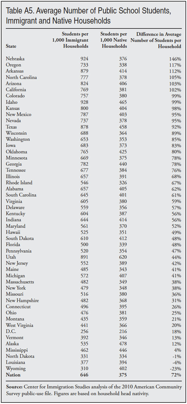
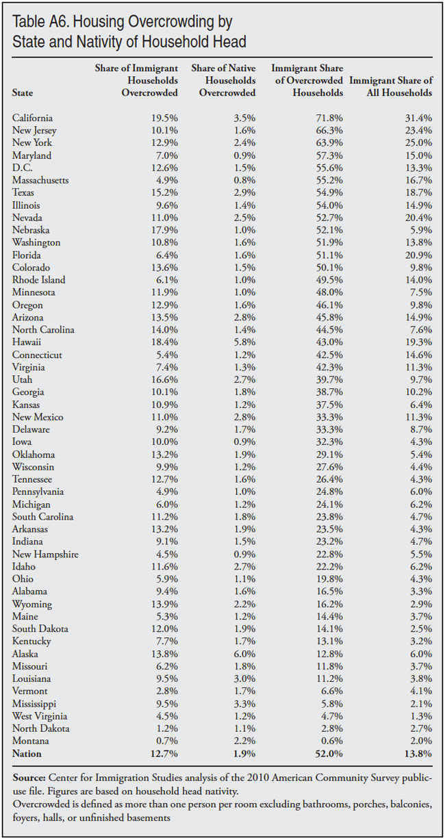
The far-right column in Table 14 shows the share of households headed by immigrants and natives that are overcrowded.34 The 2010 ACS shows that 12.7 percent of immigrant-headed households are overcrowded compared to 1.9 percent of native households. Because immigrant households are so much more likely to be overcrowded, they account for a very large share of such households. In 2010, 52 percent of overcrowded households were headed by an immigrant, even though they represent only 13.8 percent of all households. Table 14 shows that overcrowding varies significantly by sending region. Relatively few households headed by Canadians and Europeans are overcrowded. In contrast, it is particularly common among immigrants from Mexico and Central America.
Home Ownership
Owning a home has long been an important part of the American dream. Table 15 reports home ownership for immigrant and native households and some of the characteristics of those households.35 There is a very significant difference in home ownership rates between immigrants and natives. Overall, Table 15 shows that 52.6 percent of immigrant households are owner-occupied compared to 67.5 percent of native-headed households. While it may seem that home ownership is a clear sign of belonging to the middle class, Table 15 shows that for immigrant households in particular this is not always the case.
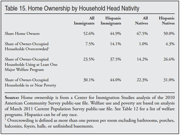
The table shows that overcrowding is much more common among owner-occupied immigrant households, with 7.5 percent being overcrowded compared to just 1 percent of owner-occupied native households. While 7.5 percent is not a large percentage, it does mean that roughly one out of 14 owner-occupied immigrant households is overcrowded compared to one out of 100 for native households. The table also shows that 23.5 percent of owner-occupied immigrant households used at least one major welfare program compared to 14.2 percent of native households. A somewhat larger share of immigrant households also have low incomes, with 30.1 percent below 200 percent of poverty compared to 22.3 percent of native home owners. Thus it would be a mistake to think home ownership is always associated with prosperity.
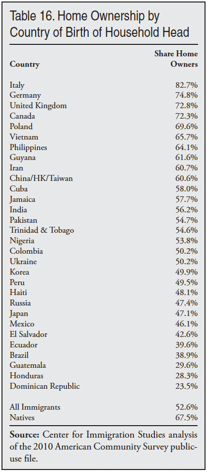
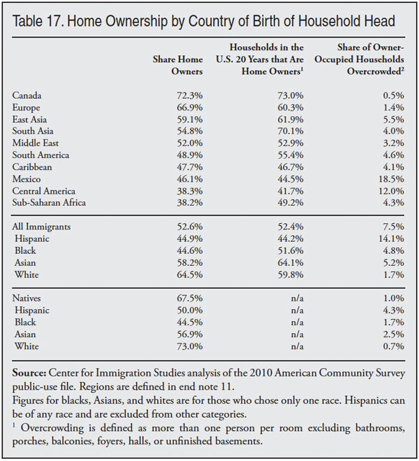
Table 16 shows home ownership rates by country of birth. As with the other socio-demographic characteristics examined so far in this report, there is significant variation by country. For example, the home ownership rate for households headed by Italian immigrants (82.7 percent) is more than 3.5 times that of Dominican immigrants (23.5 percent). Table 17 shows home ownership rates by region, race, and ethnicity. In addition to overall rates, Table 17 shows home ownership rates for households headed by immigrants who have been in the country for 20 years.36 The table shows that immigrant households headed by these well-established immigrants have about the same rate of home ownership as immigrants overall. This does not mean that immigrant home ownership does not rise over time. In fact, as we will see later in this report, home ownership does increase significantly the longer immigrants live in the country. What it does mean is that the much lower rate of home ownership for immigrants overall is not caused by a large number of new arrivals. Even immigrants who have been in the country for two decades still have substantially lower rates of home ownership than native-headed households.
Language Ability
Table 18 reports immigrants’ language ability by country. Table 19 shows the same information by region, race, and ethnicity. The 2010 ACS data on which the tables are based report language skills for persons five years of age and older. The skill level is entirely based on the respondent’s own opinion of their language ability. The tables show that about half of all immigrants report that they speak only English or speak it very well and about one-third report that they speak it not at all or not well. Like the other tables reporting socio-economic status by country or region in this paper, Tables 18 and 19 show very significant variation in language ability.
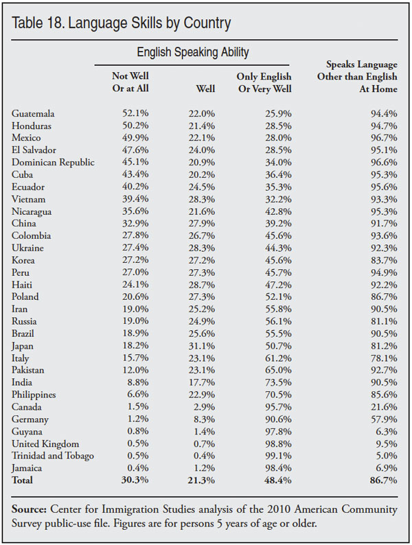
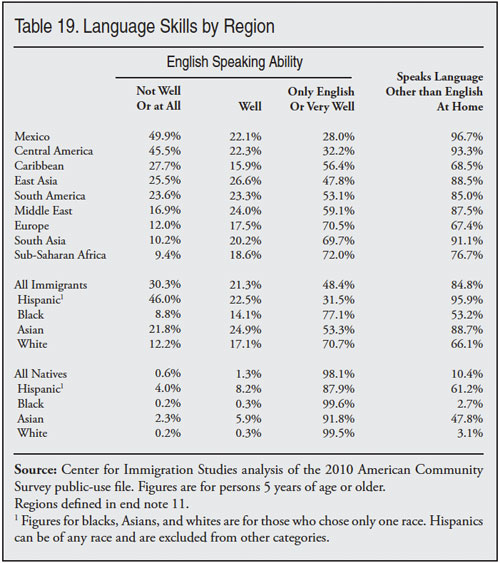
Not surprisingly, the vast majority of immigrants from English-speaking countries such as Guyana, the United Kingdom, and Jamaica report that they speak only English or speak it very well. In contrast, a majority or near majority of immigrants from Guatemala, Honduras, Mexico, El Salvador, and the Dominican Republic report that they speak English not at all or not well. There is a large body of research showing that language skills are a key determining factor for immigrant earnings. The large share of immigrants from Latin America who have limited or no English language ability must play a significant role in the high rates of poverty, near poverty, lack of health insurance, and welfare use reported earlier in this report.
Public Education
Public Schools
One the biggest impacts of immigration is on U.S. public schools. The American Community Survey (ACS) asks respondents if they are in school, and if the school is public or private, so it is possible to report statistics for students from immigrant and native households by the type of school they attend. The top of Table 20 shows the number of school-age children (five to 17) from immigrant and native households. The 2010 ACS shows that 20.6 percent of five- to 17-year-olds live in immigrant-headed households.37
In the last few years, a good deal of attention has been focused on the dramatic increase in enrollment experienced by many school districts across the country. While it has been suggested that this increase is the result of the children of baby boomers reaching school age, the so called “baby boom echo”, it is clear from the ACS that immigration policy accounts for the dramatic increase in school enrollment. Table 20 shows that there are 11.1 million school-age children from immigrant households. Some 20 percent of these students are immigrants themselves. The children of immigrants account for such a large percentage of the school-age population because a higher proportion of immigrant women are in their childbearing years and immigrants tend to have somewhat larger families than natives.
Table 20 shows that children from native households are significantly more likely to be in private school than children from immigrant households. As a result, children from immigrant households are a slightly larger share of public school students than they are of the school-age population. The 10.5 million children from immigrant households in public schools are 21.5 percent of all students in public schools.
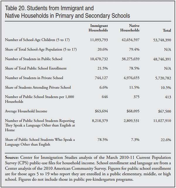
Table 20 also shows that the average number of public school students per household is dramatically larger for immigrant households. In 2010, there were 646 public school students for every 1,000 immigrant households, compared to 375 students for 1,000 native households. This means that the average number of public school students per immigrant household is 72 percent larger than the number for native households. Of course, the dramatic increase in school enrollment caused by immigration may not strain public schools if tax revenue increases proportionately. As reported in Table 14, however, the average household income of immigrant households is about 7 percent less than the average income of native households — $63,694 compared to $68,095. This almost certainly translates into lower average tax payments from immigrant households, as the household is the primary unit by which taxes are collected. The much larger number of students on average in immigrant households coupled with slightly lower income means that immigration is likely to create fiscal strain for some public school districts in areas of large-scale immigrant settlement.
Non-English Speakers
Another potential challenge created by immigration stems from the large share of public school students from immigrant households who speak a language other than English. The bottom of Table 20 shows that 8.2 million (78.5 percent) of students from immigrant households speak a language other than English at home. In addition, there are 2.8 million students from native households who speak a language other than English at home in public primary and secondary schools. In total, almost 23 percent of students in public school in the United States speak a language other than English at home.
Just because a language other than English is spoken at home does not mean the students struggle with English. Most of these students were born in the United States. But providing appropriate language instruction for the millions of students for whom English is not their first language is a significant expense for many school districts. This fact, coupled with the much larger size of immigrant households and their lower than average incomes means that school budgets often will be strained by the arrival of large numbers of immigrant families in their school district.
Immigrant Progress Over Time
Poverty and Income over Time
Both the ACS and CPS ask respondents when they came to the United States. Thus it is possible to examine immigrants by year arrival. Table 21 reports the progress of immigrants over time. The public-use CPS files group immigrants by year of arrival in an effort to preserve anonymity. Table 21 reports year of arrival in the most detailed fashion possible using the public-use CPS data. The far left of Table 21 reports the length of time the immigrants have been in the country as of 2011. The next column reports the share in poverty, followed by the share in or near poverty, followed by the share without health insurance. The bottom of the table reports figures for all immigrants and natives.38 Table 21 reads as follows: In 2011, 33.3 percent of immigrants who have lived in the country for less than four years had incomes below the poverty threshold. The table also shows that 55 percent of the newest immigrants were in or near poverty, defined as income below 200 percent of the official poverty threshold. Those with income above this amount can be seen as at least middle class, while those with incomes below this amount can be viewed as the low-income population. Poverty and near poverty are also good measures of economic progress because they include people in and out of the workforce. Another advantage of using poverty to measure progress is that it controls for the number of people in a family.
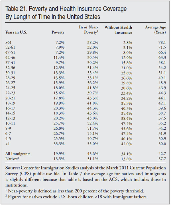
Two key findings can be drawn from Table 21: First, immigrants make significant progress the longer they reside in the United States. The newly arrived have much higher rates of poverty and near-poverty than natives, but the longer the immigrants have lived in the country, the lower their poverty or near-poverty. The share without health insurance coverage also declines significantly with time. The second key finding is that despite this progress it takes immigrants a very long time to close the gap with natives because they start out so much poorer. For example, immigrants who have been in the country for 20-21 years still have a poverty rate that is 32 percent higher than that of natives. Their rate of being in or near poverty is 39 percent higher than that of natives.
The last column in Table 21 shows the average age of immigrants in 2011 based on how long they have lived in the country. The table shows that the poverty and near-poverty rates of immigrants who have been in the country for 28-29 years are similar to those of natives. Because it takes immigrants so long to match the rates of natives, they tend to be much older than the average native-born American by the time they have the same rate of poverty or near-poverty. Immigrants in the United States for 28–29 years are 49 years old on average, or 11 years older than the average native. Natives who are 49 years old have a rate of poverty under 10 percent, and their share in or near poverty is slightly more than 22 percent. So although long-time immigrant residents have poverty levels similar to natives overall, they are significantly more likely to be poor than are natives of the same age. This is important because it indicates that a much larger share of immigrants have low-incomes during their adult lifetimes than natives.
The difference between immigrants and natives is also somewhat understated in Table 21 because no children of immigrants who have been in the country for 18 or more years are included. In contrast, the figures for natives include their children. This is important because poverty is higher for children than adults. If the U.S.-born children (under 18) of immigrants who live with their parents were included in Table 21 the poverty rates shown would be higher.
Table 21 provides important insight into how immigrants fare over time. However, it must be remembered that it is not known if today’s new arrivals will follow a similar path. Table 21 only shows how immigrants are doing at one point in time. What we can say is that progress in terms of poverty and health insurance coverage was significant over time, yet this progress still leaves immigrants well behind natives, especially relative to natives of the same age.
Welfare, Home Ownership, and Income over Time
Table 22 reports welfare and home ownership rates by year of entry for households headed by immigrants. The table also reports average total personal income for adults (18+) by year of arrival. Turning first to the share of immigrant households using at least one welfare program, the table indicates that the improvement over time in poverty rates and health insurance coverage shown in Table 21 does not apply to welfare use. Welfare use is a problem for new arrivals and well-established immigrants.
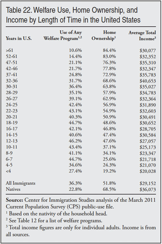
Home ownership on the other hand rises significantly over time, though it takes immigrants a very long time to match the rates of natives. Households headed by immigrants that have been in the country for 32 to 36 years have home ownership rates that roughly match those of native-headed households — 68.6 percent. However, these households are headed by an immigrant who is 54 years old on average. Native households headed by a 54-year-old have a home ownership rate of 78 percent. Still, immigrant progress is significant over time and the overall rate of home ownership after a few years can be seen as high. Of course, home ownership in the United States is very common, partly as a result of direct and indirect government subsidies. Nearly two-thirds of all households in the country are owner-occupied. Even among native households with incomes below the poverty line, 38 percent are still owner-occupied. Thus, high rates of home ownership are to be expected in America. This is especially true given the lax lending standards that became so pronounced in the last decade, which have been so criticized as contributing to a housing bubble and subsequent housing bust.
Turning to average total income for adults (18+), Table 22 indicates that immigrants income rises the longer they reside in the United States. But like the other socio-economic measures examined, only immigrants who have been in the country for a very long time have incomes roughly similar to that of natives. The table indicates that in 2011 an immigrant who had been in the country for 30–31 years had an average income that roughly matched that of adult natives. Immigrants who have been in the country for this long are on average 49 years old. Native income at age 49 averages $45,404 or nearly 30 percent higher than the income for immigrants who have been in the country for 30–31 years. This is another indication that the lifetime income of the foreign-born is substantially lower than the native-born.
Language Skills over Time
Table 23 shows self-reported language skills based on the 2010 ACS. The ACS reports individual years of arrival, unlike the CPS, which groups year of arrival by multiple years. The table shows two-year groupings simply to make the table manageable. Table 23 shows significant improvement in language skills over time. Language skills, unlike other measures of progress, cannot be compared meaningfully with the native-born. Nevertheless, Tables 23 provides reasons for both optimism and pessimism. On the one hand, immigrants report a clear and steady improvement in language skills over time. On the other hand, less than half of immigrants in the country for 25 to 26 years report that they speak only English or speak it very well. And more than one-fourth who have been in the country that long report that they do not speak English, or if they do speak it, they don’t speak it well. Common sense and a large body of research indicate that knowing English is a key to improving one’s life prospects. The large fraction of even long-time residents who report that they have not mastered English is troubling and contributes to the relatively low socio-economic status of immigrants shown elsewhere in this report.
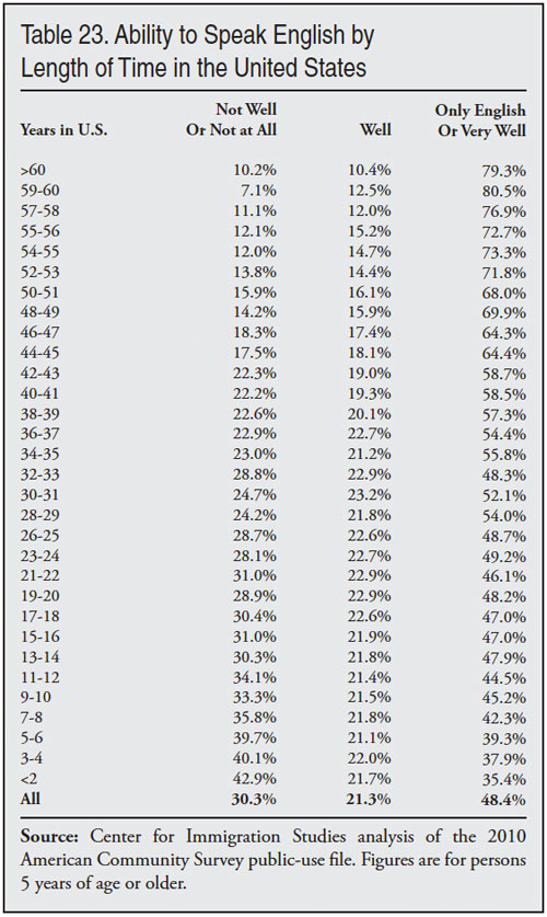
Figure 5 reports socio-economic statistics for immigrants who have been in the country for five or fewer years and those here for 20 years.39 Figure 6 reports the same information, but for only Hispanic immigrants. Like Tables 21 and 22, Figure 5 indicates that even well-established immigrants (those in the country 20 years) lag significantly behind natives. Figure 6 shows this is even more true for Hispanic immigrants. Even well-established immigrants are dramatically poorer than natives and have much higher welfare use, and much lower home ownership rates than natives.
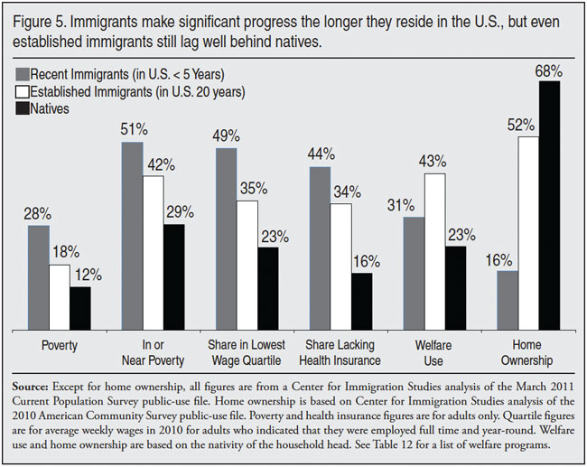
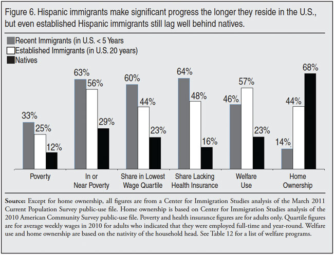
Progress over Time by Age
As we have seen, time spent in the United States and age are, quite naturally, highly correlated. Immigrants who have been in the country longer tend to be older on average. Therefore, one way to think about progress over time is to examine socio-economic status by age. Table 24 reports the share of immigrants in or near poverty (under 200 percent of poverty threshold), the share of workers in the bottom fourth of the wage distribution, and average total income. (Unlike income, wage data are only for those who are employed full-time and year-round.) All figures for both immigrants and natives are for adults 18 and older.
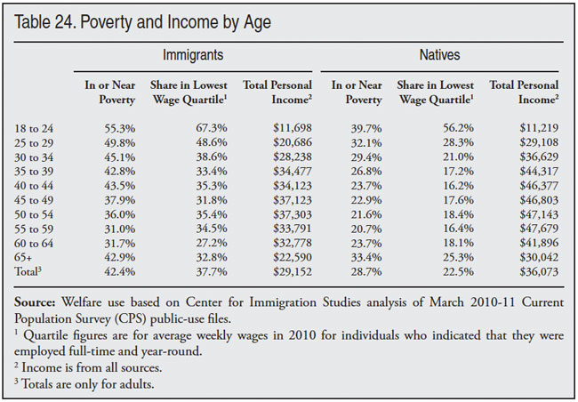
Table 24 shows that immigrant adults never come close to matching the income of natives of the same age, with the exception of the average income for those 18 to 25. Figure 7 shows average income by age. Both Table 24 and Figure 7 support the general observation that the lifetime income or wages of immigrants are substantially below that of natives, even though immigrants do make progress over time as they age. Table 25 further reinforces this observation. It shows the average income and the share in or near poverty in 2010/2011 by age for immigrants who arrived in the 1990s and 1980s. (To obtain more robust estimates, Table 25 uses a combined sample of the March 2010 and 2011 CPS.) On average, 1990s immigrants have been in the country for 15 years and 1980s immigrants have been here for 25 years.
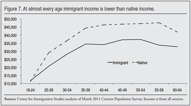
Turning first to 1990s immigrants, Table 25 shows that the share of immigrants in or near poverty (under 200 percent of the poverty threshold) is significantly higher for immigrants at every age. In terms of income, immigrants 25 to 29 come closest to natives. But the difference is more than $5,000 on average and in the other age groups the difference is about twice this amount. Like the age comparisons in Table 24 and Figure 7, the younger age cohorts come closest to matching natives. This is an indication that those immigrants who arrived young and grew up in the United States do better than those who arrived as adults. This makes perfect sense, since children will be more acclimated to the language and culture of the United States. Moreover, they will have greater access to educational opportunities.

But children will always comprise a modest share of new arrivals because most people make the decision to go to a new a country in their late twenties, typically before they have had children. In 2010, of the immigrants who arrived in 2009 or the first six months of 2010, 83 percent were older than 15 and 79 percent were older than 18. Immigrants generally do not come as children, nor do they generally arrive at older ages. Of the newest arrivals in 2010, 54 percent were between 18 and 39. The age of immigrants at arrival partly reflects the nation’s immigration policy, but it mainly reflects the simple fact that people generally make the decision to leave their home countries as adults under age 40. This means that only a modest share of immigrants will ever grow up in the United States. Because of this, the closer income and poverty of younger immigrants found in Table 25 will be unrepresentative of immigrants overall. In 2011, just 6 percent of 1980s immigrants were 25 to 29, compared to 18 percent who were 45 to 49.
The 1980s immigrants shown in Table 25, are somewhat better off at each age group than 1990s immigrants. This makes sense because these immigrants have lived in the United States considerably longer than 1990s immigrants. And as we have seen, conditions improve for immigrants over time. However, 1980s immigrants still have substantially higher rates of poverty/near-poverty and lower average incomes than natives of the same age. For example, across age groups, immigrant income is on average 24 percent lower than native income. Immigrants who arrived in the 1980s can only be described as very well established in the United States by 2010, yet they are still much poorer on average than natives of the same age.
Tables 21 through 25 and figures 5 through 7 show that it would be incorrect to think that immigrants do not do better the longer they live in the country. With the exception of welfare use, immigrants improve their situation over time for every measure examined. However, the tables and figures also show that even very long-time residents lag well behind natives. This is especially true compared to natives of the same age. Of course, we cannot say for sure that immigrants will continue to follow the same pattern in the future. But if they do, then they will arrive with relatively low incomes and make significant progress over time. But that progress will still leave them substantially poorer, more likely to use welfare, less likely to have health insurance, and less likely to be home owners than natives, even after they have been in the country for two decades.
Hispanics by Generation
Progress Across Generations
While it is not the focus of this paper, it is possible to distinguish among natives by generation using the CPS. The CPS asks respondents about the country of birth of their mother and father. (The ACS does not include these questions.) While there is some debate about definition, the brief analysis below follows the common practice of referring to those born outside of the United States (immigrants) as the “first generation”, those born in the United States with either an immigrant father or mother as the “second generation”, and those born here with two U.S.-born parents as the “third generation-plus”, or more simply as just the “third generation”.40
In the discussion that follows we focus on Hispanics because nearly 60 percent of all children born to immigrants are born to Hispanics.41 Therefore, how the descendants of Hispanic immigrants fare is one of the most important issues surrounding the current immigration debate. Moreover, the number of second generation adults from most countries and for non-Hispanics in general is small in the CPS, making meaningful analysis by generation difficult.
Comparing generations is not as straightforward as it may seem. First, there is the issue of minor children who are by definition a different generation than their parents, but who are nonetheless dependent on their parents. This must be addressed when making comparisons across generation.42 For this reason when we examine poverty or health insurance coverage we report statistics only for adults in the analysis that follows. Second, there is research showing that persons whose ancestors are from a Spanish-speaking country are less likely to identify as “Hispanic” the higher their income and education. It is not entirely clear how much this issue matters. Mexicans are by far the largest Hispanic group and in the 2011 CPS, 97 percent of U.S.-born individuals with a Mexico-born father identified as Hispanic, as did 98 percent of those with a Mexico-born mother. Ultimately, the term “Hispanic”, like race, is a construct that relies on self-identification. So if an individual does not see himself or herself as Hispanic, it is difficult to argue that he or she is in fact Hispanic. Moreover, researchers have little choice except to rely on self-reported ethnicity and we follow this practice.
It is important to keep in mind that by examining the generations at one point in time we are not comparing parents or even grandparents and their children. The parents of today’s second generation adults are generally not today’s immigrants. Instead, the parents of today’s second generation adults typically entered the country decades ago and have in most cases either passed away or have retired. The same is true of adults in the “third generation-plus” whose forbears, at the very least, entered many decades ago.43 What the data from 2011 can tell is how past waves have done up to the present time. They cannot tell us whether the descendants of today’s immigrants will follow the same pattern.
Socio-Economic Status by Generation
The first two sets of bars in Figure 8 show educational attainment for persons 25 to 65. The comparison is with non-Hispanic natives. As will be recalled from Tables 7 and 26, immigrants overall are much less likely than natives to have completed high school and are slightly less likely than natives to have at least a bachelor’s degree. Figure 8 shows that this difference with natives is much more pronounced among Hispanic immigrants, who are much less likely to have completed high school or have a bachelor’s degree.
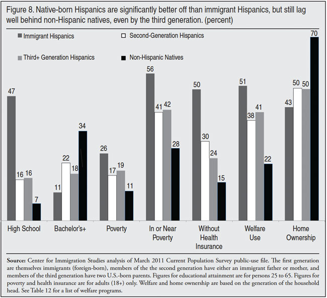
Turning to the second generation, Figure 8 shows that those adult Hispanics with immigrant parents are much more likely to have completed high school than foreign-born Hispanics — 47 percent versus 16 percent. The same is true of third-generation Hispanics. Relative to non-Hispanic natives, however, the share of second- and third-generation Hispanics who have not completed high school (16 percent) is still twice as high. Furthermore, the high school completion rate for the third generation is no higher than the second generation. This implies no progress between the second and third generations in this area.
Figure 8 also shows that the share of second- and third-generation Hispanics with at least a bachelor’s degree is significantly higher than that of foreign-born Hispanics. However, it is still dramatically lower than for non-Hispanic natives. Only 22 percent of second-generation Hispanics have a college degree, compared to 34 percent of non-Hispanic natives. And for third generation Hispanics the share with a bachelor’s degree is even lower, just 18 percent. Like the high school completion rate, this is an indication of no progress between the second and third generations for college completion. In fact, it implies deterioration. This is very troubling given the importance of education in the modern American economy.
The third and fourth sets of bars in Figure 8 show the share of adults, 18 and older, living in poverty and the share in or near poverty. In or near poverty is defined as income below 200 percent of the poverty threshold. The bars show that U.S.-born Hispanic adults have significantly lower poverty than foreign-born Hispanics. However, even through the third generation, the share of Hispanic adults in poverty is significantly higher than non-Hispanic natives. The same is true for the share with income under 200 percent of the poverty threshold. Equally important, the poverty rate for adults is no better for the third generation relative to the second.
The next set of bars show the share of adults without health insurance. As with poverty, native-born Hispanics are much more likely than immigrants to have insurance. However, there is only modest progress between the second and third generations — from 30 to 24 percent. Also, the slight improvement between the second and third generations in insurance coverage seems to be mostly due to higher Medicaid use by third-generation Hispanics.44 Perhaps most important, third-generation adult Hispanics are still much less likely to have health insurance than are native-born non-Hispanics.
The sixth set of bars show welfare use. They show that the share of households headed by Hispanic immigrants using at least one major welfare program is somewhat higher than for native-born Hispanics. But even through the third generation the rates are significantly higher than for non-Hispanic natives. And as is the case with other measures in Figure 8, there seems to be no evidence of progress between the second and third generations.
Turning to home ownership, Figure 8 shows that it is higher for U.S.-born Hispanics than foreign-born Hispanics — 43 versus 50 percent. However, the rates are still dramatically lower than for non-Hispanic natives. Furthermore, there seems to be no intergenerational progress between the second and third generations. On the other hand, the 50 percent home ownership rate for U.S.-born Hispanics (both second and third generation) can by itself be seen as high. However, as discussed earlier, home ownership is very common in the United States. With 70 percent of non-Hispanic households owner-occupied, the 50 percent shown for Hispanic natives through the third generation is low in relative terms. It should be remembered that the third generation includes all subsequent generations, obscuring any progress that may be made across later generations.
Income by Generation
Figure 9 reports earnings and total income. In Figure 9 all figures are only for adults 18 and older. The income figures are lower than earnings because some adults, particularly those who do not work, may have little or no income and these individuals lower the average. The average earnings of adult Hispanic immigrants are $17,831 (40 percent) lower than those of non-Hispanic natives. For the second generation they are $13,120 (29.4 percent) lower and the average earnings of third generations Hispanics are $10,178 (22.8 percent) lower than those of average native-born non-Hispanics. This is an indication of progress between the generations and some convergence toward the earning levels of non-Hispanic natives.
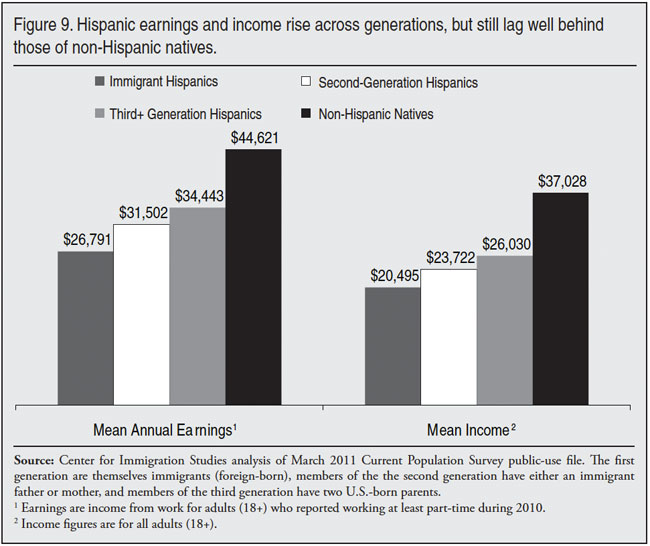
But again, the third generation still has significantly lower earnings than native-born non-Hispanics. While they are not shown in Figure 9, the difference between Hispanics and non-Hispanics in median earnings, rather than mean earnings, follows the exact same pattern.45 Figure 9 also shows that average income follows the same pattern as earnings, with the gap between Hispanics and non-Hispanics being somewhat larger than for earnings.
One weakness of both Figures 8 and 9 is that they do not fully control for age. A larger share of adult second- and third-generation Hispanics are young and this impacts income.46 Table 26 reports earnings by age and generation. It also reports the share in or near poverty. Like other measures examined in this report, Table 26 shows that native-born Hispanics are much better off than immigrant Hispanics. But Table 26 also shows that second- and third-generation Hispanics have much lower earnings than non-Hispanic natives in the same age cohort. The same pattern holds for the share in or near poverty, defined as less than 200 percent of the poverty threshold. Figure 9 shows that the average earnings of third-generation adult Hispanics is $10,178 lower (22.8 percent) than native-born non-Hispanics. In Table 26 the average difference across age cohorts is about $8,700 (22 percent) lower when compared to non-Hispanics of the same age. Table 26 indicates that some of the difference between the overall earnings of adult native-born Hispanics and non-Hispanics shown in Figure 9 is due to the relative youth of Hispanics. But most of the difference remains when age is controlled for. The same general pattern holds for second-generation Hispanics. One other interesting finding in Table 26 is that the seeming progress from the second to third generations in earnings found in Figure 9 seems to disappear once age is taken into account.
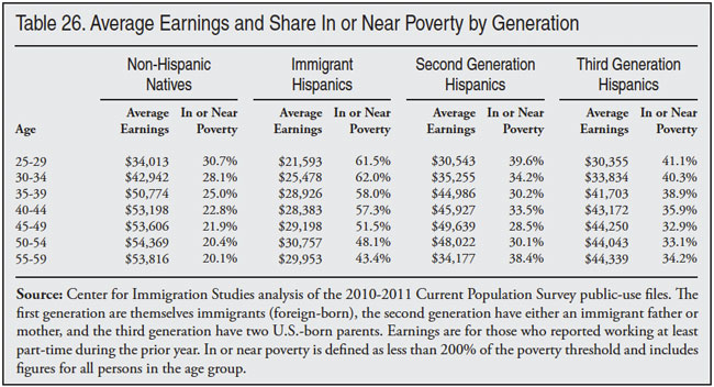
As for the share in or near poverty, Figure 8 shows a 14.6 percentage-point gap between third-generation Hispanics and non-Hispanic natives overall. Table 26 shows that when age is controlled for, the difference averages 12.5 percentage points across the age cohorts. Thus, the much larger share of third-generation Hispanics in or near poverty shown in Figure 8 remains even when age is taken into account. The overall conclusion from Table 26 is that when it comes to average earnings and the share in or near poverty, the relative youthfulness of Hispanic natives does not explain the large differences with non-Hispanic natives.
Generational Change, 1995-2010. Figure 10 shows the share of Hispanics by generation living in or near poverty from 1995 to 2010. As was discussed earlier, in or near poverty (below 200 of poverty threshold) is an important measure because below this level income taxes are generally not paid and it is where eligibility for many welfare and other means-tested programs begins. The figure shows that for all generations there was significant improvement from 1995 to 2000. The economic expansion of the 1990s lowered the share of all Hispanics in or near poverty. Perhaps most importantly, it narrowed the gap with non-Hispanic natives. But since 2000 the share of Hispanic adults in or near poverty has not declined significantly, nor did their rates converge with non-Hispanic natives. Even during the economic expansion from 2000 to 2006, second- and third-generation Hispanics did not converge with U.S.-born non-Hispanics.
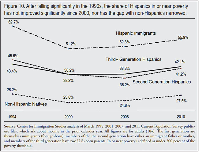
There are many possible explanations for the much lower socio-economic status of native-born Hispanics relative to non-Hispanics natives, even through the third generation. Figures 8, 9, and 10 and Table 26 do not really answer the question of why Hispanics are so far behind non-Hispanic natives. Discrimination, culture, and the changing nature of the economy may all play a factor in reducing economic opportunities for Hispanics. The figures also do not answer the question of what yardstick should be used to measure progress by generation. For example, should improvement between generations by itself be the primary way to think about progress? Or is a comparison with non-Hispanic natives the best way to think about intergenerational mobility? Further, the list of variables used to measure progress in Figures 8, 9, and 10 and Table 26 is not exhaustive. But the above analysis indicates that there are real reasons for concern about the intergenerational progress of Hispanics, who are by far the largest immigrant group now arriving in the United States.
Like any important social question, there is debate among academics about how U.S.-born Hispanics are faring. However, a number of researchers have found cause for concern in the economic mobility of second and third generation Hispanics. Several researchers have, for example, highlighted significant problems in the educational environment in which Hispanics are learning.47 Other research have also found that, while native-born Hispanics are better off than their foreign-born Hispanic counterparts, they still are significantly worse off than other natives.48 The findings in this report support such a conclusion.
Figures 8, 9, and 10 and Table 26 make clear that it would be wrong to argue that U.S.-born Hispanics have the same socio-economic status as foreign-born Hispanics. But it would also be a mistake to think that low socio-economic status among Hispanics is only associated with immigrants, or just the children of immigrants.
Educational Attainment
Education Level of Immigrants
The statistics reviewed thus far indicate that a larger share of immigrants than natives have low incomes, lack health insurance, access means-tested programs, and in general have much lower socio-economic status. As already mentioned, one of the primary reasons for this situation is that many immigrants arrive in the United States with relatively few years of schooling. Table 27 reports the education level of immigrants ages 25 to 65 by country and region. The table shows very significant differences between immigrants by sending country and region. Some immigrant groups are much less educated on average than natives, while immigrants from other countries are much more educated than natives. Immigrants from Mexico and the Western Hemisphere (excluding Canada) in general tend to be the least educated, while those from South Asia, East Asia, and Europe tend to be the most educated.
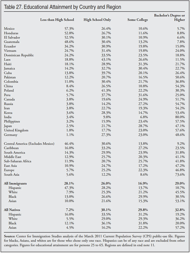
Looking back on Tables 10 through 19, we see that immigrants from those countries and regions that have higher education levels tend to have the highest income and home ownership rates and lower levels of poverty, welfare use, and uninsurance. Conversely, the least-educated immigrant groups tend to be the least prosperous. There is nothing particularly surprising about this finding.
It has been well known for some time that education is one of the best predictors of economic outcomes in modern America. In fact, the benefits of education have become more pronounced in recent decades. The arrival of large numbers of less-educated adult immigrants means that many will struggle in the United States. As we have seen, this does not mean that they make no progress over time. Nor does it mean that they will not find jobs. But it does mean that absent a change in U.S. immigration policy, immigration will continue to add workers disproportionately to the bottom end of the labor market, where wages are the lowest and unemployment the highest. It also means that immigration will add disproportionally to the overall size of the low-income population in the United States.
Importance of Education
The importance of education is shown very clearly in Table 28 The table reports income, poverty, health insurance coverage, and language skills for adults, and welfare use and home ownership based on the education of the household head. The table indicates that the least-educated immigrants are much worse off than are average natives. For example, the poverty rate for adult immigrants without a high school education (31.7 percent) is nearly triple the rate for adult natives overall (11.8 percent). For adult immigrants with only a high school education it is nearly double the overall native rate — 20 percent vs. 11.8 percent. However, immigrants with a college degree have a poverty rate that is actually lower than the overall rate for natives — 7.4 percent vs. 11.8 percent. The share of households headed by an immigrant who has not graduated from high school that use at least one major welfare program is 2.5 times that of native households overall. And for households headed by immigrants with only a high school education, it is still nearly double the rate for natives overall. But for households headed by immigrants who have at least a bachelor’s degree, welfare use is a good deal lower than the overall rate for native households. Table 28 indicates just what would be expected; the least-educated immigrants do much worse than natives, who are on average more educated. In contrast, the most educated immigrants do a good deal better than the average native.
Table 28 confirms the common sense observation that education is a key determinant of economic outcomes. Thus, one of the main reasons immigrants are much poorer than natives on average is that a much larger share of immigrants have low levels of education. This results in their having much higher rates of poverty, uninsurance, and welfare use and lower income and rates of home ownership. While not surprising, it is very relevant to immigration policy. It means, for example, if we would like immigrants who arrive in the future to have higher incomes and lower poverty and welfare use, then allowing in fewer immigrants who have modest levels of education could do a lot to accomplish that goal. Of course, there are many other competing goals of immigration policy, so creating a more-educated stream of immigrants is only one among a number of policy options that could be pursued.
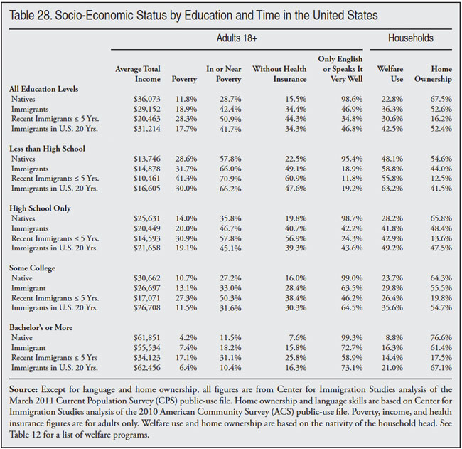
Immigrants and Natives by Education
While the differences in socio-economic status with natives shown in Table 28 are large, comparing immigrants and natives with the same education shows that, with some exceptions, immigrant adults tend to do somewhat worse. However, the differences within educational categories are, for the most part, not enormous. Equally important, differences by education are much less than are the overall differences between immigrants and natives. For example, the table shows that adult immigrant poverty overall is 18.9 percent, 7.1 percentage points higher than the rate for adult natives overall. But, looking at the differences across the four educational categories in Table 28 shows an average difference of 3.7 percentage points. Thus it can be said that roughly half the difference in poverty between immigrants and natives is caused by the lower educational attainment of immigrants.
Education and Progress over Time
In addition to overall figures, Table 28 provides statistics by educational attainment for immigrants in the country for less than five years and for immigrants in the country for 20 years. As already discussed at length in this report, immigrants who have been in the country longer are much better off than newer arrivals. Table 28 shows this is true for all educational categories. Even the least-educated immigrants in the country for 20 years are far better off than their newly arrived counterparts. Income, poverty, home ownership, insurance coverage, and language skills all improve with time. Welfare use is the lone exception. It does not decline with time. Putting aside welfare use, if all that matters is progress over time, then Table 28 shows that progress over time is a characteristic of immigrants regardless of education.
However, Table 28 also shows that the least-educated immigrants who have been in the country for two decades have dramatically higher poverty, uninsurance, and welfare use as well as dramatically lower home ownership and income. The poverty rate for immigrants who lack a high school education and have been in the country for 20 years is still nearly triple that of natives and the share in or near poverty is more than double. Of these least-educated, long-time immigrant residents, 66.2 percent live in or near poverty. Nearly half (47.6 percent) do not have health insurance and 63.2 percent use at least one major welfare program. Immigrants with less than a high school education who have been in the country for 20 years are dramatically worse off than natives, even though they are better off than their newly arrived counterparts.
The situation is better for those with a high school education who are long-time residents, but the differences with natives are still very large. The average income for those with only a high school education who have been here for 20 years is still only 60 percent that of natives. The share in poverty is 62 percent higher and the share without health insurance is 2.5 times higher than for the average native. Almost half (49.2 percent) of households headed by an immigrant with only a high school education who has been in the country for 20 years access the welfare system. Well-established immigrants who have only a high school education are clearly better off than well-established immigrant high school dropouts, but they are still much worse off than the average native.
Immigrants with some college who have been in the United States for 20 years are much closer to the average for natives. While income lags that of natives, long-time resident immigrants with some college are similar to natives in poverty and near poverty. Health insurance coverage is still half that of natives and welfare use is well above that of natives. As for college graduates, the situation is reverse that of the lower educational categories. Immigrants with at least a bachelor’s degree who have been in the country for 20 years have much higher incomes than the average native, as well has much lower rates of poverty. Health insurance coverage is similar to natives, as is home ownership.
Even newly arrived college graduates are relatively prosperous. Table 28 shows that the average income of immigrant college graduates in the country for five or fewer years is not that different from the average for natives. Poverty does tend to be relatively high for newly arrived college graduates, but the share in or near poverty is very similar to natives. These results in Table 28 are relevant to immigration policy because they indicate that low socio-economic status is not always associated with new arrivals. Newly arrived immigrant college graduates do relatively well in the United States. Thus, it is wrong to think that low income or high welfare use is simply unavoidable among new immigrants. The most educated immigrants are relatively prosperous even when have been in the country for only a few years.
That educational attainment matters a great deal to economic success in the United States is expected. The question for policymakers and the public is should this fact be given more weight in formulating immigration policy.
Characteristics by State
In this section we examine characteristics of immigrants and natives by state. In order to obtain more statistically robust estimates at the state level, we use a combined two-year sample of the March CPS 2010-2011 for income, poverty, health insurance, educational attainment, and welfare use. Elsewhere in this paper, such as in Tables 10, 11, 12, and 26, we examined these and other issues at the national level based on only the March 2011 CPS. Thus, the national totals in the earlier tables will not exactly match the national totals found in the state tables. However, the difference between the national figures using only the 2011 CPS and a combined two-year sample are quite small. The state figures for public school enrollment, home ownership, and household crowding are based on the 2010 ACS and will match national totals found elsewhere in this report.
Household Income and Home Ownership. The first two columns of Table 29 report average household income in the top immigrant-receiving states. The second two columns report the more commonly used median household income of immigrant and native households. The states are ranked based on how much higher the native median income is than the immigrant median income. While in most of the top immigrant-receiving states native median income is higher, this is not true in every state. In Maryland and Virginia, the median household income of immigrant households is roughly the same as that of native households.
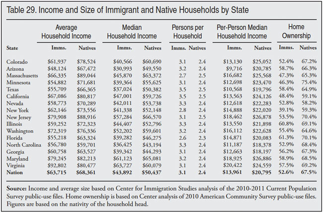
Where the difference in median household income between immigrant and native households tends to be much larger is in per-capita income. (Per-capita median income is calculated by dividing total household income by the number of people in the household.) Even in Maryland and Virginia, the per capita median income of immigrant households is 42 and 20 percent lower respectively than that of natives. In some states, the difference with natives is even larger. In Arizona, Colorado, Texas, California, Nevada, North Carolina, Illinois, and Massachusetts the per-capita household income of natives is at least 50 percent higher than immigrants. The per-capita figures indicate that immigrant households are a good deal poorer than native household once household size is taken into account.
The last two columns in Table 29 show the share of immigrant and native households that are owner-occupied. In most of the top immigrant-receiving states the gap between immigrant and native home ownership is 10 percentage points or more. However, it is interesting to note that in Nevada and Arizona, where immigrant household income tends to be much lower than that of natives, and as we will see poverty and welfare use tend to be much higher, home ownership rates are much closer than in many of the other top immigrant-receiving states.
Public Schools
Immigration has a very significant impact on public schools in many states. Table A3 in the appendix shows the number of public school students from immigrant and native households in all 50 states and the District of Columbia. Immigrants comprised the largest share of public school students in California, Nevada, New York, Texas, New Jersey, Florida, Hawaii, and Arizona. In these states more than one in four primary and secondary public school students are from immigrant households.
Table A3 also shows the share of public school students in immigrant and native households in poverty. Nationally, 28.9 percent of public school students from immigrant households are in poverty. Of all public school students in poverty, 29 percent are from immigrant households. In California 60.4 percent of public school students in poverty are from immigrant households, as are 41.8 percent in Nevada, 42.9 percent in Arizona, and 38.1 percent in Washington state. Even in some states not traditionally thought of as being heavily impacted by immigration, a very large share of public school students in poverty come from immigrant households. For example, 37.3 percent of public school students in Rhode Island in poverty are from immigrant households, as are 32.1 percent in Nebraska and 28.6 percent in Minnesota. Immigration has had a very large impact on the number of low-income public school students in the country and in many states.
Table A4 in the appendix shows the number and share of public school students by state who speak a language other than English. In 13 states, at least one out of five students lives in a household where a language other than English is spoken at home. In California and Texas, 48 and 37.2 percent respectively of all public school students live in such households. This does not necessarily mean that all of these students do not speak English well. But it does mean that school systems across the country will have to provide appropriate language instruction for some significant share of these students. Tables A3 and A4 show that immigration has added a large number of students to the public school system, many of whom speak a language other than English.
Table A5 in the appendix shows the average number of students per 1,000 households for all 50 states plus the District of Columbia. Like the national numbers already shown in Table 20, in almost every state there are many more public school students per immigrant household than per native household. In fact, Table A5 shows that in 28 states the number of students per immigrant household is 50 percent larger than for native households. In North Carolina, Arizona, California, Colorado, and Nevada the number of public school students per immigrant household is roughly twice that of native households.
Table 29 showed that immigrant household income tends to be a good deal less than native household income for most of the top immigrant-receiving states. For example, in Arizona the median household income for immigrant households is 60 percent less than that of natives and the mean household income is 40 percent less. Table A5 shows that immigrant households have twice the number of public school students than native households in Arizona. Even in Virginia, where immigrant household income is slightly higher than natives’, the average household still has 59 percent more public school students compared to native households. Since households are the primary unit by which taxes are assessed and collected, the relatively low income of immigrant households coupled with the much greater demand they create for public education means that in many parts of the country there will be a significant increase in school enrollment without a corresponding increase in the local tax base.
Overcrowded Households
Table A6 in the appendix shows household crowding by state. Table A6 shows household crowding is much more common among immigrant households than native households — 12.7 percent versus 1.9 percent. Because overcrowding is so much more common among immigrant households, they account for a larger share of all overcrowded households. As Table A6 shows, nationally 13.8 percent of all households are headed by an immigrant, yet immigrant-headed households account for 52 percent of all overcrowded households. In California, immigrant households account for 71.8 percent of all overcrowded households, even though they are 31.4 percent of all households.
It may not be surprising that immigrant households account for a very large share of overcrowded households in states such as New York (63.9 percent), Texas (54.9 percent), Illinois (54 percent), Nevada (52.7 percent), and Arizona (45.8 percent). What is more surprising is that they are 57.3 percent of overcrowded households in Maryland, 52.1 percent in Nebraska, 48 percent in Minnesota, and 39.7 percent in Utah. Immigration has added significantly to the stock of overcrowded households in many states, including some that are not traditionally seen as heavily impacted by immigration. In all, immigrant households account for one-third or more of overcrowded households in 25 states plus the District of Columbia.
Poverty and Near Poverty
Table 30 reports the percentage and number of immigrants and their U.S.‑born children who live in poverty compared to natives and their children. As in the other tables in this report, the figures include immigrants and the U.S.-born minor children (under age 18) of immigrant fathers. While the foreign-born tend to have much higher poverty rates in the top-receiving states, in Virginia, Maryland, and New Jersey the difference with natives is not that large. In contrast, immigrants and their children tend to have much higher rates of poverty in Arizona, Colorado, Illinois, Minnesota, North Carolina, Texas, and Washington State. Turning to the share in or near poverty, (defined as below 200 percent of the poverty threshold), with the exception of Virginia, immigrants and their young children have much higher rates of poverty/near poverty than natives in the top states of immigrant settlement. As already discussed, those with incomes below this amount usually do not pay income taxes, and they typically become eligible for means-tested programs.
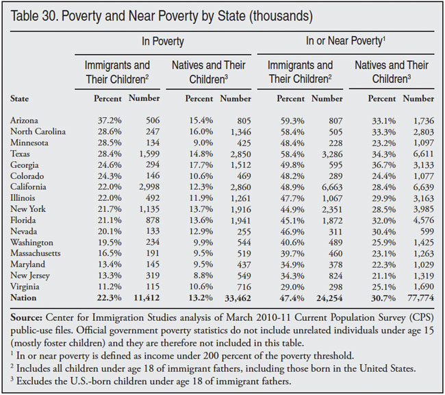
Health Insurance Coverage by State
able 31 shows the share of immigrants and their children without health insurance by state. With the exception of Massachusetts, the difference between immigrant and native insurance coverage rates is enormous. In 10 of the states shown, immigrant rates of uninsurance are double those of natives.
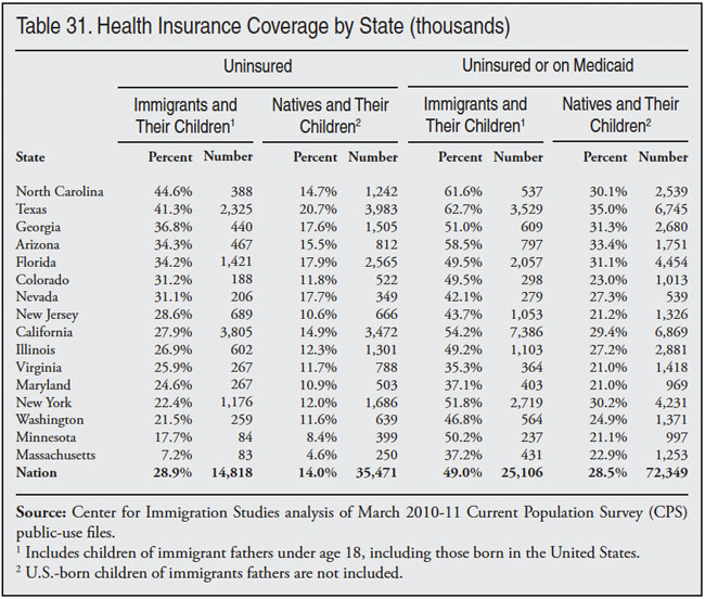
The impact of immigration on the health care system as a whole can also be seen when we consider the share of immigrants and their minor children who are either uninsured or enrolled in Medicaid, which is shown in the second half of Table 31. Based on the 2010-2011 CPS, the share of immigrants and their children on Medicaid or without health insurance is 49 percent.49 In comparison, 28.5 percent of natives and their young children are uninsured or on Medicaid. In Texas, North Carolina, Arizona, California, New York, Georgia, and Minnesota, more than half of immigrants and their children are either uninsured or on Medicaid. Moreover, in New York, Colorado, Florida, Illinois, and Washington state nearly half of immigrants and their children are uninsured or on Medicaid. The impact of immigration on the health care systems in these states and the nation is clearly very large.
It is worth noting that by subtracting the share on Medicaid or uninsured from the share who are uninsured the percentage on Medicaid alone can be calculated. In most of the states listed in Table 31, immigrants and their children are more likely to be on Medicaid than natives and their children. In Massachusetts, where the rates of uninsurance are very similar for immigrants and natives, part of the reason for this is that 30 percent of immigrants and their young children are on Medicaid compared to 18.4 percent of natives.
Earlier in this report we observed that immigration had a very large impact on the nation’s health care system. Table 32 shows the share of each state’s population comprised of immigrants and their minor children and their share of the uninsured and in poverty. The table reads as follows: immigrants and their minor children comprise 36.8 percent of California’s overall population and they are 51.2 percent of those in poverty. They are also 52.3 percent of the uninsured in the Golden State. Table 32 shows that immigrants tend to be a much larger share of the poor and uninsured in these states than they are of the overall population.
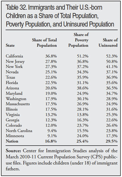
Welfare Use by State
Table 33 shows the percentage of immigrant- and native-headed households using at least one major welfare program. Programs included are TANF, SSI, general assistance, Food Stamps, WIC, free/subsidized school lunch, public/rent subsidized housing, and Medicaid. As we saw in Table 12, the biggest difference in program use is for Medicaid and food assistance programs. For state governments, Medicaid is a particular concern because between one-third to one-half of the program’s costs are typically borne by state taxpayers. The largest percentage-point differences in overall welfare use for immigrants and natives are found in Minnesota, New York, Texas, California, Colorado, Washington, and Arizona. The smallest differences are in Virginia, Georgia, Nevada, Maryland, and New Jersey.
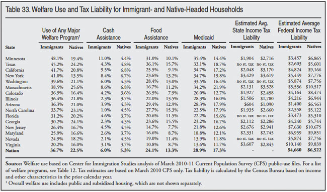
Estimated State and Federal Income Tax
In addition to welfare use, Table 33 also shows estimated income tax payments for immigrant and native households. Based on the characteristics of immigrant families and individuals, the Census Bureau estimates tax liability. That is, what should be paid in income taxes given income, dependents, home ownership, etc. This estimate does not have any information about tax compliance. It is only an estimate of what should be paid if the law is followed. Figures for state and federal tax are shown in the far right of Table 33. In terms of state income tax, native households have higher tax liability than immigrant households in every state but Virginia. The average difference across the states shown is 29 percent, which is significant. The Census Bureau’s estimated state tax liabilities indicate that in almost all of the top immigrant-receiving states that have state income taxes, immigrants pay less than natives. It is worth noting the Bureau’s estimated tax liability (state and federal) likely understates tax liability for those with high incomes.
In terms of federal income tax, the difference with natives is much larger. On average native households have federal income tax liability that is 40 percent higher. Again, Virginia is the exception. This report has shown that immigrant households have higher rates of welfare use and public school enrollment. And immigrants and their children are much more likely to lack health insurance. Perhaps most important, immigrant households are much larger on average than native households. These facts coupled with lower average income tax liability raise the clear possibility that immigrant households are a significant net fiscal drain. However, several things must be kept in mind. First the tax estimates are not actual tax payments or even self-reported tax payments, they are Census Bureau derived estimates. Tax compliance rates are likely to differ significantly for immigrant and native households, particularly for illegal immigrant households, which are included in the data. Second, state and federal income are not the only taxes collected by government. Third, welfare and education are by no means the only sources of expenditures for state or federal government. In short, the tax estimate and the other information in this report are not a balance sheet of taxes vs. expenditures. But the information is consistent with the very real possibility that immigrant households are on balance a net fiscal drain.
Education Levels by State
Table 34 shows the education level of immigrants and natives (ages 25 to 65) in the top immigrant-receiving states. As has already been discussed at length, a much larger share of immigrants than natives have not completed high school. This is also the case in every state in Table 34. The difference is largest in Colorado, followed by Texas, California, and Arizona. The gap is smallest in Virginia, Florida, and Massachusetts. At the high end of the educational distribution the situation is somewhat different. In states such as Colorado, Arizona, California, Texas, and North Carolina immigrants are much less likely to have at least a bachelor’s degree. However, in a number of states immigrants are as likely or even more likely to have completed college, including Florida, Washington, Minnesota, Maryland, and Virginia. Looking back on Tables 29 to 33, they show that, in general, in states where immigrant educational attainment is lowest relative to natives the gap with natives in socio-economic status tends to be the highest. In contrast, where immigrants are more educated, the gap is much smaller.
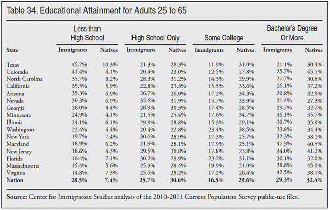
State Work Force
Table 35 shows work force characteristics by state. The first column shows the number of immigrant workers in each state based on 2010/2011 data. The second column shows the number of immigrant workers in the state who arrived in 2000 or later. The third column shows the share of all workers in the state who are foreign-born. Thus the table reads as follows: Based on 2010 and 2011 data there were 5,537,000 immigrant workers in California, 1,457,000 of whom arrived in 2000 or later. Overall, 34.4 percent of all workers in the state were immigrants. The fourth column shows the number of natives (18 to 65) not working, the fifth column shows the percentage of natives (18 to 65) working in 2010-11, and the sixth column shows the share of natives (18 to 65) working in 2000/2001. Thus, in California, 5,405,000 natives ages 18 to 65 were not working in 2010/2011. Overall, 64.9 percent of natives in this age group held a job. Column six shows that in California at the beginning of the last decade 74.1 percent of natives in this age group worked. The last three columns in the table show the same information as columns four, five, and six, except that the figures are only for young natives (18 to 29) with no more than a high school education. This includes high school dropouts and those who have graduated high school but have no additional schooling. Young workers are reported separately because they are the group most likely to be in competition with immigrants for jobs at the bottom end of the labor market.
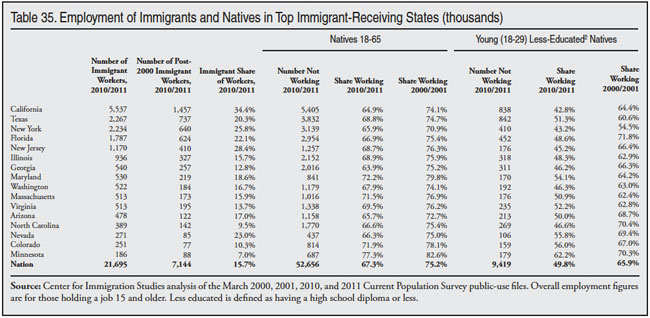
Table 35 shows that immigrants make up a large share of workers in almost all of these states. In California, immigrants are more than a third of workers, and they are roughly a quarter of all workers in New Jersey, New York, and Nevada and about a fifth of workers in Florida, Texas, and Maryland. The table also shows that in all of these states there is a very large population of working-age, native-born people who are not employed. For example, in California, New Jersey, New York, Florida, Texas, Arizona, Washington, Massachusetts, Illinois, Virginia, Georgia, and North Carolina there are more than one million working-age natives not employed. If we compare the number of natives not working to the number of post-2000 immigrants it shows that in almost every state the number of natives (18 to 65) not working is about four times the number of newly arrived immigrants. And in many states the proportion is even larger.
Those who are not working are either unemployed, which means they have looked for a job in the last four weeks, or they are not looking for work. In total, there are 30 million adult working-age (18 to 65) natives not employed in the 16 states shown in Table 35. There are an additional 22.7 million working-age natives not working in other states. Of those who are not employed, some are discouraged workers who would like to work, but have not looked in the last four weeks and so are not counted as officially unemployed. Some of those not working are disabled, some are parents taking care of young children, and others are college students who could work but do not wish to do so. (There are virtually no college students in the right side of Table 35 because those attending college have at least some education beyond high school and are therefore not included.) It would be mistake to think that all of those not working want to work or are even able to do so. But even if only one in five of the 52.7 million working-age natives not employed got a job, they would be a larger population than the 7.14 million new immigrant workers added in the last decade. Put a different way, if employment rates nationally for working-age natives simply returned to 2000-01 levels (75.2 percent), then 12.2 million more natives would be working in 2010/2011.
The starkest finding in Table 35 is the dramatic deterioration in the employment rate of working-age natives. On average, their employment rate declined by more than seven percentage points in these states from the beginning of the decade. This is a very large decline because, like unemployment rates, employment rates do not swing dramatically. A seven percentage-point decline is a very large change. Even more striking is the decline in the employment rate of young (18 to 29) less-educated natives. On average, the share holding a job in this group declined 15 percentage points in these states. Employment rates were already relatively low for this group, so the decline is that much more profound. In California, New Jersey, New York, Florida, Washington, Illinois, and North Carolina fewer than half of these individuals had a job in 2010 and 2011. In these same states, in 2000 and 2001, roughly two-thirds of this demographic held a job.
Although not shown in Table 35, the dramatic deterioration in employment among natives began before the recession. The share of 18 to 65 year olds working was 72.9 percent in 2006/2007, lower than the 75.2 percent at the start of the decade, even though March of 2006/2007 represents the peak of the last economic expansion. More striking is that the share of young, less-educated natives working was 61.1 percent in 2006/2007 compared to 65.9 percent at the start of the decade. Clearly the current downturn caused a massive decline in work among this population. But the decline began well before the Great Recession.
Table 35 shows that immigrants comprise a large share of workers in many states. But these same states also have a very large number of native-born people not holding a job. If immigration was curtailed in the future, there certainly seems to be a very large pool of potential workers for employers to draw upon. Of course, as mentioned above, many people not working do not wish to work. But again, if employment rates nationally for working-age natives simply returned to 2000-2001 levels, then 12.2 million more natives would be working, which is more than all of the new immigrant workers allowed into the country in the prior decade — legally and illegally.
Illegal Immigration by State
It is well established that illegal aliens do respond to government surveys such as the decennial census and the Current Population Survey. While Census Bureau surveys do not ask the foreign-born if they are legal residents of the United States, the Department of Homeland Security (DHS), former INS, the Pew Hispanic Center, and the Census Bureau have all used socio-demographic characteristics in the data to estimate the size of the illegal alien population. We follow this same approach.50 Using a combined two-year sample of the CPS (March 2010 and 2011) we estimate 10.5 million illegal immigrants, or slightly less than 28 percent of the foreign-born population. It must also be remembered that these figures are only for those in the CPS, not those missed by the survey. Estimates prepared by other researchers often adjust for undercount in Census Bureau data. While there is debate about the number missed, most research indicates that roughly 10 percent of illegals are not counted in Census Bureau surveys such as the CPS.51 Thus, the true size of the illegal population could be 11.5 million. If the undercount is larger, then the total illegal alien population is larger. By design, this estimate is consistent with those prepared by the Census Bureau, DHS, and Pew Hispanic Center.52
While it may seem obvious, it is important to note that in the discussion that follows immigrants can only be legal or illegal. As a practical matter, this means, for example, that if our estimate for poverty among illegals is too high, then the poverty rate for legal immigrants must be correspondingly too low. Conversely, if the estimated poverty among illegal immigrants is too low, then the poverty rate for legal immigrants must be too high.
One of the most important characteristics of illegal immigrants is the very large share with little formal education. We estimated that 54 percent of adult illegal immigrants (25 to 65 years of age) have not completed high school, 25 percent have only a high school degree, and 21 percent have education beyond high school. As already discussed, this is critically important because education is such a determinant of socio-economic status in the modern American economy. We also estimate that 58 percent of the illegal population comes from Mexico, 12 percent is Central American, 9 percent is from East Asia, and 7 percent is from South America, while Europe, South Asia, and the Caribbean account for about 3 percent each. Although these estimates are consistent with other research findings, including those produced by the federal government, it should be obvious that there is no definitive means of determining whether a respondent in the survey is an illegal alien.
Illegals by State
Below we examine the demographic characteristics of illegal aliens by state. Since the sample size is much smaller for individual states than for the nation as a whole, the results should be interpreted with caution, especially for the smaller states. In addition to issues associated with sample size, it should also be remembered that the identification of illegals in the survey also contains some error. Table 36 reports our best estimates for the number of illegals by state in the CPS. (It should be noted that even if the undercount is 10 percent nationally, as many researchers think, it is possible that this not uniform across states.) Table 36 shows that California has by far the largest illegal population, followed by Texas, Florida, and Illinois. Those four states account for half of the illegal immigrant population.
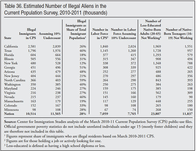
Employment of Illegal Immigrants
Table 36 shows the number of illegal immigrants in the labor force in each state. In total, nearly 7.1 million illegal immigrants (7.8 million if adjusted for undercount) are in the U.S. labor force. This equals 67 percent of the total illegal immigrant population in the United States. Table 35 showed the number of native-born 18- to 65-year-olds not working and the number of young (18 to 29) less-educated natives not working by state. Table 36 reports the number of less-educated natives 20 to 65 not working and the number of teenagers (16 to 19) not working. Less-educated is defined as having no education beyond high school. It is often suggested that there are simply no young or less-educated Americans available to fill jobs taken by illegal immigrants. Like Table 35, Table 36 shows that there are a very large number of potential workers in the top immigrant-receiving states. In the states shown in Table 36, there are 12.5 million less-educated adult natives (20 to 65) not working and 7.3 million native-born teenagers not employed. Nationally, there are 35.6 million people in these two categories. While many of the individuals not working many not wish to work or cannot work, if only one in five took a job it would roughly equal the entire illegal immigrant work force.
Poverty Among Illegals
Table 37 reports the share of illegals and their U.S.-born children (under 18) who live in poverty or near poverty, with near-poverty defined as less than 200 percent of the poverty threshold. Not surprisingly, Table 37 shows that illegals tend to have a very high rate of poverty and near-poverty. Recall from Table 30 that, based on the 2010 and 2011 CPS, 13.2 percent of natives and their children lived in poverty.53 At 26 percent, the national rate for illegal immigrants by themselves is about twice that of natives. The rate is even higher (30 percent) when their U.S.-born children are included.
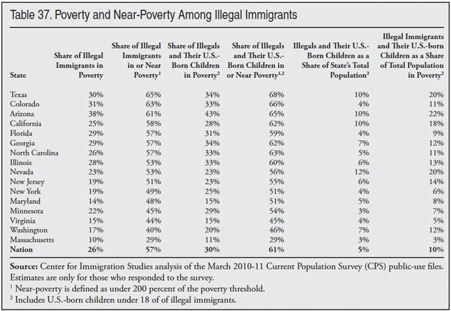
The share of illegals in or near poverty follows the same pattern as the share in poverty. Rates for illegals tend to be dramatically higher than those of natives. In every state shown, with the exception of Massachusetts, Washington, and Virginia, the majority or close to a majority of illegal immigrants and their minor children live in or near poverty.
Nationally, illegal immigrants and their U.S.-born children account for 9.9 percent of all persons in poverty, compared to their 4.9 percent share of nation’s total population. Illegal aliens clearly have low incomes, and the low-income population in the United States is clearly larger because of immigration. Nonetheless, illegal immigration accounts for only a modest share of the total population in poverty. Moreover, it should also be clear that most illegal immigrants do not live in poverty.
It is worth noting that of all immigrants and their children who live in poverty, 40 percent are illegal aliens or the young children of illegal aliens. Based on the 2010 and 2011 CPS, 4.4 million illegal immigrants and their children live in poverty, out of 11.4 million immigrants and their children in poverty. Most low-income immigrants are not illegal aliens. Put a different way, legal immigration has a larger impact on the size of the poor population in the United States than does illegal immigration.
Health Insurance Among Illegals. Table 38 reports the share of illegal immigrants and their minor children without health insurance coverage. Not surprisingly, most illegals are uninsured. Nationally, we estimate that 62 percent of illegals lack health insurance, compared to about 14 percent of natives (see Tables 11 and 31). When their U.S.-born children are counted the figure is 50 percent. Because these children are eligible for Medicaid, they tend to be more likely to be covered by insurance than their illegal immigrant parents.
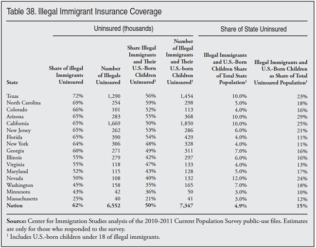
Illegals also account for a large share of the total uninsured population. Nationally, 14.6 percent of all uninsured persons in the United States are estimated to be illegal aliens or the young children of illegal immigrants. This compares to their 4.9 percent share of the nation’s total population. In some states the impact is much larger. In Arizona, California, Nevada, and Texas, roughly one-fourth of the uninsured are illegal immigrants and their children. In New Jersey, Washington, and North Carolina roughly one-fifth of the uninsured are illegal immigrants.
Welfare Among Illegals by State
Table 39 shows the share of households headed by illegal aliens using various welfare programs. It shows that a large share of illegal alien households use the food assistance programs (food stamps, WIC, and free lunch) and Medicaid. But use of cash assistance (TANF, State General Assistance, and SSI) is generally very low. It should also be added that the share of households headed by illegals in public or rent-subsidized housing is zero in our estimates.54 It must be remembered that, in general, illegals cannot use the welfare system themselves. But their U.S.-born children can be enrolled in Medicaid and receive food assistance. Table 39 reflects the fact that a very large share of illegal immigrants have low incomes and as a result their children can enroll in means-tested programs. This is important because it means that efforts to bar illegals from using welfare programs will be ineffective. Very few are using these programs directly and their U.S.-citizen children will continue to enjoy the same welfare eligibility as any other American citizen.
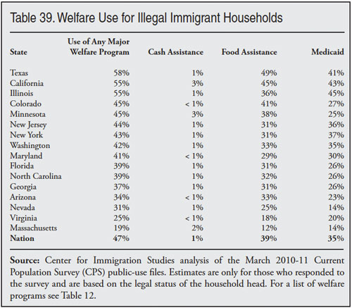
It should also be noted that the high rates of Medicaid and food assistance use by illegal immigrant households is not caused by an unwillingness to work on the part of illegals. In fact, 96 percent of illegal household have at least one worker, much higher than the rate for native households. Rather, with half of adult illegals not having completed high school, their average income in the modern economy will be very low. The American welfare system is geared toward helping low-income workers, especially those with children. Since a very large share of illegals work, have low incomes that reflect their education, and have U.S.-born children, it should not be surprising that many illegal households use the welfare system. Use of means-tested programs by illegal workers is important because it indicates that the desire of employers to have access to large numbers of unskilled immigrant workers creates significant costs for taxpayers. This does not mean that the overall effort to help low-income workers is misplaced. But it does raise the question of why we have an immigration policy that tolerates so many unskilled illegal workers.
Illegals and the School-Age Population
Table 40 reports the estimated number and share of the school-age population (five to 17) in the United States that is comprised of illegal immigrants. Overall, illegals account for 1.3 million school-age children, or 2.4 percent of all five- to 17-year-olds. This is smaller than the 3.4 percent illegals represent of the nation’s total population because immigrants, including illegal aliens, generally come to the United States after age 17, so there are relatively fewer illegal immigrants under age 18. Table 40 also shows that school-age illegal aliens plus the U.S.-born children of illegal aliens comprise about 7.2 percent (3.9 million) of the total school-age population. In states like Nevada, Arizona, Texas, California, Washington, Illinois, and New Jersey illegal immigrants comprise a much larger share of the school-age population than they do nationally.
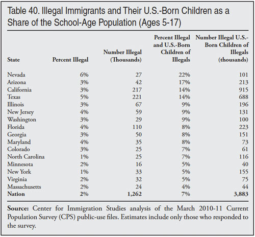
Since per-student expenditures in the United States are roughly $10,000 a year, it is likely that some $13 billion annually goes to educate illegal aliens in public schools. The total cost for educating illegal aliens and their U.S.-born children likely comes to over $39 billion a year.
School expenditures for illegal immigrants and their children provide a good example of how what one chooses to include in a cost estimate of illegal immigrants will have a very large impact on the results, even if there is some agreement on numbers. There are many more U.S.-born school-age children of illegal immigrants than there are children who are illegal immigrants themselves. Including the U.S.-born children in any cost estimate dramatically increases the expenditure side of the ledger. Because the presence of these students in the country is entirely the result of illegal immigration, it is reasonable to count them as a cost. But some researchers may choose not to do so. And this decision will likely change the results. Therefore, it is important when examining cost estimates to see what is included, particularly as it relates to the U.S.-born children of illegals.
Illegals’ Household Income
Table 41 shows the average income and size for households headed by illegal immigrants. We use average income and not median income because at the state level it is not possible to calculate median income figures because of sample size in most states.55 Thus, the incomes in Table 41 may seem high, but they are mean or average incomes, not median incomes. (For those interested, the last row at the bottom of Table 41 does show the median household income of illegal immigrants for the entire country.) Proportionately, the difference between the median income of illegal immigrants and natives is very similar to the difference in mean incomes.
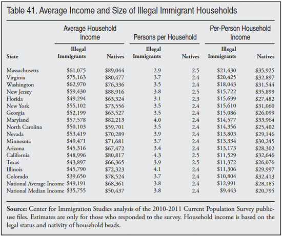
Not surprisingly, Table 41 shows that the mean income of illegal households is much less than the mean income of native households in every state. At the same time, these households are much larger on average than native households. Overall, the average income of natives is 39 percent higher than those of illegal immigrants and illegal alien households are 56 percent larger on average. As already discussed, lower household income coupled with larger household size means that illegal alien households will pay less in taxes and use more in services than native households because households are the primary basis on which taxes are assessed and benefits distributed in the United States. Even assuming that illegals pay all the taxes they are supposed to, given their average household income and size it is difficult for them not to create a significant fiscal drain.
The fiscal problem associated with illegal immigrant households can be seen in the area of public education. As discussed above, the total cost for educating the children of illegal immigrants is roughly $39 billion a year. We estimate the combined total income of illegal immigrant households at about $162 billion. If these estimates are correct, it would mean that just to cover the costs of education they would have to pay 24 percent of their income. Even if illegal immigrants paid all the income and payroll taxes that they should, given their lower income and large household size it seems doubtful that they would pay enough in taxes to cover the education of their children, let alone all the other costs they create.
But again, this is because of the education level of illegals, not because they do not work. The vast majority of working-age illegals work. In fact, we estimate that 96 percent of illegal alien households have at least one person working. This compares to 76 percent of native-headed households. But because of their education levels, a very large share of illegal immigrants have low incomes. This is the primary reason that their presence in the United States tends to strain public coffers.
Legal Immigrants
Table 42 shows the characteristics of adult immigrants by legal status based on the 2010 and 2011 CPS. It also shows characteristics for less-educated legal immigrants. (Less-educated is defined as having no more than a high school diploma.) There are several important findings that can be drawn from the table. First, the inclusion of illegal immigrants in Census Bureau data does reduce the overall socio-economic status of immigrants. But in most cases it does not fundamentally change the overall picture. For example, the poverty rate for adult immigrants overall is 18.5 percent — 61 percent higher than for native-born adults. When adult illegal immigrants are removed, the figure for adult legal immigrants alone is still 15.9 percent — 38 percent higher than for adult natives. The share of adult immigrants in or near poverty follows a similar pattern. It is 51 percent higher than adult natives overall and it is 33 percent higher for legal immigrants alone. Health insurance coverage shows a more significant narrowing with natives when illegal immigrant are excluded, but legal immigrants are still much more likely than natives not to have insurance. Table 42 shows that the overall welfare use rate for all immigrants is 63 percent higher than native households. When illegal immigrants are excluded it is still 45 percent higher.
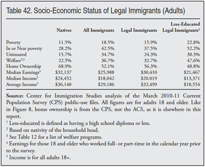
Average income and median earnings show a somewhat different pattern. The gap between immigrants and natives is moderate in size to begin with and excluding illegals narrows the difference further. For example, the average income of all adult immigrants is 81 percent that of natives, for adult legal immigrants it is 90 percent. This confirms what has been shown elsewhere in this report: A large share of immigrants have very low incomes and live in or near poverty, lack insurance, and use the welfare system. But the overall averages or median incomes are closer to natives. This is true for immigrants generally as well as for legal immigrants.
The second conclusion to draw from Table 42 is that legal status is no guarantee of success. Less-educated legal immigrants have low income, low health insurance coverage rates, and high welfare use relative to natives. Many in Congress, as well as President Obama, have argued for giving legal status to illegal immigrants as well as increased levels of legal immigration. Since illegal aliens are overwhelmingly less-educated, we can gain insight into the possible effects of legalization by looking at the economic situation of less-educated legal immigrants. As will be recalled, we estimate that 54 percent of illegal immigrants have not graduated high school and 25 percent have only a high school degree. Thus eight out of 10 illegal immigrants have no more than a high school education.
Table 42 shows that legal immigrants with this level of education make extensive use of the welfare system. Nearly half of households headed by less-educated legal immigrants use at least one major welfare program. The share of adult less-educated legal immigrant adults living in poverty is 23 percent and the share in or near poverty is 52 percent. Poverty and near-poverty are very common among less-educated legal immigrants, as is the share without health insurance (30 percent). Because education is such a key determinant of economic outcomes, legalization will not solve the problems of welfare use or low income associated with an illegal immigrant population that is largely unskilled.56 Further, the results in Table 42 do not mean the socio-economic status of illegal immigrants would not improve with legalization. What it does mean is that a legalization would almost certainly leave illegal immigrants much poorer on average than natives or even the average legal immigrant.57
Conclusion
Immigration continues to be the subject of intense national debate. The more than one million immigrants arriving each year have a very significant effect on many areas of American life. The latest data collected by the Census Bureau show that the last decade was the highest in terms of immigrant arrivals in American history. New immigration plus births to immigrants added more than 22 million people to the U.S. population in the last decade, equal to 80 percent of total population growth. Immigrants and their young children (under 18) now account for more than one in five public school students, one-fourth of those in poverty, and nearly one-third of those without health insurance, creating enormous challenges for the nation’s schools, health care system, and physical infrastructure. The large share of immigrants who arrive as adults with relatively few years of schooling is the primary reason so many live in poverty, use welfare programs, or lack health insurance, not their legal status or an unwillingness to work.
Despite the fact that a large share of immigrants have few years of schooling and low incomes, most immigrants do work. In fact, the share of immigrant men holding a job is higher than that of native-born men. Moreover, the evidence examined in this report and other research makes clear that immigrants make significant progress the longer they reside in the United States. This is even true for the least educated. Unfortunately, this progress still leaves them well behind natives in most measures of socio-economic status even after they have been in the United States for decades. The share of adult immigrants who have lived in the United States for 20 years who are still in poverty or lacking health insurance is at least 50 percent higher than for adult natives. And the share of these long-time resident immigrant households using at least one welfare program is nearly twice that of native households.
At the same time that immigration policy has significantly increased the number of less-educated immigrants, there has been a dramatic deterioration in the labor market position of less-educated natives. Comparing data from the beginning of this decade shows a huge decline in the share of young and less-educated natives holding a job — from two-thirds to just under half. The decline in work among young and less-educated natives began well before the Great Recession. It is very difficult to find any evidence of a shortage of less-educated workers in the United States. Some may argue that immigrants only do jobs that Americans do not want, but an analysis by occupations shows that the vast majority of workers in almost every job are U.S.-born, including three-fourths of janitors and two-thirds of construction laborers and meat processors.
A central question for immigration policy is: Should we continue to allow in so many people with little education — increasing potential job competition for the poorest American workers and the population in need of government assistance? Setting aside the lower socio‑economic status of immigrants, no nation has ever attempted to incorporate 40 million newcomers into its society. Those concerned about population growth point to added sprawl, traffic, pollution, and overall impact on the quality of life that may come from causing so much population growth from one government policy — immigration. Supporters of population growth point to the greater opportunities for businesses, workers, and consumers that it may create. However one approaches population increase, it is clear that immigration has become the determinant factor in U.S. population growth. It is equally clear that while immigration makes the U.S. population much larger, it does not make the population significantly younger.
Whatever one’s view of immigration, it is critically important to understand that its effect on America represents a choice. Selection criteria can be altered, as can the total number of people allowed into the country legally. Moreover, the level of resources devoted to reducing illegal immigration can also be reduced or increased.
The goal of this paper has been to provide information about the impact of immigration on American society to better inform the policy discussion about what kind of immigration policy should be adopted in the future. Absent a change in policy, 12 to 15 million additional legal and illegal immigrants will likely settle in the United States in just the next 10 years. Thus, immigration’s impact will continue to grow if current trends continue.
End Notes
1 It does not include those born abroad of American parents or those born in outlying territories of the United States such as Puerto Rico.
2 For the post-1980 immigrant population, the Department of Homeland Security estimates a 5 percent undercount in the ACS. See the DHS publication "Estimates of the Unauthorized Immigrant Population Residing in the United States: January 2011", at http://www.dhs.gov/xlibrary/assets/statistics/publications/ois_ill_pe_2…. The Pew Hispanic Center comes to a similar conclusion in their analysis of the Current Population Survey. See "Trends in Unauthorized Immigration: Undocumented Inflow Now Trails Legal Inflow", October 2008, at http://pewhispanic.org/files/reports/94.pdf.
3 See, for example, "Immigration and Economic Stagnation: An Examination of Trends 2000 to 2010", November 2010, https://cis.org/highest-decade. See also "Homeward Bound: Recent Immigration Enforcement and the Decline in the Illegal Alien Population", July 2008, https://cis.org/trends_and_enforcement; and "A Shifting Tide: Recent Trends in the Illegal Immigrant Population", July 2009, https://www.cis.org/IllegalImmigration-ShiftingTide.
4 The Pew Hispanic Center assumes a 5.2 percent undercount of the total foreign-born in the 2005 CPS. See Figure 3, p. 4 in their March 2006 estimate of the illegal population, at http://pewhispanic.org/files/reports/61.pdf. Pew bases its 5.2 percent estimate on work done by Passel, Van Hook, and Bean. Their paper, "Narrative Profile with Adjoining Tables of Unauthorized Migrants and Other Immigrants, Based on Census 2000: Characteristics and Methods", was done for Sabre Systems as part of a contract with the Census Bureau.
5 See End Note 2 for a discussion of the ACS and the decennial census.
6 Starting in 1970, the Census began to ask about year of arrival, so arrival by decade is available for the 1960s onward. Administrative data on legal immigration goes back to 1820 and shows that no decade comes close to the nearly 14 million immigrants who arrived from 2000 to 2010.
7 If we line up the arrival data with job growth and compare January 1990 to April of 2000 (the date of the Census), job growth was 22 million. If we compare January 2000 to July 2010 (the control data for the ACS) we find a decline of 425,000 jobs. In a previous study we reported a net decline of over a million jobs from 2000 to 2010 and a net gain of some 21 million from 1990 to 2000. That study, "Immigration and Economic Stagnation: An Examination of Trends 2000 to 2010", https://www.cis.org/highest-decade, used the year of arrival data from the Current Population Survey, which is taken in March. The Census is taken in April and the ACS is weighted to reflect the population in July. Although the months compared in that earlier study were different, resulting in somewhat different job figures, the basic conclusion is exactly the same. Immigration was higher 2000 to 2010 compared to 1990 to 2000, even though the economy was fundamentally different in each decade. Historical data from 1994 to the present can be found at http://www.bls.gov/schedule/archives/empsit_nr.htm#2010. Figures for January 1990 can be found in the November 1990 issue of Monthly Labor Review, at http://www.bls.gov/opub/mlr/1990/11/rpt1full.pdf.
8 For example, new arrivals were very high in 2000 based on the year of arrival data (Figure 3) from the 2001 ACS, but there was little growth in the foreign-born between 2000 and 2001 (Figure 2). However, the 2000 total foreign-born number is from the decennial census, while the 2001 total and the arrival data for that year are from the ACS. The ACS was not fully implemented in 2001, and that survey differs from the Census in other ways that may explain why high levels of new immigration in 2000 did not produce high growth in the immigrant population. Another seeming incongruity is the high growth from 2003 to 2004 of 1.4 million (Figure 2), yet Figure 3 shows new arrivals were only 1.2 million in 2003. Also there was very high growth (1.9 million) from 2004 to 2005 even though new arrivals in 2004 were 1.35 million. However, it must be remembered that the ACS reflects a July 1 estimate of the U.S. population, including the foreign-born. So individual year of arrival data, which correspond to calendar year, do not directly compare to growth July 1 to July 1 of each year. Moreover, the ACS was not fully implemented until 2005 and individuals in group quarters were not included in the ACS until 2006. These factors also impact year-to-year comparisons. All of these issues create important breaks in the continuity of the data.
9 Because the public-use ACS files report individual year of arrival, it is easy to calculate the average length of time immigrants have been in the country in 2010.
10 The figures for Tables 3 and 4 come from a Center for Immigration Studies analysis of the 2010 public-use file of the American Community Survey, which shows 39,916,875 immigrants. However the public-use ACS files, while designed to be representative of the ACS data used internally by the Census Bureau, do not exactly match the internal file, hence the 39,000 (0.01 percent) difference in the totals found in Tables 3 and 4 compared with the totals in Tables 1, 2, and 5, which come from the internal data used by the Census Bureau in American FactFinder.
11 Countries that can be identified in the public-use ACS file and for which there were actually respondents by region are as follows: Central America: Belize, Costa Rica, El Salvador, Guatemala, Honduras, Nicaragua, and Panama. South America: Argentina, Bolivia, Brazil, Chile, Colombia, Ecuador, Guyana, Paraguay, Peru, Uruguay, Venezuela, and South America not specified. South Asia: Afghanistan, India, Bangladesh, Pakistan, Sri Lanka, and Nepal. East Asia: China, Hong Kong, Taiwan, Japan, Korea, Cambodia, Indonesia, Laos, Malaysia, Philippines, Singapore, Thailand, Vietnam, Burma, East Asia and Asia not specified. Europe: Denmark, Finland, Iceland, Norway, Sweden, United Kingdom, Ireland, Belgium, France, Netherlands, Switzerland, Albania, Greece, Macedonia, Italy, Portugal, Spain, Austria, Bulgaria, Czechoslovakia, Slovakia, Czech Republic, Germany, Hungary, Poland, Romania, Yugoslavia, Croatia, Bosnia, Estonia, Latvia, Lithuania, Byelorussia, Moldova, Ukraine, Armenia, Georgia, Russia, USSR not specified, and Europe not specified. Caribbean: Bermuda, Cuba, Dominican Republic, Haiti, Jamaica, Antigua-Barbuda, Bahamas, Barbados, Dominica, Grenada, St. Kitts-Nevis, St. Lucia, St. Vincent, Trinidad and Tobago, and Caribbean and West Indies not specified. Middle East: Azerbaijan, Kazakhstan, Uzbekistan, Iran, Iraq, Israel/Palestine, Jordan, Kuwait, Lebanon, Saudi Arabia, Syria, Turkey, Yemen, Algeria, Egypt, Morocco, Sudan, and North Africa not specified. Sub-Saharan Africa: Cape Verde, Ghana, Guinea, Liberia, Nigeria, Senegal, Sierra Leone, Ethiopia, Kenya, Somalia, Tanzania, Uganda, Zimbabwe, Eritrea, Cameroon, South Africa, and Africa and Western and Eastern Africa not specified.
12 This is based on the number of immigrants in the 2010 ACS who indicated that they arrived in 2000.
13 Based on the child's age, the March 2010 Current Population Survey shows that there were 8.981 million children born in the United States to immigrant fathers during the prior decade. Of these births 2.257 million were to fathers who arrived in 2000 or later. All of these children were living in the United States in 2010.
14 It may also be helpful to think about the limitations of using just growth in the immigrant population by considering the fact that if, say, one million immigrants enter the country each year, at some point one million immigrants will eventual die a year, assuming no out-migration. This would mean that the arrival of one million new immigrants roughly equaled deaths and thus there is no growth in the foreign-born population. But of course the U.S. population would in fact be much larger with the arrival of one million new immigrants regardless of mortality.
15 For a discussion of the decline in immigrant education relative to natives, see "The Slowing Progress of Immigrants: An Examination of Income, Home Ownership, and Citizenship, 1970-2000", at https://cis.org/sites/cis.org/files/articles/2001/back401.html.
16 This figure refers to persons 18 or older who are in the workforce. To be in the workforce one has to be either employed or actively looking for work. Persons actively looking for work are considered unemployed.
17 The median figures in Table 7 and all subsequent tables, including those for households, are calculated using the Census Bureau method of grouping data into $2,500 cells. While the median figures in this Backgrounder very closely match median figures published by the Census Bureau, they may not exactly match in all cases because the bureau top-codes income figures in the public-use files of the CPS.
18 The report, "Immigration in an Aging Society Workers, Birth Rates, and Social Security", can be found at https://cis.org/sites/cis.org/files/articles/2005/back505transcript.html.
19 See p. 21 of the Census Bureau's "Methodology and Assumptions for the Population Projections of the United States: 1999 to 2100", at www.census.gov/population/www/documentation/twps0038.pdf.
20 The report, "100 Million More: Projecting the Impact of Immigration on the U.S. Population, 2007 to 2060", can be found at https://cis.org/sites/cis.org/files/articles/2007/back707.html.
21 It should be noted that the unemployment rate cannot be calculated by comparing the difference between those with a job and those in the labor force because the Bureau of Labor Statistics calculates unemployment by dividing those actively looking for a job by the labor force. In contrast, the share holding a job or the share in the labor force are based on the entire 18- 65-year-old population.
22 Like official U.S. government poverty statistics, the poverty statistics in this report do not include persons under age 15 unrelated to the household head. This excludes about 400,000 children, who are mostly in foster care.
23 Figures for natives exclude the young (under 18) U.S.-born children of immigrant fathers.
24 Countries that can be identified in the public-use CPS files and for which there were actually respondents by region are as follows: Europe: Albania, Austria, Belgium, Bulgaria, Czechoslovakia, Denmark, Finland, France, Germany, Greece, Hungary, Ireland, Italy, Netherlands, Norway, Poland, Portugal, Romania, Spain, Sweden, Switzerland, United Kingdom, Yugoslavia, Czech Republic, Slovakia, Bosnia & Herzegovina, Croatia, Macedonia, Serbia, Latvia, Lithuania, Armenia, Belarus, Georgia, Moldova, Ukraine, Russia/USSR not specified, Kosovo, Cyprus, and Europe not specified. South Asia: Afghanistan, Bangladesh, India, Nepal, Pakistan, and Sri Lanka. East Asia: Myanmar, Cambodia, China, Indonesia, Japan, Korea, Malaysia, Philippines, Singapore, Thailand, Vietnam, and Asia not specified. Middle East: Azerbaijan, Iran, Iraq, Israel, Jordan, Kuwait, Laos, Lebanon, Saudi Arabia, Syria, Turkey, Uzbekistan, Yemen, Algeria, Egypt, Morocco, and Sudan. Central America: Belize, Costa Rica, El Salvador, Guatemala, Honduras, Nicaragua, and Panama. Caribbean: Bermuda, Antigua and Barbuda, Bahamas, Barbados, Cuba, Dominica, Dominican Republic, Grenada, Haiti, Jamaica, St. Kitts-Nevis, St. Lucia, St. Vincent and the Grenadines, Trinidad and Tobago, and West Indies not specified. South America: Argentina, Bolivia, Brazil, Chile, Colombia, Ecuador, Guyana, Paraguay, Peru, Uruguay, Venezuela, and South America not specified. Sub-Saharan Africa: Cameroon, Cape Verde, Ethiopia, Eritrea, Ghana, Kenya, Liberia, Nigeria, Senegal, Sierra Leone, Somalia, South Africa, Tanzania, Uganda, Zimbabwe, and Africa not specified.
25 Sarita A. Mohanty, Steffie Woolhandler, David U. Himmelstein, Susmita Pati, Olveen Carrasquillo, and David H. Bor, "Health Care Expenditures of Immigrants in the United States: A Nationally Representative Analysis", American Journal of Public Health, Vol. 95, No. 8.
26 Using the revised weights from the March 2000 CPS shows 40.23 million uninsured in 1999, for a growth of 9.68 million compared to the March 2011 CPS. The 2011 CPS shows 6.2 million uninsured immigrants in the country who arrived in 2000 or later and that 385,000 of those same immigrants have U.S.-born children who are uninsured.
27 Figures for immigrants include the U.S.-born children (under 18) of immigrant fathers. Figures for natives exclude these children.
28 See, for example, Figures 20-1, 20-2, and 20-3 in "Profiles of the Foreign-born Population in the United States 2000", U.S. Government Printing Office. Dianne A. Schmidley, Series P23-206.
29 See Appendix F in Measuring the Effect of Benefits and Taxes on Income and Poverty: 1992, U.S. Census Bureau, for a discussion of under-reporting of income and receipt of redistribution programs.
30 The Census Bureau released the 2011 CPS without figures for the EITC and ACTC, thus the figures for the Credit are from the 2010 CPS. The Additional Child Tax Credit can also be referred to as the refundable portion of the Child Tax Credit. Table 12 reports those who are eligible for cash from the government, not just a refund of money they paid as taxes.
31 Use of welfare for both immigrants and natives in the CPS is understated because people forget about use when answering the survey. This is particularly true of Medicaid and cash assistance programs, which administrative data show are somewhat higher than the numbers found in the CPS.
32 The primary refugee-sending countries that can be identified in the CPS are Albania, the former Yugoslavia, the former USSR, Afghanistan, Iraq, Cuba, Ethiopia, Eritrea, Liberia, Sierra Leone, Somalia, Sudan, Vietnam, Cambodia, Laos, and Nicaragua.
33 See "Measuring Overcrowding in Housing, 2007", from the U.S. Department of Housing and Urban Development Office of Policy Development and Research, at www.huduser.org/publications/pdf/Measuring_Overcrowding_in_Hsg.pdf. It is worth noting that for reasons that are not entirely clear there has been a significant decline in household overcrowding. There is debate about how much of this decline is due to changes in data collection and how much is a real decline. But this issue does not affect the analysis in this report because we are only examining figures for a single year.
34 To calculate household size we exclude all those in group quarters such as prisons, nursing homes, and college dorms.
35 Calculations of home ownership exclude those in group quarters.
36 All immigrants in the ACS are asked what year they came to the United States. For the purposes of this analysis, 20 years is defined in the 2010 ACS as having entered the country in 1989, 1990, or 1991. We average three years together in order to obtain a more robust estimate.
37 The March 2010 Current Population Survey (CPS) shows that 20.5 percent of school-age children have an immigrant father and the March 2011 CPS for 2010 shows 21.3 percent of the school-age population have an immigrant father. Both the ACS and CPS produce very similar results, but we use the ACS because, unlike the March CPS, it distinguishes between public and private schools. Another advantage of the ACS is that it includes a question on language, which is an important issue in public education.
38 As is the case in other tables, the figures for natives exclude the U.S.-born children under age 18 of immigrant fathers.
39 Poverty, earnings, health insurance, and welfare use are based on the March 2011 CPS. Those in the country five or fewer years arrived in 2006 or later. Those in the United States 20 years arrived from 1988 to 1993. By 2011, on average, these immigrants had lived in the country for 20.5 years. Coding the data in this way by year of arrival is necessary given the way respondents are grouped by the Census Bureau in the public-use files. Also, grouping 1988 to 1993 provides for a larger sample. Homes ownership is based on the ACS, and those in the country for 20 years arrived in 1989, 1990, or 1991.
40 It is not possible to identify generations beyond the third with the CPS, so all those with two U.S.-born parents constitute the "third generation-plus", regardless of where their grandparents were born.
41 The 2010 ACS shows that 55 percent of immigrant women who had a child in the prior year were Hispanics. The 2011 CPS shows that, of U.S.-born children in the United States with an immigrant father, 59 percent are Hispanic.
42 Brian Duncan and Stephen J. Trejo, "Ancestry vs. Ethnicity: The Complexity and Selectivity of Mexican Identification in the United States", pp. 31-66 in Amelie F. Constant, Konstantinos Tatsiramos, and Klaus F. Zimmermann, eds., Ethnicity and Labor Market Outcomes (Research in Labor Economics, Volume 29), 2011. And "Who Remains Mexican? Selective Ethnic Attrition and the Intergenerational Progress of Mexican Americans", pp. 285-320 in David Leal and Stephen Trejo, eds., Latinos and the Economy: Integration and Impact in Schools, Labor Markets, and Beyond, New York: Springer.
43 A modest share of the "third generation-plus" are decedents of people living in Texas or the American southwest when it was part of the Spanish Empire or Mexico.
44 Of second-generation adult Hispanics, 9.5 percent used Medicaid compared to 14 percent of third-generation Hispanics.
45 The median earnings of foreign-born Hispanics are $20,727, or 62 percent that of non-Hispanic natives ($33,435); for second-generation Hispanics it is $24,390, or 73 percent that of non-Hispanic natives; and it is $26,926, or 81 percent that of non-Hispanic natives for third-generation Hispanics.
46 The average age of adult second-generation Hispanics in the 2011 CPS is 33.8 and for the third generation-plus, it is 41 years. This compares to the average age of 47.2 years for adult U.S.-born non-Hispanics.
47 See for example, Patricia Gandara and Frances Contreras, The Latino Education Crisis: The Consequences of Failed Social Policies, Harvard University Press, 2009; and Carola Suárez-Orozco, Marcelo M. Suárez-Orozco and Irina Todorova, Learning a New Land: Immigrant Students in American Society, 2008.
48 In his work, Harvard economist George Borjas has emphasized that large initial differences in human capital among the immigrant generation can persist through into following generations. See for example, George J. Borjas, "The Intergenerational Mobility of Immigrants", Journal of Labor Economics,1993; and George Borjas, "Working Paper 12088", in Making It in America: Social Mobility in the Immigrant Population, National Bureau of Economic Research, 2006, http://www.nber.org/papers/w12088. See also Stephen J. Trejo, "Why Do Mexican Americans Earn Low Wages?" Journal of Political Economy, Vol. 105, No. 6, December 1997; and Gretchen Livingston and Joan R. Kahn, "An American Dream Unfulfilled: The Limited Mobility of Mexican Americans", Social Science Quarterly, Vol. 83, No. 4, December 2002.
49 As will be recalled from the discussion on page 29, 50.2 percent are on Medicaid or uninsured based on the 2011 CPS alone. This is very similar to the 49 percent shown when using a combined sample of the 2010 and 2011 CPS.
50 To distinguish legal from illegal immigrants in the survey, this report uses citizenship status, year of arrival in the United States, age, country of birth, educational attainment, sex, receipt of welfare programs, receipt of Social Security, veteran status, and marital status. We use these variables to assign probabilities to each respondent. Those individuals who have a cumulative probability of 1 or higher are assumed to be illegal aliens. The probabilities are assigned so that both the total number of illegal aliens and the characteristics of the illegal population closely match other research in the field, particularly the estimates developed by the Department of Homeland Security/legacy INS, the Urban Institute, and the Pew Hispanic Center. This method is based on some very well-established facts about the characteristics of the illegal population. For example, it is well known that illegal aliens are disproportionately young, male, unmarried, under age 40, have few years of schooling, etc. Thus, we assign probabilities to these and other factors in order to select the likely illegal population. In some cases, we assume that there is no probability that an individual is an illegal alien.
51 Both DHS estimates and Pew Hispanic estimates assume this level of undercount in the Census Bureau data.
52 The Department of Homeland Security (DHS) estimate of 11.5 million illegal immigrants in January 2011 can be found at http://www.dhs.gov/xlibrary/assets/statistics/publications/ois_ill_pe_2…. That estimate includes an adjustment for those missed in Census Bureau data. The Pew Hispanic Center has estimated a 11.2 million illegal immigrant population as of March 2010 based on the CPS. This includes an adjustment for those missed by the survey. The Pew report can be found at http://www.pewhispanic.org/2011/02/01/unauthorized-immigrant-population…. Older studies by the INS and Census Bureau are also available. The INS report that found seven million illegal aliens in 2000 and an annual increase of about 500,000 can be found at http://www.dhs.gov/xlibrary/assets/statistics/publications/Ill_Report_1…. The Census Bureau estimate of eight million illegals in 2000 can be found at www.census.gov/dmd/www/ReportRec2.htm. (Appendix A of Report 1 contains the estimates.)
53 The 2011 CPS by itself, reported in Table 10, showed 13.5 percent in poverty.
54 To identify illegal immigrants in the CPS we assume that a household head who reports living in public or subsidized housing cannot be an illegal immigrant. This does not mean that illegal immigrants do not live in subsidized housing. It simply means they cannot be the name on the lease, which is one of the things that defines the household head.
55 To calculate median income in the way that the Census Bureau does, it is necessary to group data into cells. But the number of illegal alien households, which is much smaller than the number of illegal alien individuals, is not large enough in most states to do this and still produce reliable results. In contrast, a mean or average figure does not require the grouping of data so it is possible to calculate average income for illegal immigrant households, even in smaller states.
56 As already discussed, if we have overestimated welfare use for households headed by illegal aliens, then legal immigrants, particularly the unskilled, must have even higher welfare use rates than reported here. This would mean that legalization would be even more costly because the difference between what illegals currently use and what they would use once legalized is even larger. This has to be the case mathematically because immigrant households accessing the welfare system can only be legal immigrants or illegal aliens and we simply take the welfare use rates for the foreign-born as reported in the CPS. We do not impute welfare use or change the share using welfare for the foreign-born in any way.
57 It should be pointed out that adult, less-educated legal immigrants in the CPS have lived in the United States longer than the average illegal immigrant. Over time income rises. The estimates for less-educated legal immigrants reflect this fact. Thus, less-educated legal immigrants in the CPS have higher incomes than would be expected for legalized illegal immigrants after any amnesty, at least initially.
Appendix