Download a pdf of this Backgrounder
Steven A. Camarota is the Director of Research at the Center for Immigration Studies.
New Census Bureau data collected in March of this year show that 13.1 million immigrants (legal and illegal) arrived in the previous 10 years, even though there was a net decline of a million jobs during the decade. In contrast, during the 1990s there was a net growth of 21 million jobs and 12.1 million new immigrants arrived. Despite fundamentally different economic conditions, the level of immigration was remarkably similar for both 10-year periods.
- The March 2010 data show that 13.1 million immigrants (legal and illegal) have arrived in the United States since January 2000. This is the case despite two significant recessions during the decade and a net loss of a million jobs.
- Data collected in March 2000 show one million fewer immigrants arrived from January 1990 to March 2000 (12.1 million), while 21 million jobs were created during the decade.
- In 2008 and 2009, 2.4 million new immigrants (legal and illegal) settled in the United States, even though 8.2 million jobs were lost over the same period.
- The new data indicate that in the absence of a change in U.S. immigration policy, the level of new immigration can remain high even in the face of massive job losses.
- Immigration is a complex process. It is not simply a function of U.S. labor market conditions. Factors such as the desire to be with relatives or to access public services in the United States also significantly impact migration.
- Although new immigration remains high, the 2.4 million new arrivals represent a decline from earlier in this decade. In the two years prior to 2006, for example, there were 2.9 million arrivals, according to Census Bureau data.
- There was no significant change in legal immigration during the past decade. Although the number of jobs declined in the decade just completed, 10.3 million green cards were issued from 2000 to 2009, more than in any decade in American history.
- Illegal immigrants also continue to arrive, though prior research indicates that the number coming dropped significantly at the end of the decade.
- The new data not only indicate that there was a slowdown in immigration in 2008 and 2009, it also indicates there was a substantial increase in the number of immigrants who returned to their home counties, particularly in 2008.
- The overall immigrant population grew to 37.6 million in March 2010. This does not include those living in group quarters, such as prisons and nursing homes. Including these individuals makes for a total immigrant population of 38.2 million.
Introduction
The findings in this Backgrounder indicate that the number of immigrants who arrived in the first decade of this century was very high, despite a weak economy for much of the decade. For example, between April 2001 and November 2004 there was no net increase in the number of jobs. There was also no net job growth between January 2008 and the end of the decade. Overall, there was a net decline of one million jobs during the entire decade even though the U.S. population grew by roughly 29 million during the decade.1 Many factors in addition to the economy impact immigration levels. While the level of new immigration remained very high throughout the last decade, the number of new arrivals was smaller at the end of the decade than at the beginning. This almost certainly reflects, at least in part, the dramatic deterioration in the U.S. economy from 2008 onward.
The data for this Backgrounder come primarily from the March Current Population Surveys (CPS), collected by the Census Bureau. The CPS asks immigrants when they came to the United States. As already indicated, the March 2010 CPS shows 13.1 million immigrants arrived in the last decade, compared to 12.1 million arrivals in the 1990s. Statistically, the figures for the decade just completed are higher than for the 1990s. Based on CPS data, the first decade of this century was the highest decade of immigration in the nation’s history. However, data from the 2000 decennial census show 13.2 million new immigrants arrived in the 1990s. Statistically this is the same as the 13.1 million from the 2010 CPS for the first decade of this century.2 Thus, comparing the 2000 census to the 2010 CPS shows the two decades were equal. No other decade in American history comes close to the level of immigration in the last two decades. In the 1980s, which like the 1990s was also a period of economic expansion, 8.7 million new immigrants arrived.3
It is worth noting that the 2010 decennial census, which will be released shortly, has no immigration questions. There is another Census Bureau survey called the American Community Survey (ACS), which does asks about immigration. The 2010 ACS will not be available for another year, however. While the 2010 ACS should provide an estimate of new immigrants similar to the 2010 CPS, in the past the ACS has tended to show several hundred thousand more new arrivals. It is possible the ACS will show that immigration in the decade just completed will exceed that of the 1990s, even in comparison to the 2000 census.4 At this point, based on the CPS, what we can say is that immigration in the first decade of the 21st century was at least as high as the 1990s, despite very different economic situations.
Data and Methods. The data for this Backgrounder come primarily from the CPS collected by the Census Bureau. The March data, also called the Annual Social and Economic Supplement, is considered such an accurate source of information on the foreign-born because, unlike the decennial census or American Community Survey, each household in the CPS receives an in-person interview from a Census Bureau employee.5 The foreign-born are defined as persons living in the United States who were not U.S. citizens at birth.6 In this report the terms foreign-born and immigrant are used synonymously. The CPS generally does not include group quarters, such as prisons, nursing homes, and college dorms. The inclusion of those in group quarters would raise the total foreign-born population to 38.2 million in March 2010.7 The immigrant population in the 2010 CPS includes roughly 10 million illegal aliens and at least one million persons on long-term temporary visas, mainly students and guestworkers.8 Also, some percentage of the foreign-born (especially illegal aliens) are missed by government surveys of this kind.
Later in this report we examine the American Community Survey, which also asks individuals if they are immigrants. As already indicated, data from the 2010 ACS will not be available for another year, so it will be some time before data for the entire decade can be analyzed from the ACS. Data from the 2009 ACS are also used in this Backgrounder.
Recent Trends in Immigration
Figure 1 reports the number of immigrants living in the United States based on the CPS collected in March of each year from 1995 through 2010.9 Again, the CPS does not include persons in group quarters. Including those individuals would add another 500,000 to 600,000 to the total number of immigrants living in the country for any given year. Figure 1 shows that between March 2000 and March 2005 the foreign-born population grew by 5.2 million, or somewhat over one million a year. The figure also shows that between 2005 and 2010 the immigrant population grew by 2.4 million, or by about half a million a year. The 2007 figure of 37.3 million immigrants is not statistically different from the 2010 figure of 37.6 million. Thus, there has been no significant growth in the immigrant population over the last three years. However, the growth from 36.8 million in 2009 to 37.6 million in 2010 is statistically significant.10 Figure 1 indicates that the foreign-born population may be rebounding. While the growth in the last year is statistically significant, one year of data is not necessarily a trend and should be interpreted with caution.
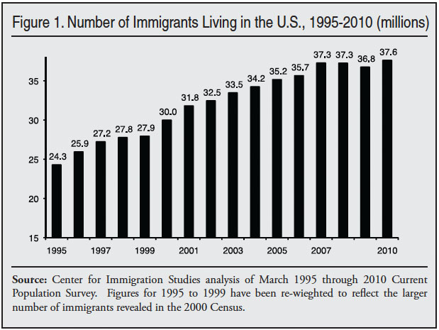
Deaths and Out-Migration. When growth in the foreign-born population is discussed, it must be remembered that all children born in the United States to immigrants are, by definition, natives. So the sole reason for an increase in the foreign-born population is new immigration. Moreover, the increase over time represents a net figure and does not reflect the level of new immigration.
New arrivals are offset by deaths and out-migration. Given the age, sex, and other demographic characteristics of the immigrant population, it is likely that there are about 7,000 deaths per million immigrants each year or somewhat over 200,000 a year during the last decade. This rate does not change much from year to year, but it does increase gradually over time as the immigrant population grows. As a result, there were roughly 100,000 more deaths a year among immigrants in 2010 than in 1995 because the overall population is 13.3 million larger. This means that a slower net increase in the immigrant population may not indicate a falling level of new immigration.
In addition to deaths, new arrivals are also offset by return migration. There is an ongoing debate about the size of return migration, especially with regard to recent trends. Some time ago the Census Bureau estimated that some 280,000 immigrants living here returned home each year.11 But it is not at all clear if that number is correct or even relevant to the current situation. Later in this report we estimate the level of out-migration over the course of the decade. Out-migration can have a significant impact on the number of immigrants in the country. For example, the decline in the size of the foreign-born population from 2007 to 2008 is likely to be the result, at least in part, of an increase in immigrants returning to their home countries.
New Immigrants over the Last Decade. Another way to examine trends in immigration is to look at responses to the year of arrival question. The CPS asks individuals when they came to America to stay. However, in order to preserve anonymity, the Census Bureau groups several different years of arrival together in the public-use CPS. Table 1 shows the number of new arrivals as it is grouped in each CPS from 2000 to 2010. So, for example, the table reads as follows: in the March 2010 CPS, 2.44 million new immigrants said they arrived in 2008, 2009, or the first part of 2010. In March 2009, 3.5 million immigrants said they arrived in 2006, 2007, 2008, or the first part of 2009. Table 1 allows the reader to look at individual entering cohorts or to collapse several together.
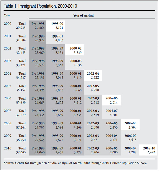
The March 2010 CPS indicates that 13.1 million immigrants (legal and illegal) settled in the United States between January 2000 and March 2010. This implies that about 1.3 million new immigrants arrived annually in the United States in the last 10 years. Of course, some of the immigrants who arrived in 2000 through 2009 would have died or returned home by 2010, so the actual level of new arrivals is somewhat higher. Given the economic problems in the last decade we would expect a higher fraction of those who arrived in the decade to leave by its end than did in the 1990s. Some share of the foreign-born population is also missed by the Census Bureau. Some prior research indicates that 5.2 percent of all immigrants are missed in the CPS.12 The share of new arrivals missed by the CPS is almost certainly higher, however, because a large fraction are in the country illegally and because they are the least established part of the foreign-born population, making them harder for the Census Bureau to count. So the actual level of new immigration could be 1.4 million or even 1.5 million a year for the decade.13
The Past Decade May Exceed the 1990s. The March 2000 CPS showed 12.1 million new arrivals between January 1990 and March 2000. (This information is not shown in Table 1.) Compared to the 13.1 million for the first decade of this century, the 1990s had less new immigration. This difference is statistically significant. If the two CPS’s are compared, the last decade exceeded the 1990s. However, as already mentioned, the 2000 decennial census showed 13.2 million arrivals, which statistically is the same as the 13.1 million in the 2010 CPS.
The finding that the 2010 CPS shows a higher level of immigration in the last decade than the 2000 CPS shows for the 1990s is important because the two decades were very different in terms of job growth. There were two significant recessions during the first decade of this century, plus the September 11 terrorist attacks. During the decade there was actually a net loss of about one million jobs according to the Bureau of Labor Statistics (BLS).14 In contrast, the BLS reports a net increase in jobs of about 21 million in the 1990s.15
This finding that immigration in the decade just completed was at least equal to the 1990s is significant because it is a reminder that immigration is a complex process and not simply a function of labor market conditions. Such factors as the desire to be with relatives, political freedom, lower levels of official corruption, and the generosity of American public services are all among the reasons people come to the United States. These things do not change during a recession, even a steep one. Moreover, the employment and wages available in the United States may still be much better than in many of the primary immigrant-sending countries, even during a severe economic downturn. It is also important to understand that immigration is driven by social networks of friends and family who provide information about conditions in the United States to those back home, which both makes them more aware of opportunities in the United States and more likely to come. Also, new immigrants often live with friends who can help the new arrivals. Thus as the immigrant population grows, it creates pressure and opportunities for more immigration. As a result, immigration can remain very high even if there is no job growth in the United States. This does not mean that the economic factors are unimportant. But the fact that at least as many immigrants arrived in the first decade of the 21st century than in the 1990s is a clear indication that factors other than the state of the U.S. economy matter a great deal.
Legal Permanent Immigration. Although there was a net decline of one million jobs during the decade, 10.3 million green cards were issued from 2000 to 2009, making it the highest decade of legal immigration in the nation’s history. These figures are for permanent immigration that allows individuals to stay as long as they like and become citizens if they choose, normally after five years. In comparison to the decade just completed, 9.8 million green cards were issued from 1990 to 1999, including several hundred thousand amnesty beneficiaries at the beginning of the decade.16 In addition to permanent immigration, several hundred thousand long-term temporary visas that allow recipients to work in the United States were issued each year during the decade. This includes such categories as H1-B, H2-B, H1-A, I, J, L, P, and TN visas. It must be pointed out that many new green card holders are not new arrivals in the county. In recent years more than half have been individuals already in the country, either temporary visa holders or illegal immigrants “adjusting status” from within the United States.
New Immigration and Job Growth. While overall new immigration in the last decade may have been somewhat higher than in the 1990s, this does not mean that there was no variation within the decade. Estimating how immigration may have changed during the decade is difficult. As we have seen in Figure 1, growth in the foreign-born population varied during the decade. The CPS is not designed to measure migration year by year, however. Further, as discussed above, the grouping of multiple years of entry together adds to the difficulty of estimating individual year of arrival data using the CPS. Figure 2 attempts to overcome these problems by subtracting the number in the most recent arriving cohort or cohorts from the previous year’s most recent arriving cohort(s). The difference between cohorts should show the number of new immigrants. So, for example, to estimate the number who arrived in 2009, the 3.5 million immigrants who arrived between 2006 and 2009 (shown in the 2009 CPS) is subtracted from the 4.7 million who arrived between 2006 and 2010 (shown in the 2010 CPS). The difference of 1.2 million should be the number who came between March 2009 and March 2010. Since the overwhelming majority of this new immigration occurred in 2009, 1.2 million should be the number of new arrivals for that year and is reported in that way in Figure 2.
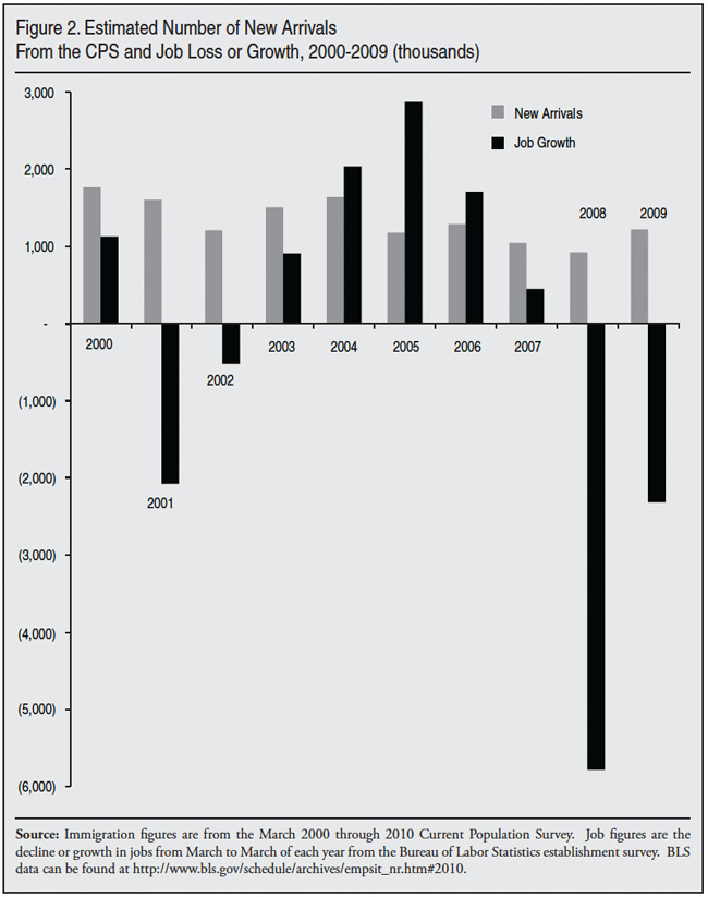
While the approach described above is not without problems, it should provide some insight into trends over the course of the decade.17 The cumulative number of new arrivals shown in Figure 2 for the entire decade 2000 to 2009 is 13.35 million, and this is very similar to the 13.1 million for the decade from the March 2010 CPS. We would expect the cumulative number of new arrivals in Figure 2 to be somewhat higher than the total for the decade shown in the 2010 CPS because some immigrants who arrived during the decade returned home or died before the decade ended and would not show up in the 2010 CPS. The fact that these two numbers line up so well gives us some confidence that the results reported in Figure 2 are correct.
Figure 2 shows that there has been significant variation in the number of new arrivals during the decade. Of course, this can also be seen simply by looking at Table 1. In general, new immigration seems to have declined during the decade, with an increase in the last year. In addition to reporting the estimated number of new arrivals, Figure 2 also shows the net increase in the number of jobs created or lost from March of each year to the next as reported by the Bureau of Labor Statistics.18 When compared to new immigration, it is very hard to see any clear relationship between immigrant in-flows and the creation or loss of jobs. The correlation between the two is only .39, which is low. The square of a correlation, in this case .15, can be interpreted to mean that employment growth explains 15 percent of immigrant in-flows. If we correlate new immigration with job growth/decline in the prior year, on the assumption that it takes time to stimulate immigration, the coefficient is even weaker. Of course, correlations are just one way of measuring the relationships between two variables and the results should not be seen as definitive.
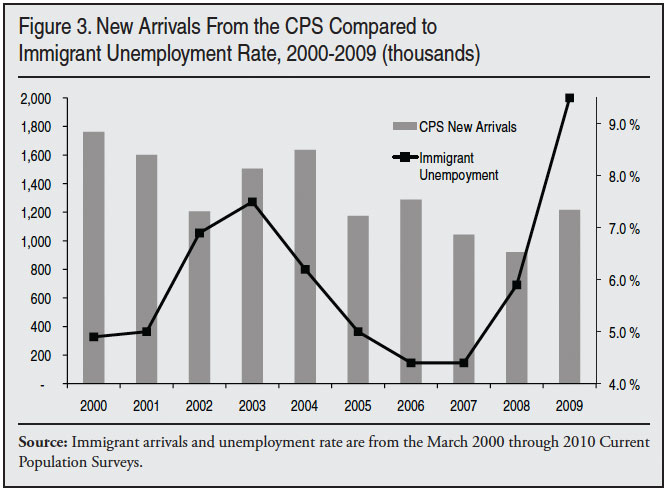
Figure 3 reports new arrivals and the unemployment rate for immigrants in March of each year based on the CPS. That is, it shows the number of immigrant who arrived each year and unemployment in March. So, for example, the March 2001 CPS is used to measure arrivals for 2000 and unemployment for 2000 comes from the 2000 CPS. This would seem to be a good test of the relationship between the economy and immigration levels arrivals because it is measuring unemployment at the start of the year and then reports the number of immigrants who came into the country during the year. We would expect that if unemployment was low, immigration levels would be high. This approach may be a better way of examining the relationship between immigration levels and jobs because it directly measures the employment situation of immigrants rather than aggregate job growth, as is the case in Figure 2. Figure 3 does not show a clear relationship between the unemployment rate of immigrants and the number of new arrivals. The correlation is even weaker than in Figure 2.
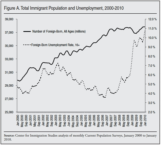
This report primarily uses the March CPS for reasons mentioned in the methods section. Figure A at the end of the report uses the total foreign-born population from the CPS collected each month from January 2000 to January 2010. Figure A also does not show a clear relationship between immigrant employment and the size of the immigrant population.
The correlation between the monthly size of the immigrant population and unemployment is in the wrong direction. (Immigrant flows should be negatively correlated with unemployment; as unemployment rises, the immigrant population should fall.) However, if we look at the relationship between the change in the size of the immigrant population year over year by month with the change in the monthly unemployment rate, then the correlation is much stronger. The correlation for the decade is -.55, which means that as unemployment went up over the course of the year, the size of the immigrant population grew less or actually declined. The square of a correlation, in this case .30, can be interpreted to mean that changes in the monthly unemployment rate of immigrants explains 30 percent of the variation in the size of the immigrant population. Of course, a correlation is not causation. But it certainly makes sense that changes in the unemployment rate would have some impact on the rise or fall in the number of immigrants in the country. But this analysis also indicates that other factors in addition to the unemployment rate of immigrants play a large role in determining immigrant flows.
The American Community Survey. In addition to the CPS, the Census Bureau also collects the American Community Survey (ACS). The ACS is a much larger survey, which makes estimates derived from it statistically more robust than the CPS. On the other hand, unlike the CPS, most respondents are not interviewed by a Census employee, but instead mail back a questionnaire. The ACS like the CPS asks individuals if they are immigrants. One advantage of the ACS is that the public-use data do report individual years of arrival. So unlike the CPS there is no need to subtract one entering cohort comprised of several years from the prior year cohort to estimate new arrivals.
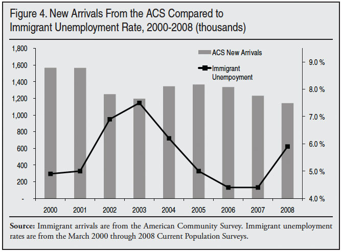
Data from the 2010 ACS will not be available for another year, so it will be some time before a complete picture of the decade’s migration is available. Figure 4 reports new arrivals for 2000 to 2008 based on the 2000 to 2009 ACS. Figure 4 also reports the unemployment figures for March of each year from Figure 3.19 As is the case with Figure 3, the ACS does not show any clear relationship between immigrant unemployment rates and the level of new immigration.
The results in Figures 2, 3, and 4 do not mean there was no relationship between immigration levels and the economy. After all, most adult immigrants come to work and they would not come if they did not think they could find a job. What we can say based on the figures is that variation in the level of new immigration year to year does not seem that closely connected with labor market conditions. Perhaps other measures of employment would show a closer link between immigration levels. Or perhaps some part of the immigrant population is more closely connected to the economy, such as those who come to America illegally. Given the complex nature of immigration and the many factors that make people want to come to America, the finding that immigration levels and national job growth or immigrant unemployment over the last decade are not closely linked may not be too surprising.
Coming and Going in the Last Decade. The top of Table 2 shows an extremely simple method for calculating out-migration. The first row of the table calculates growth in the foreign-born population for each two-year period. The second row reports the level of new immigration for each two-year period. Table 2 reports new immigrant arrivals by two-year groupings because the public-use data from the CPS group immigrant arrivals in two-year cohorts every other year. (The same information can be found in Table 1.) So, for example, the first row shows that growth was 2.47 million 2000 to 2002 and the second row shows 3.33 million new arrivals 2000 to 2002, based on the 2002 CPS. The third row in the table provides a crude estimate for out migration by subtracting growth from new arrivals. For example, between 2000 and 2002 return migration would be 861,000 (3.33 million minus 2.47 million).
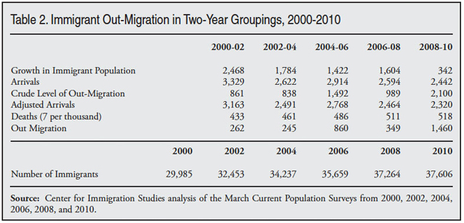
To understand the simple logic of this approach it may to helpful to think of the calculation this way, 3.33 million immigrants arrived but the population only grew 2.47 million from 2000 to 2002 because 861,000 immigrant left. (All persons born in the country are awarded citizenship and are not immigrants, so the only way to add to the immigrant population is new arrivals from abroad.) The calculation in the top part of Table 2 is only a crude measure mainly because it does not include the deaths that must occur among immigrants in each two-year period. Table 2 then calculates out-migration more precisely by estimating the number of deaths among immigrants for each two-year period. It also adjusts the arrival data to account for the slight difference between the period of growth measured and the period of new arrivals reported in the CPS.20 Figure 5 reports the results from the bottom of Table 2 graphically.
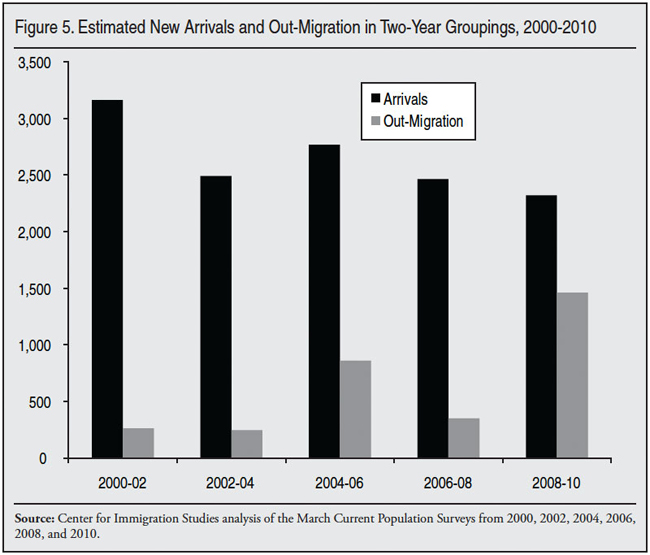
Table 2 and Figure 5 indicate that new immigration varied through the decade, but that out-migration seems to have fluctuated more. The number of new arrivals 2000 to 2002 is statically higher than for the rest of the decade. This is consistent with the individual year estimates shown in Figure 2. The number of new arrivals 2002 to 2004, 2006 to 2008, and 2008 to 2010 are not statistically different from each other. Statistically, the period 2004 to 2006 is somewhat higher than the 2002 to 2004 and 2006 to 2010 periods.
But it is out-migration that varied much more during the decade just completed. During the last two years of the decade, the number of immigrants heading home was much higher than at any other time during the last 10 years. As we have seen in Figure 2, job losses were very large in 2008 and 2009, so it makes sense that more people would return to their home countries. In prior research we have found evidence that increased enforcement of immigration at the end of the decade also contributed to an increase in the outmigration of illegal immigrants.21 Thus the results in Table 2 and Figure 5 make a good deal of sense. It is worth noting that there is reason to think that the dramatic increase in return migration shown for the 2008 to 2009 period is concentrated in 2008, while in 2009 return migration was much lower.22 However, individual year out-migration estimates are more statistically volatile than two-year estimates given the sampling variation in the survey. For this reason we report the two-year estimates shown in Table 2 and Figure 5.
Immigration at the State Level
Growth in the Immigrant Population by State. Table 3 compares the number of immigrants in 1995, 2000, and 2007 for each state.23 It also shows the share of the population that was foreign-born in each of those years. While immigrants tend to be concentrated, Table 3 shows they have become less concentrated over time. In 1995 the top five states accounted for 68 percent of the total foreign-born population; in 2000 these same states accounted for 66 percent of the foreign-born and they dropped to 60 percent by 2010. Or, looked at in a different way, these five states accounted for 68 percent of the total immigrant population in 1995, but only 47 percent of the growth in the immigrant population between 1995 and 2010. However, the increasing dispersion of immigrants can be exaggerated. In 2010 the top 10 states of settlement accounted for 72 percent of immigrants; these same states accounted for 75 percent of immigrants in 2000. A change to be sure, but not a very large one. What has happened in the last decade and a half is that the number of immigrants living outside traditional areas of immigrant settlement has increased significantly. But growth in the traditional states has also been substantial. As a result, traditional-settlement states still account for a large, though declining, share of the total immigrant population.
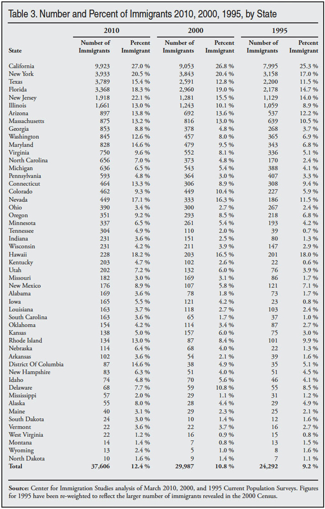
Table 3 also shows different patterns for different states. For example, in New York the number of immigrants increased by 685,000 between 1995 and 2000, but in the 10 years after 2000 it grew by just 90,000. New Jersey, which is right next to New York, is quite different. The numerical increase was 600,000 between 2000 and 2010. A similar pattern holds for Texas. Perhaps the most dramatic increases can be found in Georgia and North Carolina, where the immigrant population increased 3.2-fold and 3.9-fold respectively between 1995 and 2010. In just the last 10 years the immigrant population in both states roughly doubled. The key point to take from Table 3 is that there is no one pattern that reflects the entire country.
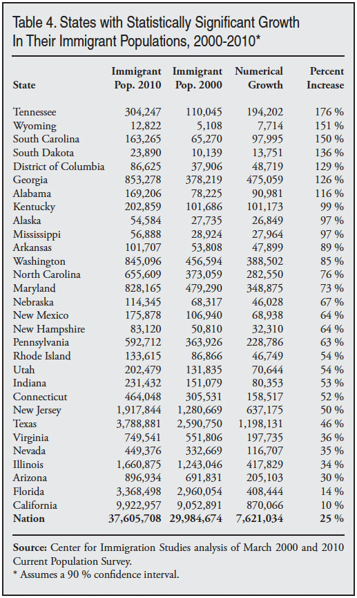
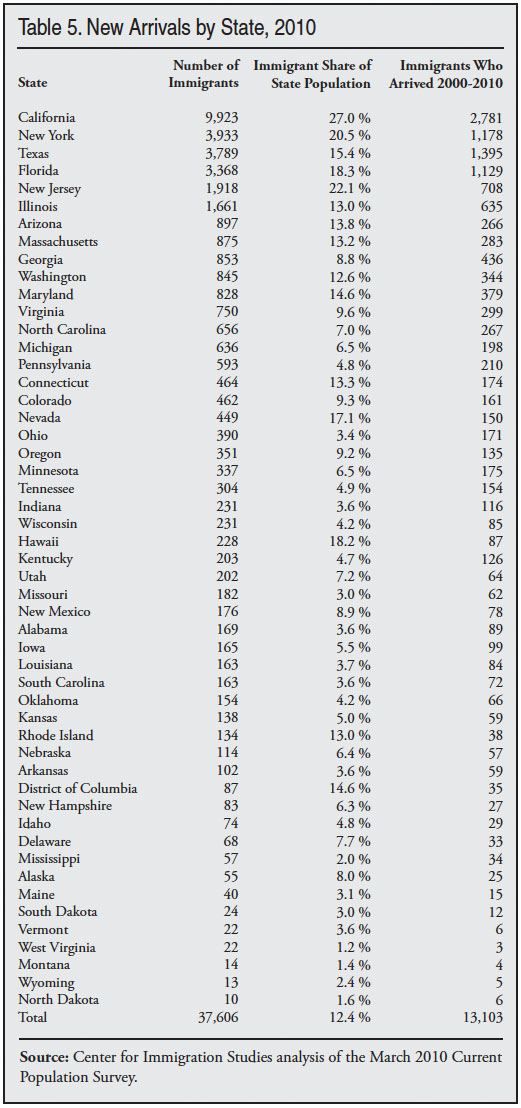
Table 4 shows the 30 states plus the District of Columbia where growth was statistically significant between 2000 and 2010. Table 5 reports the number of immigrants, the share of the population that is immigrant, and the number of immigrants who arrived between 2000 and 2010 in each state. Comparing Tables 3 through 5 shows differing trends across states. For example, New York received a large number of new arrivals over the last decade (1.2 million), but there was very little growth in the size of the foreign-born population. This is likely because a significant share of New York’s immigrant population was older in 2000 than was the case in other states and therefore passed away during the decade. It is also possible that the lack of growth was due to high levels of outmigration of immigrants from the state. Texas, on the other hand, shows 1.4 million new arrivals from abroad and growth in the foreign born of 1.2 million. This is an indication that there is relatively little out-migration of immigrants from that state. Tables 3 to 5 make clear that the pattern of immigrant settlement differs significantly from state to state.
Region and Country of Origin
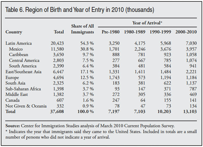
Sending Regions. Table 6 shows the distribution of immigrants by region of the world, with Mexico and Canada broken out separately. Mexico accounts for 30.8 percent of all immigrants, with 11.6 million immigrants living in United States, more than the number of immigrants from any other single region of the world, with the exception of Latin America, of which Mexico is a part. Immigrants from Latin America (Mexico, Central and South America, and the Caribbean) account for the majority of all immigrants — 54.3 percent of the foreign-born come from these areas. East Asia/South East Asia also make up a significant share of the total, accounting for 17.1 percent of immigrants. This is similar to the combined total for Europe and the Middle East. The importance of the Western Hemisphere, excluding Canada, is even more striking when we look at recent arrivals.
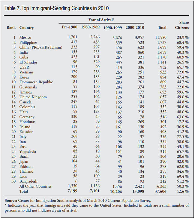
Top Sending Counties. Table 7 ranks the top 25 immigrant-sending countries by the number of immigrants as of March 2010. Mexico is, of course, the largest sending country, accounting for more than six times as many immigrants as the Philippines, the next largest country. As is clear from Table 4, Latin American and Caribbean countries dominate the list of immigrant-sending countries, accounting for almost half of the top 25 countries. One of the striking things about contemporary immigration is that there has been a significant decline in the diversity of immigrants: Mexico accounts for 31 percent of all immigrants in 2010, up from 28 percent in 2000, 22 percent in 1990, and 16 percent in 1980. The top sending country in 1970 was Italy, which accounted for only 10 percent of the foreign-born. The last column in Table 7 shows the share of immigrants from each country who are naturalized U.S. citizens. There is a great deal of variation between countries in the share who are citizens.
Conclusion
This report examines just-released Census Bureau data collected in March 2010 showing that 13.1 million immigrants (legal and illegal) arrived in the United States between January 2000 and March 2010. This compares to the same data from 2000, which showed 12.1 million new arrivals in the 1990s. This is a striking finding because the decade just completed and the 1990s were very different decades in terms of job growth. There were two significant recessions during the last decade plus the September 11 terrorist attacks. There was no job growth for large parts of the decade. Overall there was a net loss of one million jobs from January 2000 to January of 2010. The finding that immigration was so high in the first decade of the 21st century is important because it is a reminder that immigration is a complex process and not simply a function of labor market conditions.
Many factors influence migration decisions, such as the desire to be with relatives, the political freedoms in this country, and the generosity of American public services. These things do not change during a recession. Moreover, the employment opportunities and wages available in the United States may still be much better than in many of the primary immigrant-sending countries, even during a severe economic downturn.
It is also important to understand that immigration is driven by social networks of friends and family who provide information about conditions in the United States and often help new immigrants after they arrive. As the immigrant population grows, it creates pressure for more immigration regardless of the economy.
Continued high immigration, even during the worst recession in 70 years, does not mean that labor market conditions have no impact on the level of immigration. What it does mean is that other factors also matter in addition to the economy. There has been no significant change in legal immigration policy in recent years, and as a result the United States continues to allow in very large numbers of permanent immigrants (green card holders) and long-term temporary visa holders, such as guestworkers. Given the high rate of unemployment and non-work in the United States, it may make sense to reconsider this policy. Absent a change in policy, new immigration will likely continue at very high levels. In fact, there is evidence that immigration levels have already begun to increase.
Appendix
End Notes
1 Historical data from 1994 to the present can be found at the Bureau of Labor Statistics (BLS), http://www.bls.gov/schedule/archives/empsit_nr.htm#2010. BLS job figures are based on a survey of employers. Census population estimates show growth of 25.6 million between April 2000 and July 2009. While the 2010 census will provide the official size of the population, it is likely that it will show growth of roughly 29 million during the decade. Population estimates through 2009 can be found at http://www.census.gov/popest/states/NST-ann-est.html.
2 The difference may partly reflect the that fact the 2000 census includes those in institutions such as prisons and also that it is an April number rather than a March number. One extra month may not seem like much, but with 1.2 to 1.5 million annual arrivals an extra month can easily add 100,000 more immigrants to the total.
3 This figure comes from the 1990 census, which like the 2000 census and the CPS asked individuals if they were immigrants and what year they came to America. Actually, in 1990 and 2000 only about 15 percent of the population were given the census “long form,” which included these and other questions. The CPS did not regularly ask about citizenship or year of arrival until 1994. Historic census data by year of entry can be found at http://www.census.gov/population/www/documentation/twps0029/twps0029.html.
4 Part of the reason the ACS shows more immigrant arrivals is that it includes persons in institutions such as prisons, while the CPS does not. Also the CPS is a March survey, while the ACS is weighted to reflect the population in June of each year, which adds several hundred thousand immigrants to the ACS. The 2009 ACS shows 12.2 million arrivals from 2000 to 2009. It seems likely that the 2010 data will show roughly 13.1 million arrivals for the prior decade.
5 Persons in the CPS are re-interviewed over a period of months and this fact is known to respondents at the start of process. Moreover, the March CPS includes an extra-large sample of minorities. The 210,000 persons in the survey, 28,000 of whom are foreign-born, are weighted to reflect the actual size of the total U.S. population.
6 This includes naturalized American citizens, legal permanent residents (green card holders), illegal aliens, and people on long-term temporary visas such as students or guest workers who respond to the CPS. It does not include those born abroad of American parents or those born in outlying territories of the United States such as Puerto Rico.
7 Technically, the CPS does include a small share of immigrants living in communal settings such as college dorms or temporary housing, but in practice it barely captures any of this population. It explicitly does not include institutionalized individuals such as prisoners. Both of these populations together are referred to by the Census Bureau as “group quarters.” The March 2010 CPS found just 21,000 immigrants living in group quarters. In contrast, the 2009 American Community Survey (ACS), which is supposed to capture these populations, found 623,000 immigrants in group quarters. The 2009 American Community Survey found 38.5 million immigrants living in the country.
8 The Department of Homeland Security (DHS) estimate of legal and illegal immigrants in Census Bureau data for 2009 can be found at: http://www.dhs.gov/xlibrary/assets/statistics/publications/ois_ill_pe_20.... Table 2 in the report includes an estimate of non-immigrants and illegals in the American Community Survey. The population totals and coverage ratio of the ACS and CPS are very similar.
9 Figure 1 reports the number of immigrants living in the country from 1995 through 2007 from the March CPS. The data for 1995 to 1999 were originally weighted based on the results of the 1990 census carried forward. This was also true for the March 2000 and 2001 CPS. After the 2000 census, which was conducted in April of that year, the Census Bureau re-weighted the March 2000 and 2001 CPS based on the results from the 2000 census. This had the effect of increasing the size of the foreign-born population in the March 2000 CPS by 5.659 percent. While the Census Bureau has not re-weighted the 1995 through 1999 CPS, it is very reasonable to assume that the undercount was similar in those years. If we adjust the 1995 through 1999 March CPS by the same amount it produces the results found in Figure 1. This does introduce some element of uncertainty when data prior to 2000 are compared to later data.
10 These results are based on a t-test with p>.90.
11 Unlike deaths, out-migration may or may not rise with the size of the immigrant population. Also, unlike deaths, it can fluctuate from year to year. While the potential pool of return migrants obviously grows as the immigrant population grows, this does not necessarily mean that more will chose to go home, or in the case of illegals, be forced to do so. Put simply, out-migration usually is voluntary and can fluctuate; deaths are not voluntary and therefore occur at a predictable rate. This does not mean that out-migration cannot be estimated. See the Census Bureau publication at www.census.gov/population/documentation twps0051/twps0051.pdf.
12 The Pew Hispanic Center assumes a 5.2 percent undercount of the total foreign-born population in the 2005 CPS. See Figure 3, page 4, in their March 2006 estimate of the illegal population, http://pewhispanic.org/files/reports/61.pdf. Pew bases its 5.2 percent estimate on work done by Passel, Van Hook, and Bean. Their paper, “Narrative Profile with Adjoining Tables of Unauthorized Migrants and Other Immigrants, Based on Census 2000: Characteristics and Methods,” was written for Sabre Systems as part of a contract with the Census Bureau.
13 In addition to the year of arrival there is another question in the CPS that asks respondents where they lived last year. This question may also provide insight into migration trends; however, there are significant problems with the results. First, the level of new immigration shown from the questions is implausibly low. For example, for most of the past decade the growth in the foreign-born year-to-year is larger than the arrival data implied by this question. Another problem with this question is that a non-trivial fraction of respondants report a residence that is in conflict with the results of the year of arrival question. It is not clear why this is the case. Given these problem we rely on the year of arrival data for most of this analysis.
14 BLS monthly statistics show there were 1.2 million fewer jobs in the United States in December 2009 compared to January 2000. A comparison between March 2000 and March 2010 shows a decline of 1.6 million jobs. See the BLS employment situation archive at http://www.bls.gov/schedule/archives/empsit_nr.htm#2010.
15 In January 1990 the Establishment Survey (seasonally adjusted) from the Bureau of Labor Statistics showed 109.654 million jobs in the United States, the figure for January 2010 was 130.781 million, for a net increase over the decade of 21.1 million. If we compare March 1990 to March 2000, the net increase in jobs would be 21.3 million over the decade. Historical data from 1994 to the present can be found at http://www.bls.gov/schedule/archives/empsit_nr.htm#2010. Revised, seasonally adjusted figures for 1990 can be found in the November 1990 issue of Monthly Labor Review, http://www.bls.gov/opub/mlr/1990/11/rpt1full.pdf.
16 Figures come from The Yearbook of Immigration Statistics: 2009, at http://www.dhs.gov/files/statistics/publications/LPR09.shtm.
17 In a report titled “Immigrants and Mid-Decade: A Snapshot of American’s Foreign-Born Population in 2005,” ( www.cis.org/sites/cis.org/files/articles/2005/back1405.pdf) pages 2 through 4 and end notes 6 through 14 discuss in greater deal why estimating individual year flows of immigrants is so difficult. That report discusses some of the breaks in the continuity of the data that make year-to-year comparisons difficult. One key problem with the kind of analysis done in Figure 2 is sampling variability. The margin of error using a 90 percent confidence interval for the 3.5 million arrivals (2006-2009) is about 180,000 and for the 4.7 million arrivals (2006 to 2010) is almost 210,000. This means it is very possible that the actual number of new arrivals 2006 to 2009 is really 3.7 million, while the actual number of new arrivals for 2006 to 2010 is really 4.5 million. If these high and low values are correct, then the number of new arrivals would be 800,000; quite a bit less than the 1.2 million shown in Figure 2 for 2009. Moreover, subtracting one cohort from another in the following year does not take into account the departure of immigrants that occurs over the course of a year. While the number of just-arrived immigrants leaving within just one year is small, it does introduce an potential area of uncertainty. The limitations of this method are also illustrated by the fact that some of the results in Figure 2 do not agree with the results in Figure 1. For example, between 2000 and 2001 growth in the foreign-born is 1.8 million, yet Figure 2 shows only 1.5 million new arrivals. Mathematically it is not possible for the foreign-born to grow by more than the number of new arrivals. This problem exists only in a few years and it almost certainly reflects of sampling variability, which exists in any survey.
18 The BLS archive page that reports the number of jobs each month can be found at http://www.bls.gov/schedule/archives/empsit_nr.htm#2010.
19 The arrival data from the ACS public-use files show the following: 1.566 million arrivals for 2000, 1.565 million for 2001, 1.249 million for 2002, 1.196 million for 2003, 1.345 million for 2004, 1.366 million for 2005, 1.335 million for 2006, 1.231 million for 2007, and 1.136 million for 2008.
20 Growth is measured from March to March for each two-year period, but the arrival data are for calendar years. For example, the arrival data for 2002 are for January 2000 to March 2002. So we adjust new arrivals downward so that it better matches the growth period.
21 See “A Shifting Tide: Recent Trends in the Illegal Immigrant Population,” at http://www.cis.org/IllegalImmigration-ShiftingTide.
22 The figures shown in Figure 2 can be used to measure out-migration year-by-year, instead of the two-year comparisons shown in Table 2 and Figure 5. A year-by-year comparison shows very high out-migration in 2008, but low out-migration in 2009. This is because, as was shown in Figure 1, there was a small decline in the size of the foreign-born population from March 2008 to March 2009, but growth from March 2009 to March 2010. This very different pattern for these two years seems to be, at least in part, the result of changes in out-migration.
23 So that comparisons can be made between 1995 on the one hand and 2000 and 2007 on the other hand, we have attempted to adjust figures for 1995 to reflect the results of the 2000 census. The effect of this adjustment is to increase the foreign-born population by only a small amount.